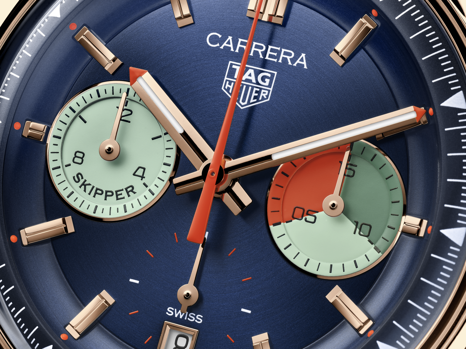
The Watchmaker’s Canvas

In the rarified world of haute horlogerie, where decimal tolerances speak of engineering precision and tourbillons pirouette with celestial grace, there lies a surface no thicker than a coin but deeper than a sonnet: the watch dial. While movements often garner the loudest applause, it is on the dial that imagination, identity, and artistry converge.

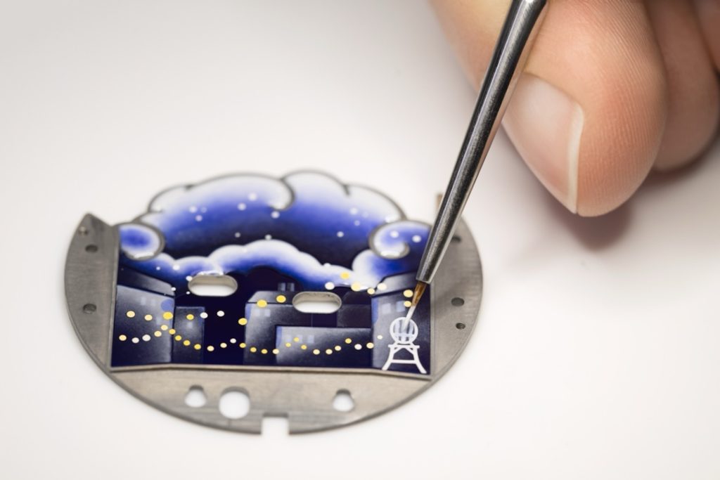
Dial artistry is not mere ornamentation; it is a deliberate canvas, a miniature theatre of craftsmanship. It serves not only to inform, but to seduce, provoke and sometimes to play. Today, traditional techniques like cloisonne enamel, miniature painting and guilloche coexist with contemporary innovations such as laser engraving, 3D printing and even augmented reality.

These hybrid approaches allow artisans to experiment with depth, interactivity and narrative in ways previously unimaginable — pushing the dial into new realms of artistic and sensory experience. In the following paragraph, we will turn our attention to eight extraordinary maisons whose work exemplifies wonderful possibilities of creative expression on the faces of timepieces.

Patek Philippe

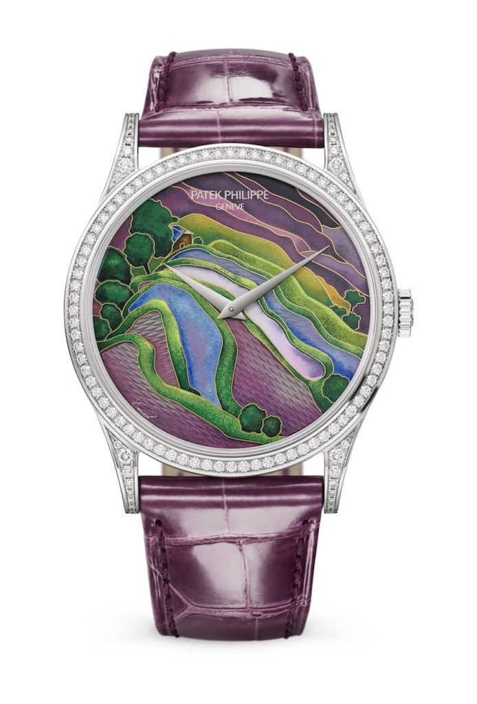
Let us begin at the summit—with Patek Philippe, a maison that has long held a religious devotion to metiers d’art. Here, dial artistry is not a trend, but a calling, rooted in an ethos that prizes time-honoured techniques as deeply as it does innovation. The 2025 Rare Handcrafts collection continues this tradition with remarkable pieces like the Golden Ellipse Ref. 5738/50J-011 “Yellow-Crested Cockatoo”, featuring a cloisonne enamel dial enhanced by a miniature painting that brings the vibrant bird to life in exquisite detail. It is not simply decorative—it is narrative.

Equally mesmerizing is the Calatrava Ref. 5077/100R-071 “White Swan,” whose dial is crafted from rare species of wood marquetry and finished with delicate gold leaf. Each thin slice of wood is chosen for its grain, tone, and pliability, then hand-cut and assembled like a jigsaw puzzle of tone and texture. This level of detail—sometimes involving over 200 pieces per dial—requires not just skill but patience bordering on the monastic. The result is not merely visual, but tactile, drawing the eye into its layered intricacies with each glance.

Yet, Patek Philippe’s dial artistry extends far beyond métiers d’art alone, blending seamlessly with high complications. In the Ref. 5370R-001 Split-Seconds Chronograph, introduced in 2025, design and engineering unite harmoniously. The brown Grand Feu enamel dial, with beige champlevé enamel subdials and a tachymeter scale, showcases Patek’ Philippe’s ability to balance technical sophistication with aesthetic refinement. Here, symmetry, legibility, and elegance are not mere preferences; they are obligations. The dial becomes a stage where every complication plays its part in balance and proportion, where function enhances form rather than burdens it.

Van Cleef & Arpels

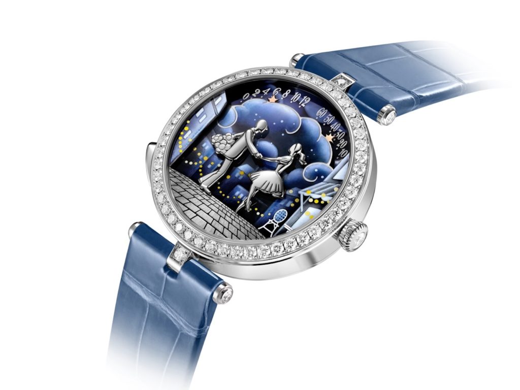
Next, we move to a maison where time is measured not in seconds, but in stories: Van Cleef & Arpels. Few watchmakers elevate narrative like this one, and their 2025 presentation at Watches & Wonders reaffirmed their mastery of emotional storytelling through mechanical ingenuity. The Lady Arpels Bal des Amoureux Automate, a sublime expression of the maison’s Poetic Complications, features a romantic scene in white gold, adorned with diamonds and miniature sculpture. At noon and midnight, an automaton mechanism animates the scene, bringing the lovers to life as they glide toward each other for a tender kiss.

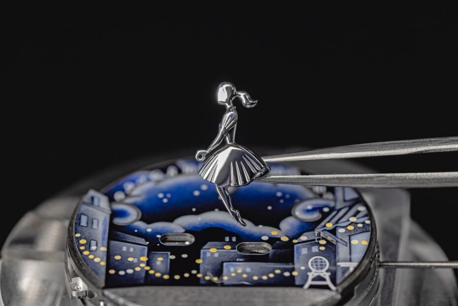
The dial’s intricate design incorporates five planes for added depth, with grisaille enamelling evoking a starlit night and delicate brushwork capturing folds of fabric and expressions of longing. Time is told by two stars set in motion via a double retrograde system, blending technical sophistication with poetic artistry. Here, mechanics are not concealed, they are staged, choreographed, and emotionally resonant. The timepiece is, in fact, a continuation of the animation depicted on the dial of the Lady Arpels Pont des Amoureux, which was first introduced in 2010.

Alongside this, the maison’s Extraordinary Dials series continues to showcase its virtuosity in métiers d’art. Previous years have featured butterflies in miniature mosaic and dreamy zodiac scenes in plique-à-jour enamel. Even in the restrained elegance of the Pierre Arpels collection, where minimalism reigns, the dial remains a sacred space, empty not from absence, but from intention. It is designed as a pause, the white space of a poem, the silence between notes in a sonata.

Chanel

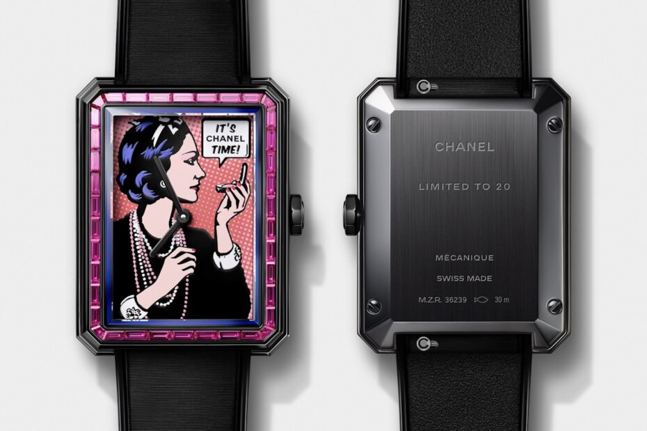
From fairy tales to fashion rebels, Chanel brings its haute couture swagger to the dial with irrepressible confidence. The house’s design language—bold yet elegant, masculine but never without grace—finds its gorological counterpoint in models like the Boy.Friend.Originally conceived as a study in masculine lines for a feminine wrist, it has now become a playground for dial experimentation.

A standout is the 2024 piece unique created for the TimeForArt auction: a Pop Art-style portrait of Gabrielle Chanel herself, clad in pearls, layered necklaces and bold cuffs, framed within a bezel of 38-baguette-cut diamonds. Crafted in Grand Feu Studio, the image is built up using twelve individual cliches, dimensionality, with texture, wit and irreverent charm.

In 2025, Chanel continues this exploration with Boy.Friend Coco Art Watch, a reissue of the 2024 piece, unique as a limited edition of 20 pieces, this time framed with a bezel of 38 baguette-cut pink sapphires. Chanel also introduced the Boy.Friend Blush at Watches & Wonders 2025. This limited-edition timepiece features a coral lacquer dial adorned with a stylised portrait of Gabrielle Chanel, paired with a pink strap and a black stainless-steel case.

The contrasting hues, slightly off-killer symmetry and expressive line work echo Chanel’s radical take on femininity. Chanel’s dial experimentation is neither nostalgic nor tech-forward: it is artistic expression in the medium of time; fashion rendered in horological form.

Hermès

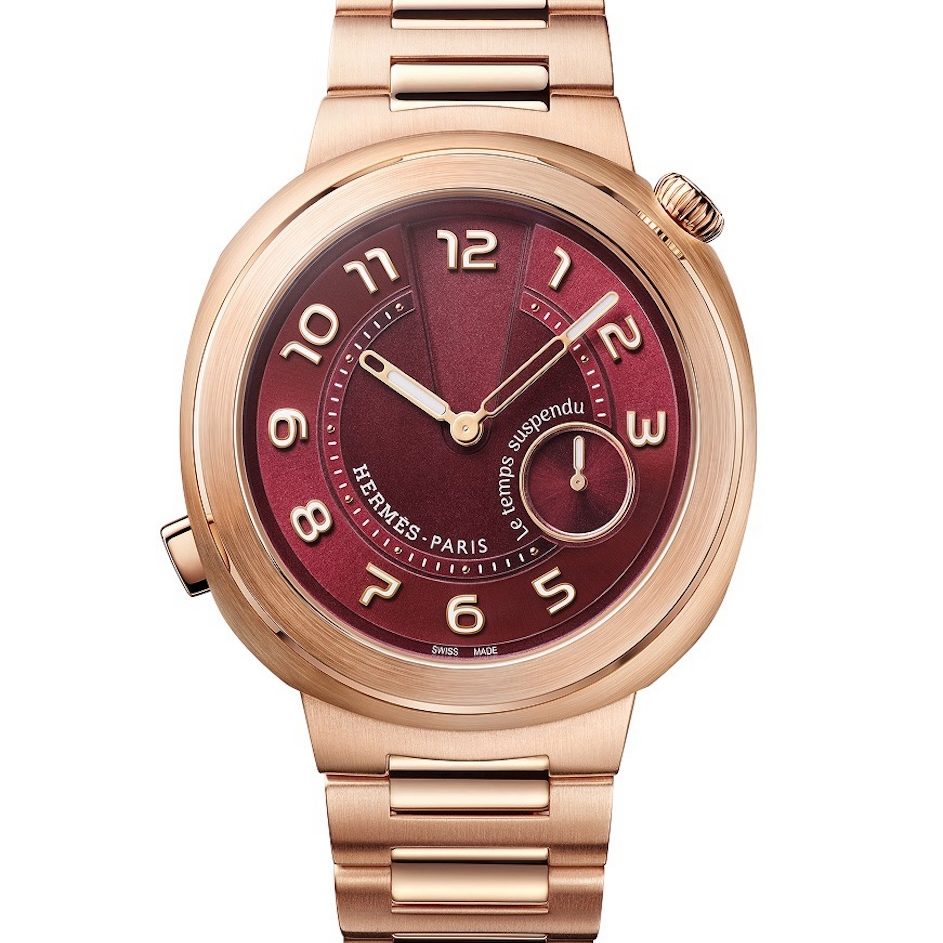
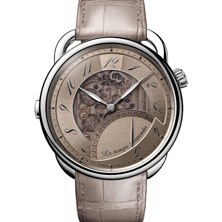
Dial artistry often speaks most potently when it whispers, and few speak this dialect more fluently than Hermès. Revered for its leather and scarves, the maison has now turned its horological eye inward, and upward. The Arceau collection, long celebrated for its asymmetrical stirrup-shaped lugs and narrative-driven dials, epitomizes this approach.

The Arceau Le Temps Suspendu, returning in 2025, invites you to pause time itself, literally. At the press of a pusher, the hands retreat, leaving time to quietly continue inside while refraining from declaring it. The dial becomes an existential pause, a philosophical gesture cloaked in horological mastery. It is a reminder that time, like language, can be withheld, held in suspense, or gently subverted.

Then, there’s the Arceau Rocabar de Rire, which replaces solemnity with mirth. A horse crafted from horsehair marquetry, engraving, and miniature painting sits on the dial, with the punchline arriving when the horse sticks out its tongue at the press of a pusher. It is playful, delightful, and exquisitely made. It reminds us that technical mastery and a sense of humor are not mutually exclusive.

Hermès has long embraced playfulness with discipline. Even in pieces like the Arceau Millefiori—where the dial is a slab of colored glass crafted in the Cristalleries de Saint-Louis—or the lacquered scenes inspired by its scarf designs, the maison demonstrates that dial artistry can be both poetic and whimsical, a quiet rebellion dressed in elegance.
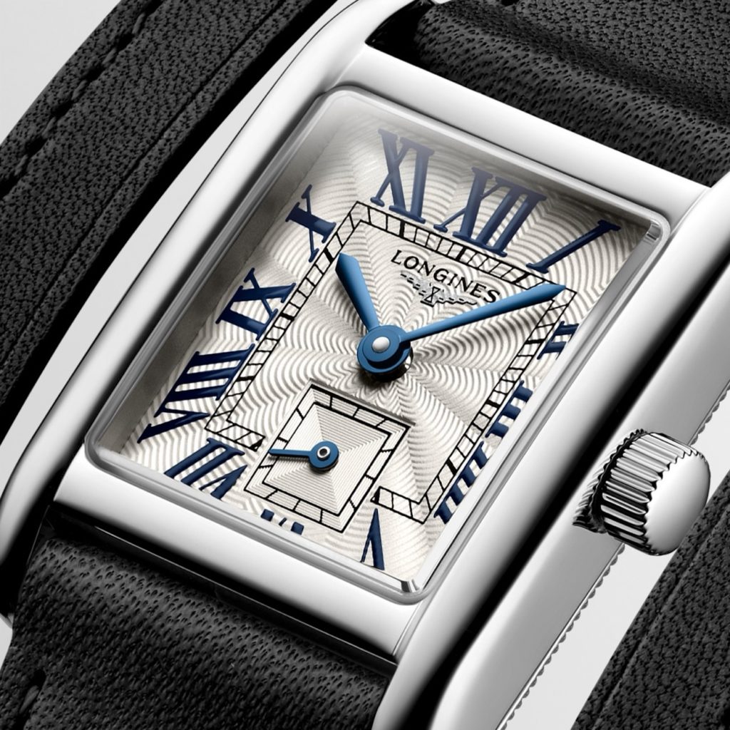
Longines

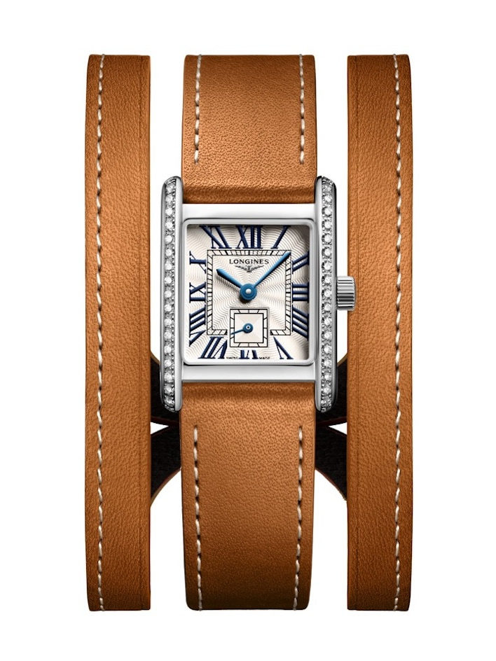
Longines proves that artistry needn’t always be ornate. Take for instance, the brand’s famed sector dials, which are studies in proportion and clarity, designs that whisper rather than shout, yet command attention with their perfect geometry. In these dials, symmetry reigns: concentric circles, crisp crosshairs, and evenly spaced markers create a visual rhythm that recalls interwar modernism and mid-century minimalism.

Contemporary releases like the Heritage Classic Sector Dial and the rectangular DolceVita Sector Dial have garnered praise not for their complexity but for their restraint. The spacing of elements, the serif typefaces, the muted palettes, all recall a time when utility and beauty were not in conflict but in conversation.

This restrained elegance permeates the broader catalogue. From the balanced typography of the Master Collection to the disciplined legibility of the Spirit line, and even in the sportier HydroConquest models, Longines consistently favours proportion over embellishment. It is a quiet, deliberate aesthetic, one that values design discipline as a form of artistry. The dial becomes a diagram of clarity, a design of timeless relevance.

Bvlgari

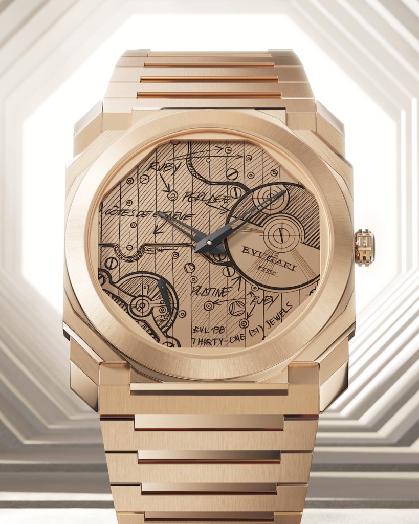
Bvlgari, master of Roman sensuality, offers a different proposition altogether. Its approach to dial artistry is all at once conceptual and sensual, merging engineering and aesthetic daring. In celebration of its 140th anniversary, the brand unveiled the Octo Finissimo Automatic Sketch Dial, a limited edition that places the movement front and centre on the dial.

The face features a hand-drawn illustration of the ultra-thin calibre BVL 138, complete with its micro-rotor and intricate finishing details. This layered, expressive depiction blends mechanical complexity with artistic imagination. Made available in 280 pieces in stainless steel and 70 in 18k rose gold, the timepiece underscores Bvlgari’s commitment to challenging horological conventions with elegant disregard.

This sketch-style approach first emerged in 2022, when Bvlgari’s creative director, Fabrizio Buonamassa Stigliani, printed his original design drawings directly onto the dial. By elevating what is normally a backstage process into the star of the show, Bvlgari upends the hierarchy of watch design. It is meta, mechanical, and unmistakably Roman in its flair. This approach offers a rare glimpse into the design process and celebrates the generative power of sketching—the first line before anything else exists, now frozen forever on the dial.

H. Moser & Cie

Meanwhile, in Schaffhausen, H. Moser & Cie dares to scribble all over tradition—challenging the codes of classic watchmaking like none before. Nowhere is this more apparent than in the Endeavour Perpetual Calendar Tutorial. This limited edition takes the brand’s revered perpetual calendar and overlays it with scribbled annotations, doodles, and playful reminders as if written by a mischievous watchmaker.

With cheeky notes like “Watch out for very rare 29th” next to the month of February, the dial transforms into living breathing user manual. And yet, the mechanism beneath remains uncompromising: instantaneous date change, manual override, and minimalist architecture all powered by the HMC 800 calibre. Moser’s point is clear: serious watchmaking doesn’t have to take itself too seriously.

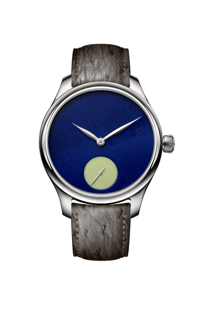
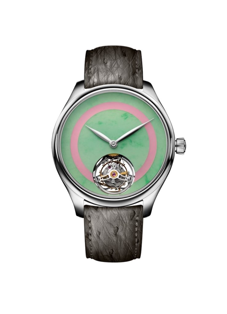
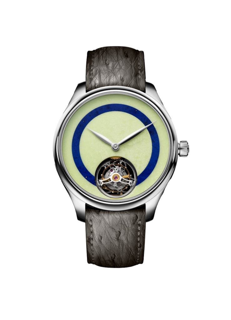
This spirit of rebellion is also reflected in Moser’s 2025 Pop Collection: a riot of colour and natural materials that reimagines the Endeavour line. Dials crafted from turquoise, coral, jade, and lapis lazuli present a vivid, almost surreal intensity. Each stone dial is unique, offering an artistic expression of nature’s imperfections, while still maintaining Moser’s commitment to technical integrity. Here, nature becomes the artist, and the dial the medium.
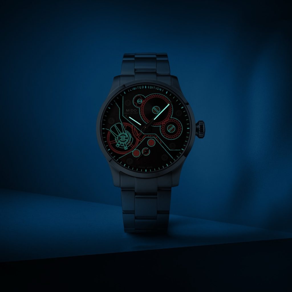
Mido

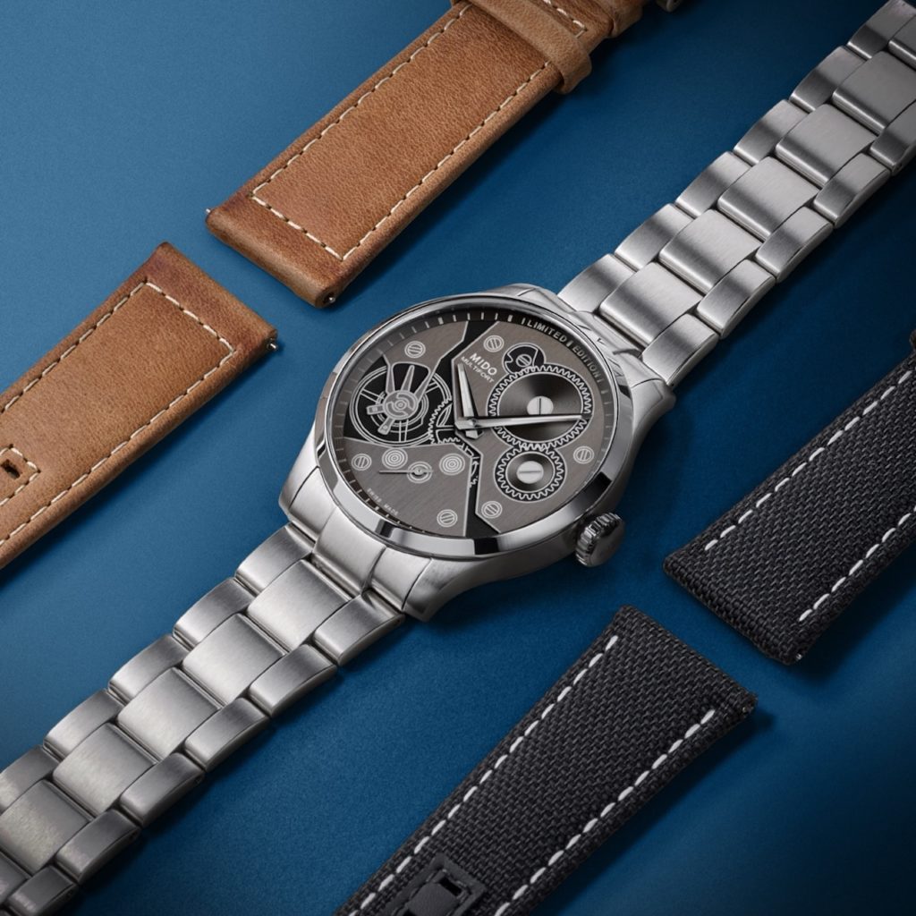
Mido, the quiet achiever of Swiss watchmaking, is carving out a unique space by reimagining mechanical design with artistic clarity. While the brand favours architectural rigor over ornamentation, its recent foray into dial artistry has been both clever and refreshing. The Multifort Mechanical, introduced in 2024, features a printed illustration of the movement across its dial.

Mido cheekily turns the mechanics inside out, placing a schematic drawing of the calibre front and centre, treated with luminescent material for a glow-in-the-dark effect. The result is cerebral yet charming, a visual homage to the machine within, rendered with graphic finesse.

And in other lines, such as the Ocean Star Decompression Timer or Commander Gradient, Mido balances colour, transparency, and playful geometry with surprising dexterity. It is not showy but assured. It proves that even in the affordable segment, dial artistry can sing with both intelligence and integrity. The art is democratic, the detail precise, the joy unmistakable.

In a world where time is often reduced to a mechanical abstraction, these eight maisons demonstrate the elevation of the dial to its rightful place as an art form. Each dial considered above represents not merely a functional surface, but a synthesis of heritage and experimentation—a miniature gallery where history, philosophy, and innovation converge. Whether it’s the precision of wood marquetry, the storytelling of automata, or the unexpected poetry of laser etching or graphic schematics, the dial has become a space where the past and future of watchmaking hold a quiet, exquisite dialogue. These timepieces remind us that a watch does more than tell time; it frames it, questions it, decorates it—and, most importantly, reimagines it.

Jack Heuer's Vision: The Enduring Appeal of the TAG Heuer Carrera

TAG Heuer Carrera Chronograph Tourbillon

While not every story about TAG Heuer begins with a specific human being, this one does. This is particularly true of our cover star this issue, and also of the broader collection it belongs to. You cannot quite begin to learn about the Carrera’s origins without first learning a little about the man responsible for having dreamed it up: Jack Heuer. Jack, whom this story addresses mostly by his first name to avoid confusion with the Heuer brand, is the great-grandson of Edouard Heuer who, in 1860, founded the watchmaking endeavour that stands today as TAG Heuer. He was born on November 19, 1932, in Bern, Switzerland. Jack describes in his autobiography: The Times of my Life - An Autobiography by Jack Heuer, that he had a “very happy and privileged childhood.” Jack Heuer was already comfortable navigating life in English, French and his father’s specific Swiss German dialect, at a young age. He was no stranger to the outdoors thanks to his father’s influence and, apparently, he was quite a talented skier who was allowed to go the more difficult slopes alongside kids who were significantly older than him.

Jack made his first contribution to the family business at the tender age of 15, when the resourceful teenager managed to employ the help of his physics teacher at school, Dr. Heinz Schilt, to create the Heuer company’s first tide watch, the Solunar, and later the Mareograph-Seafarer; and thus a connection with the TAG Heuer Carrera Chronograph Skipper (opposite) emerges, if only thematically.

Later in his life, for his university education, Jack went to the Federal Institute of Technology, in Zurich. It was here that Jack developed an interest and love for modern design. He writes that he loved the works of furniture designers Le Corbusier and Charles Eames, and architects such as Eero Saarinen and Oscar Niemeyer. Jack shares further that as a student, he even saved enough to buy himself an Eames lounge chair, which he confesses, looked oddly out of place in his student accommodation.

Jack Heuer joined the family watchmaking business, formally on January 1, 1958. In a few short years, he had delved into various aspects of the business, both at home and overseas, and the time had soon come for him to design his first watch… Hot on the heels of the launch of the beloved Autavia, in 1962, Jack was invited by the Sports Car Club of America to attend the 12 Hours Race at Sebring in Florida. The invite was the result of his loaning the race a handful of Heuer pocket watch chronographs with spilt seconds. And thus, the performance motoring story flagged off.

The Sebring race was the place to be during those years for anyone with serious interest in endurance racing. The race is known to have had notable participants from both the professional and amateur circuits including German racer, Jochen Rindt, the Mexican racing brothers, Pedro and Ricardo Rodriguez, and even the one and only, Paul Newman. While he was there, Jack writes that he spent the bulk of his time at the Ferrari pits. He spent so much time there that he managed to get well acquainted with the team’s drivers, the Rodriguez brothers and even their parents.

Designing the Carrera

Jack Heuer writes, recounting the conversation he had with the Rodriguez parents, “They told me that they were lucky that their boys were so young — Pedro was then 21 and Ricardo 19 — because if they had been born a few years earlier they would certainly have participated in the dangerous race across Mexico known as the Carrera Panamericana Mexico. At the time it was considered to be the most dangerous sports car race in the world and over a period of five years had claimed over 30 victims. It was called off in 1955 because of safety concerns, a decision no doubt reinforced by the disaster at Le Mans the same year.”

It was the first time Jack had encountered the word Carrera, which immediately left a deep impression on him. He writes, “I loved not only its sexy sound but also its multiple meanings, which include road, race course and career. All very much Heuer territory! So as soon as I got back to Switzerland I rushed to register the name under Heuer Carrera.”

Read more: Quartz Watches: What They are and How They Work

TAG Heuer Carrera Chronograph Skipper

Jack set out to make the Heuer Carrera a watch of its time, taking inspiration from the designers he admired. For this he shares, “I wanted a dial that had a clear, clean design, and a new technical invention came to my aid. A manufacturer of plastic watch crystals had invented a steel tension ring that fitted inside the crystal and kept it under tension against the surrounding steel case, thereby greatly increasing the degree of water resistance. I decided to use the inside bevel of this tension ring to carry the markings measuring one-fifths of a second. In other words, the flat dial surface no longer had to carry these markings — they had now been shifted off onto the tension ring — and this was the secret behind the fresh, clean and uncluttered appearance of my first ‘Carrera.’”

Jack designed the dial of the Heuer Carrera, first and foremost, with legibility in mind. He limited the text on the dial to a bare minimum, essentially just incorporating the word Carrera printed above the Heuer shield at 12 o’clock and a fine print of the word “Swiss” at 6 o’clock. Jack added to the watch’s legibility by opting for black text on an otherwise monochromatic dial. He proportioned the subdials with great care, ensuring superb balance. But of course, it was the steel tension ring that fitted inside the crystal and accommodated the 1/5th seconds scale that ultimately gave the first Heuer Carrera its sense of expansiveness.

The Heuer Carrera was launched in 1963 as the reference 2447, targeted primarily at motor racers. Measuring 36mm, initially the watch had three subdials — 30-minute and 12-hour totalizer, along with a running seconds — and was powered by the Valjoux 72 chronograph movement. It did not take long, however, for the watch to evolve. Practicality required that for watch buyers with the need for specialized chronograph scales, the Heuer Carrera had to accommodate a variety of alternative scales on its dial. These scales couldn’t be confined to the aforementioned steel tension ring. So the Carrera’s dial too had to consider different outlooks.

In 1965 specifically, Jack Heuer launched the reference 3147 Carrera Date, or “Dato” as it is better known among collectors. The Landeron 189 movement in the watch allowed for a running seconds display at 9 o’clock, a 45-minute totalizer at 3 o’clock and, oddly, a date window at 12 o’clock; when the chronograph was zeroed, the large second hand would obscure the date. This was rapidly rectified with a 1967 reintroduction that took away the running seconds hand and placed the date window instead at o’clock. We will get to the 1968 version later…

First, it must be acknowledged that Jack’s design and vision for the Carrera was a strong one from the start; it provided a strong base from which to grow and develop a collection of watches. Sure enough, as the decades wore on, the Heuer Carrera saw a plethora of animations, such as in the barrel-cased versions in the 70s, automatic movements, quartz movements, ever more colorful dials, incredible complications (including world premieres), different interpretations of case shapes and much more. With every passing decade and even through Heuer becoming TAG Heuer, the Carrera became entrenched into the horological firmament.

There is, honestly, a great deal more to the story of Jack Heuer and the impact he has had in building what would become TAG Heuer, beyond the Carrera. We have been exploring these tales over the years (this is our third Carrera feature) and the mine is unlikely to run dry soon.

TAG Heuer Carrera Chronograph Skipper and Carrera Chronograph with panda dial

Now, as the Carrera took on ever more progressive designs, in terms of its case, dial elements, movements, it is hard to deny that within the collecting community, there was a yearning watches in the likeness of reference 2447, but produced with today’s technology and know-how. Limited editions such as the 2017 Skipper, produced with Hodinkee, and the Blue Dreamer, produced with The Rake and Revolution magazines, were proof positive of this sentiment. Later, TAG Heuer itself launched the Carrera 160 Years Silver, in 2020 — a faithful reissue of the 2447 — unsurprisingly, the watch was a runaway success (and our Summer cover watch that year).

Read more: 8 Luxury Timepieces Based On Olympic Sports

Six Decades On

TAG Heuer has given the idea of reviving the 1963 Carrera aesthetics a right good dose of rocket fuel since then. There have been several superb launches that take after the 2447, such as the Carrera 60th Anniversary unveiled — as its name suggests — on the occasion of the Carrera’s 60th anniversary, in 2023 (the watch was last Summer’s cover star). But the most significant development, in terms of taking inspiration from the original Carrera, was the 2023 Carrera Chronograph “Glassbox”, which is a delicate reinterpretation of the 2447 with a decidedly contemporary edge.

At 39mm, and with a “box” sapphire crystal, the case features an angular façade with a mix of brushed and polished surfaces that boldly play with any and all available light. Taking inspiration from the original, TAG Heuer was deliberate and intentional in printing the tachymeter on the sloping flange, paying a homage to Jack Heuer's design chops. The watch was made available in a reverse panda variety — with the date window at 12 o’clock — as well as a blue version with its date window at 6 o’clock.

Another newsworthy development last year was the introduction of TAG Heuer’s brand new Calibre TH20-00. In simple terms, the movement is an evolution of the Heuer 02, launched in 2016 as the brand’s signature workhorse (developed from the ground up at the manufacture’s own facilities at Chevenez). The Heuer 02 is in fact the same movement upon which TAG Heuer developed its industrial tourbillon movement, the Heuer 02T.

Carole Forestier-Kasapi, TAG Heuer’s recently appointed Movement Director — and industry legend —shares about the Heuer 02, “The Heuer 02 movement is an extremely well-made calibre, it’s flawless. Our mission was to take it to the future as well as possible.” This future proofing meant fine-tuning targeted aspects of the column-wheel and vertical clutch equipped chronograph movement. An extensive study was first conducted over six months, the results of which informed Forestier-Kasapi and her team. They set out to devise a very precise development pathway in order to imbue the Heuer 02 with significant improvements.

The entire exercise took two years and yielded the new generation of the Heuer 02, now equipped with a bi-directional rotor, that is even more discreet and quiet. It also allowed for some aesthetic updates such as the movement’s new rotor shaped in the silhouette of TAG Heuer’s shield. The biggest impact from all these upgrades to the movement, however, is that TAG Heuer is now standing behind the TH20-00 with a five-year warranty, up from the previous two. Says Forestier-Kasapi, “To go from two to five years of warranty, the mechanics behind the watch have to keep up. This is a major challenge for any watchmaker.” She goes on, “TH20-00 represents a leap in quality and durability. All TAG Heuer movements will now have to meet this new benchmark of excellence.”

TAG Heuer also took the occasion of the Carrera’s 60th anniversary to demonstrate the versatility of its new TH20-00 family of movements by announcing an all-new 42mm Carrera Chronograph Tourbillon. In accordance with our story thus far, the new Carrera Chronograph Tourbillon does away with the 2016 version’s industrial outlook for an aesthetic that takes after the 2447.

The movement used to bring the timepiece to life is the calibre TH20-09, which retains the column wheel chronograph mechanism and bi-directional rotor from the essential TH20-00 and adds to it a 4Hz tourbillion. But then, there is a further cherry on the TH20-09’s proverbial cake, in that the tourbillion chronograph movement is impressively COSC certified.

Another Carrera launched to mark the collection’s 60th anniversary include the reissue of the Carrera Skipper, in a 39mm steel case with the TH20-06 calibre, which builds on the TH20-00 with a 15-minute regatta countdown indicator. Still another was the 42mm Carrera Chronosprint x Porsche, launched as a nod to the Carrera’s “brother from another mother”: the Porsche 911, which was serendipitously born in 1963. The Carrera Chronosprint x Porsche’s calibre TH20-08 was designed to recount a very poignant moment from the 911’s introduction. Forestier-Kasapi explains, “Just as the car went from 0 to 100km/h in just 9.1 seconds, so does our second hand. It takes exactly 9.1 seconds to cover the red portion of the dial and recreate that feeling of exhilaration evoked by the acceleration time of the first Porsche 911.” TAG Heuer also paid homage to Jack Heuer’s gold Carrera reference 1158CHN with a new 39mm rendition executed in yellow gold and equipped with the TH20-00 movement. Lastly, not a watch, but TAG Heuer took the occasion to launch “The Tag Heuer Carrera: The Race Never Stops” book, which beautifully bears witness to six decades of the Carrera (and is referenced heavily for this story).

The Seventh Decade and Beyond

As the Carrera embarks on its 61st year, TAG Heuer’s already geared itself to build on the momentum gathered from the prior year’s worth of celebrations. As early as January, at the LVMH Watch Week in Miami, the 42mm Carrera Chronograph Tourbillon got its next rendition with a striking circular brushed, green dial. This particular shade of green is not unfamiliar to TAG Heuer. It first appeared on a prior Carrera Chronograph launched in 2021 and has since been part of TAG Heuer’s colour palate.

The “Dato”

TAG Heuer Carrera Chronograph Dato

Alongside the green Carrera Chronograph Tourbillon, TAG Heuer launched the 39mm Carrera Chronograph “Dato”. In this instance, “Dato” refers to a very specific execution of the reference 3147 that was launched in 1968. The watch had a 36mm steel case and was still powered by the same Landeron noted earlier. It had a stark black dial with applied baton markers, white print, a white 45-second totalizer at 3 o’clock and a curiously placed date window at 9 o’clock. The unique placement of the date window earned the watch special nicknames among collectors: Cyclops and Dato 45. The former was because collectors likened the watch’s solitary date window to the solitary eye of the mythical creature. And Dato 45 — probably the cleverer of the two names — because of the placement of the date window at the 45th minute/second and also the 45-second totalizer on the reference 3147.

The 2024 Carrera Chronograph “Dato” is a contemporary reissue with the all-new Carrera case that was introduced with the Carrera Chronograph “Glassbox”, and it has a 30-minute totalizer. It must be pointed out that with the significance of the solitary date window, TAG Heuer has been thoughtful about how it has been placed in the new watch.

The scarcity of dial elements, also, really lends itself for studying the details TAG Heuer has applied to the contemporary Carrera, with the “box” sapphire crystal accentuating the sloping flange that rises from the edge of the dial and then dips down again into the primary dial face. The total effect of these details gives the dial a visual suggestion of being larger than it is.

Powering the watch is the calibre TH20-07, a further development within Forestier-Kasapi’s TH20-00 family of chronograph movements.

Read more: Elegance Meets Sporty in the Omega Seamaster Aqua Terra 150m

Golden Skipper

TAG Heuer Carrera Chronograph Skipper

A few short months later, at Watches & Wonders Geneva (WWG), TAG Heuer unveiled the aforementioned Carrera Skipper, in a 39mm rose gold case. The Skipper was first produced under Jack Heuer’s leadership as the reference 7754, in 1968. The watch is a bit of an anomaly among the early Carreras as Jack had produced the Carrera with motor racers in mind. The Skipper takes an odd turn in that regard with its regatta timer.

Peculiarity aside, the watch is highly memorable with its incredible use of colours: its blue dial and the shades of teal and striking orange used on the regatta subdial, make for an unforgettable sight.

Now, the Skipper was sold in extremely limited quantities. Jack Heuer had produced the 7754 to mark the victory of the New York Yacht Club’s ‘Intrepid’ boat over New Zealand’s ‘Dame Pattie’ in the 1967 America’s Cup. The Skipper was a congratulatory gesture on Jack’s part, because he had earlier equipped the team with hand-held yachting timers and Aquastar wristwatches to use during the competition.

The colours used for the regatta timer on the Skipper are in direct reference to the winning vessel: lagoon green (inspired by Intrepid’s rigging); Intrepid teal (the colour of the sailboat’s deck) and, for the final five-minute ‘get ready’ sector, Regatta Orange. Orange tends to be the colour of choice on a lot of sailing apparatus due its contrast against the blue of the waters.

The 2024 Carrera Skipper, now, builds on the 7754’s grand legacy with a rose gold case that gives the timepiece an elevated sense of formality. Not to mention that the blue of the dial really does pop against the rose gold.

Not an Average Panda

Carrera Chronograph with panda dial

The other Carrera launched at WWG, and the final watch of our focus here, is a Carrera Chronograph with the beloved “panda” dial. Jack Heuer first produced Carreras with the “panda” and “reverse panda” dial configurations in 1968 (roughly) as the reference 7753, powered by the manual Valjoux 7730 movement. Silvered dials with black subdials were designated 7753 SN, SN meaning “silver” and “noir”, while “reverse panda” dials were designated 7753 NS by logical convention. TAG Heuer has now applied these important pages from the Carrera’s history books to the new "Glassbox" Carrera.

The 2024 timepiece (opposite) begins with its silvered sunray dial bearing the now familiar “Glassbox” Carrera’s complex dial silhouette. The dial is set with black subdials. Interestingly, thereafter, the sloped flange is in black and marked with a tachymeter in white print. Really a clever use of contrast here, as on first sight it almost appears as though the tachymeter is engraved on an external bezel insert.

While TAG Heuer has called it a “panda” dial, said dial does deviate from monochromatic norms. As you can see, the brand opted for a pop of colour with the hands on the chronograph 12-hour and 30-minute totalizers: a very distinctive red, which is repeated on the tip of the large central chronograph second hand.

Keeping to all things contemporary- Carrera, the watch is powered by the calibre TH20-00, which is, once again, in clear view when the watch is turned over. What is different here from the new Carreras we have encountered thus far is that this one comes fitted on a three-row steel bracelet that has been designed to work seamlessly with the “Glassbox” case. While the end result looks effortless, designing bracelets to work with an established case design is never an easy feat and for this we must applaud TAG Heuer.

Sixty years on, the strength in Jack Heuer’s blueprint for the design of the Carrera is self-evident not just in the collection’s longevity, but also in the many Carrera expressions the company has delivered. Of course, every extrapolation was made while keeping the mantra of clarity and legibility front and centre. Now, as the Carrera embarks on its seventh decade, it is amazing to see how much the design of the original 2447 still holds watch enthusiasts captive.

The present generation Carrera wristwatches, specifically the “Glassbox” cased examples, bear a striking resemblance to the original. Only thorough inspection gives away the contemporary angles and refinements, and the newly minted TH20-00 family of automatic movements, visible through the watches’ display casebacks. Having said that, the present state of the Carrera does however raise a pressing question: Can Jack Heuer’s blueprint remain relevant for decades more, and beyond? What we can say for sure is that for as long as clarity and legibility remain pertinent to the universe of horology, so will the TAG Heuer Carrera.

This story was first seen on WOW’s Summer 2024 Issue.

For more on the latest in luxury watch news and releases, click here.