Luminox's 3730 Watch Scales the Heights of Adventure
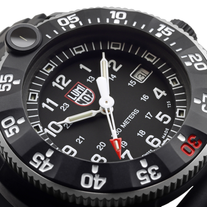
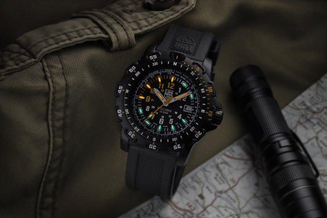
Luminox Bear Grylls 3730 Mountain series limited edition
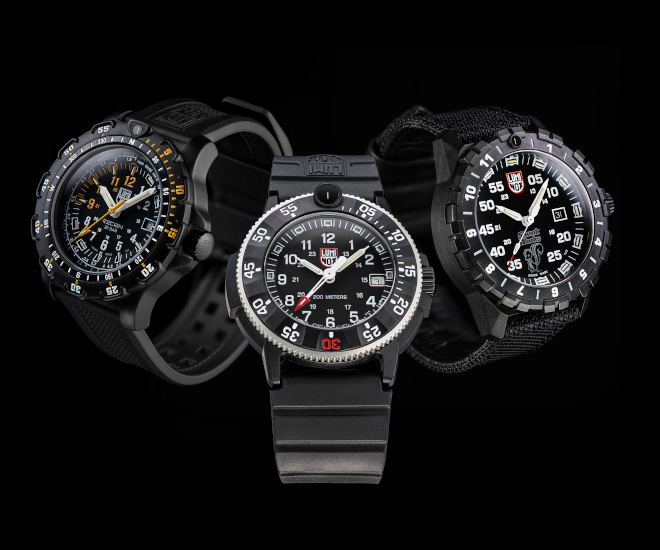
When it comes to Luminox, fans have no shortage of models to choose from, and every year they seem to add even more varieties so that there really is something for everyone. But when we saw this particular watch however, we knew we had something pretty special on our hands and it is this Luminox Bear Grylls 3730 Mountain series limited edition.
This fantastic piece was launched last year in 2023 to mark the 25th anniversary of Bear Grylls’ historic climb up Mount Everest. Just to prove to you just how crazy this guy is, and why he is deserving to be a Luminox ambassador, when he made this climb in 1998, he was only 23 years old making him the youngest Briton to ever make the ascent. On top of that, this feat came just 18 short months after he had broken his back in a parachuting accident.
Luminox Bear Grylls 3730 Mountain series limited edition
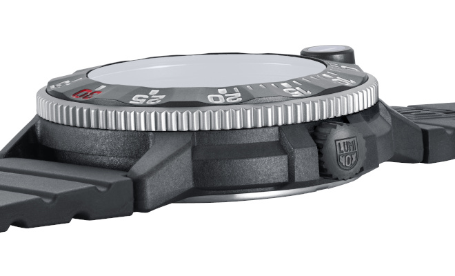
The first thing that caught our attention was this fantastic case guard called the Bull Bar that brings back seriously retro vibes. Growing up in the 1990s any tough watch worth its salt had to have a bull bar. As you would expect, the watch comes with heaps of features that would aid mountaineers in almost any situation.
The bezel is made to be bidirectional and comes with four cardinal directions, with the North represented by the classic Luminox tritium gas tube. Far from just decoration, this rotating bezel can help the wearer to get their bearings by using the hour hand, this bezel and the sun.
Luminox Bear Grylls 3730 Mountain series limited edition
Next are the various points of illumination on the watch. The Luminox Light Technology uses tritium gas in microcapsules that will stay illuminated even in the absence of sunlight for a lengthy 25 years. These lights will help the wearer see the time and even the North point on the bezel as it gets dark. Last but not least, the brilliant white dial contrasted with the black numerals will also help legibility allowing the quick reading of time during the day.
Luminox Bear Grylls 3730 Mountain series limited edition
Best of all, the watch is made with Carbonox technology which gives it an extremely strong exterior while being much lighter than the steel watches out in the market. On the caseback, the relief of Everest can be seen, and its outer ring is marked with "8848M" the altitude of the world’s highest peak. This version is limited to only 800 pieces worldwide.
MOVEMENT: Quartz; date function CASE: Carbonox carbon compound; 43mm STRAP: Blue rubber PRICE: SGD 940
For more on the latest in watch reads, click here.
The Conversation: Exhibition Casebacks Are More Than "Window Dressing"
Montblanc 1858 Geosphere caseback
You might recall a famous scene from the 1923 silent film Safety Last where the great actor and stuntman Harold Lloyd dangled from the side of a New York skyscraper, at one moment hanging on for dear life on the hands of a clock. You almost certainly know this image, even if you do not know the film or Lloyd, and as a watch-loving person – as you certainly must be – you might have wondered how in the world was the actor able to grab hold of the clock’s hands. Were they not shielded by glass or something? Depending on your age and how strong a grip watches have on you, you might have even wondered that before thinking about how this scene was shot.
Indeed, in ages long past, one might adjust a watch by turning the hands themselves, as you might also have noticed from films and other depictions and recreations of the past. Movements, all mechanical back in these periods, were a little better protected but not by much. The clockwork was protected by doors, through which servicing was done, and the largest ones were walk-in (or climb-in) engines. Pocket watches were much the same, with the movements of key-wind and key-set watches needing to be accessed directly to, well, wind and set them. The invention of the keyless works by Adrien Philippe (of Patek Philippe) in 1843 went a long way towards resolving this issue, and other advances in winding and setting the time generally made watches safer and easier to use. That is to say, the machine itself was less at risk of unintentional damage from handling and from the influence of the outside world.
Thus, the importance of the sapphire crystal protecting the dial of your watch from the elements cannot be overstated. The hands, or whatever the display style might be, are how we tell the time and the crystal is thus transparent in its virtues. So far, so clear but when it comes to the caseback, things get murky real quick. Take for example this question: what information, if anything, are enthusiasts trying to gain by having what amounts to a sapphire crystal window over the movement? The comparative value versus the dial is objectively lower, and not by degrees but orders of magnitude. Most mechanical watches and virtually all quartz ones reflect this fact. Look no farther than Rolex and G-Shock for evidence, if any is required. The aforementioned advances in watchmaking made accessing the movement for anything other than servicing unnecessary and undesirable, from a purely objective machinist standpoint.
Cartier Tank Louis Cartier Bangkok Edition
And yet, watch industry executives constantly remind us – in person and in various brand advertisements – that no one buys watches these days for purely timekeeping reasons. Your watch, despite the seconds it tracks so assiduously, does not improve your time management prowess. Well, the smart watch certainly might, and the emphasis on display real estate, which also doubles as the user interface, tells the story. Ah, but those troublesome watch insiders whisper ever so loudly: a smart watch is not a real watch. It is only real timepieces that dare to thrill you with their frenetic kinetics, or so the exhibition caseback implies. Is this really what all true watch enthusiasts demand?
The editors of WOW Singapore and Thailand roll up their sleeves and talk it over, with a special guest appearance by the editor of WOW Malaysia.
Ashok Soman (AS): Happy mid 2024! And we find ourselves with yet another watch fair around the corner. It has got me thinking about trends again...my least favourite topic. In preparation for this relatively stomach-churning process, I went trawling through my cache of old ideas that seem really cool but probably are not. Long story short, seems like tradespeople are trying to build a narrative around exhibition casebacks again.
Montblanc 1858 Geosphere Chronograph 0 Oxygen The 8000 limited edition
Ruckdee Chotjinda (RC): In fact, I’ve just completed my Watches and Wonders Geneva registration last night. Time flies indeed!
AS: Oh the nightmare of the registration photo! Seeing is not always worth something and I do not get why these badges need our mugs on them. By the same token, I really do not get why we need to see every calibre out there, but that means I might indeed be partial to talking about the dearly beloved exhibition caseback. Some observers think that now that Rolex is getting into it – in a more significant way than it has before – that others may go the opposite way. Good news I think because quite a number of movements could do with a bit more modesty.
No sooner had this thought given me cause for some smug self-satisfaction than a piece of copy came my way that gave me hives...well not literally but when I see commentary that suggests, even with all the winking and nodding in the world, that a quartz watch should have a display back, I am struck by recollections (hand-me-downs for sure) of the quartz crisis and what the landscape looked like in the 1990s.
Daniel Goh (DG): Just to jump in here, I disagree with all the negative commentary that quartz watches get. I think the invention of the quartz movement was an (important) historical component in the evolution of the watch industry. Sure, most of the quartz movements aimed to be cheaper to manufacture but is that not a natural part of every industry? Like how watchmakers also moved from making every component by hand in barns during winter months (according to Swiss watch lore) to industrialised production lines for mechanical watches.
Caseback view of the Franck Muller Grand Central Tourbillon Flash
RC: So, Daniel, are you team exhibition caseback all the time or just sometimes? What are your criteria?
DG: Good question. I think for me it depends on what the watch is trying to achieve. At the more affordable levels, an exhibition caseback is always good, regardless of the level of finishing or even the type of movement as previously mentioned with the Paulin or Seiko 5 because it really helps to generate interest in these little machines we put on our wrists. Conversely, if a watch is say a field watch, or a dive watch with historical provenance for that matter, it does not fit the purpose of the watch to put a sapphire crystal on the caseback.
RC: Oh ... you touch on a subject that is dear to my heart there. I was quite shocked when IWC gave their 2013 Ingenieur line a sapphire crystal caseback. I was like ... oh, no. No, no. Two refreshes and 10 years later, the caseback is now solid once again. Outside of special purpose watches like that, I have been generally partial towards exhibition caseback, but these days I am quite indifferent. Most watches with very well-finished movements seem to come with one anyway, and I am not going to ask the manufacture to close that window to beauty.
Cartier Tank Louis Cartier Bangkok Edition
DG: I, on the other hand, used to love exhibition casebacks because I get a window into the heart of the watch. But these days, just knowing the movement is there and just knowing the level of finishing on it is good enough for me, so it does not matter to me whether it is an open or closed caseback, what matters is the reasoning behind the choice. Sometimes I do wonder if this is because, due to my job, I am privileged enough to have seen so many beautiful watches and movements practically every other day. I am dying to know the perspective from the average joe watch buyer. If you, our dear readers are reading this, feel free to drop us an email, facebook message, Instagram DM whatever to tell us your thoughts.
AS: For the purposes of this story at least, I shall be the (sort-of) naysayer, and I have mighty forces behind me...I speak of course of the great titan of the closed caseback, Rolex! Ok seriously though, given that Rolex has a commanding market share (the dominant player in watchmaking for watches above CHF3,000), the fact that it never went in for the display caseback says a lot. Maybe it is the strange Britishness of Rolex that makes it so shy. I am reminded that the late George Daniels, that paragon of English watchmaking, wrote in his book Watchmaking that proper gentlemen did not trouble themselves with the innards of clocks nor the hows and whys and the whatnots; that was for tradespeople. My how times have changed!
RC: Yes, you brought this up once. Was it in an interview or in a book of his?
AS: A book for sure, which I sadly do not own but will be happy to receive (if anyone relevant is reading this: hint!). He was just expounding on the history of appreciating watches, which in the era of the pocket watch was quite different. This is pretty interesting because it is documented (not well) that Bovet made exhibition caseback pocket watches for China back in the old 19th century (when all those fine gentlemen were making mischief in the mysterious Orient). These would have to have been glass, perhaps of the mineral variety; we shall have to ask Bovet for more information.
RC: That is interesting to know. Thanks. I would chalk that up to evolution then, cultural and technological.
AS: There are practical reasons, lest we forget, that showing off the movement took awhile to catch on. To get right to it, sapphire crystal was required because everything else was just too fragile; there is also the matter of rubber gaskets and all the water-proofing work that would have been done in the 20th century. I suppose that all those fine Geneva watches with positively baroque finishing would have been prefect to go into cases that maximised visibility.
DG: Speaking of this, I wonder what other concessions brands have to make in order to have an exhibition caseback? I am sure in terms of water-resistance, they either have to over-engineer the caseback with that sapphire insert to still stay waterproof, especially anything above 100m of water resistance?
AS: Well, the short of it is that exhibition casebacks add height to a case and water-resistance is at the heart of it. So, if you want an exhibition caseback, you have to accept that you are introducing a potential point of failure to an otherwise happy case. This is related to what the Seiko Epson chaps told Ruckdee too; it is not only water-resistance that is negatively impacted. In order to overcome this window to multiple possible disasters, casemakers are obliged to beef things up and do whatever else is necessary, so that a return trip to the manufacture for any given watch does not become necessary.
Cartier Tank Louis Cartier Bangkok Edition
RC: Now that you have said that, I would not need, say, a slim Cartier Tank Louis Cartier with hand-winding movement to have an exhibition back because its presence would change the proportion of the case in a negative way. I think the current models also have mineral crystal above the dial, not sapphire! Not sure why, though.
DG: In this regards, I think sometimes the watch industry can be quite fickle in their reasoning for including exhibition casebacks. On the one hand, they go to great lengths to include one to show off the beautiful finishing of their movements; on the other hand, I have heard from the watchmakers at Montblanc that they are one of the few brands that also finish the inside of the barrel (that houses the mainspring), which no one except (maybe) another watchmaker will ever see.
RC: Well, what can I say, these products (and brands) operate in a realm of their own when you think about it. There are certainly more instances of whimsy and romanticism than many other industries. I am saying this in a loving way, of course, not as a complaint. I think we all love a good story. And it is even better when the story is backed by a strong product.
AS: Journalists, collectors and enthusiasts frequently talk up the virtues of the exhibition caseback, mostly I think because we just have to ogle the calibre like horological perverts. On that point about Cartier, I think the Tank mainly illustrates that opting out of the display caseback lets you stay slim and maintain the proportions that you desire. On the other hand, Piaget and Bulgari have done just fine (and perhaps a bit better than) with the display caseback. To be fair, those brands accept a lot of risk in terms of build quality and they are not doing anywhere near the volume that Cartier is.
DG: Besides the proportions, is there an “absence makes the heart grow fonder” element with closed casebacks? Like for example I love watching the tourbillon function but more and more I find myself asking for a tourbillon that does not show on the dial. And also, I love how vintage watches with solid casebacks can still blow me away when watchmakers open them and I finally see the fantastic movement inside.
RC: That wanting to have the tourbillon but not needing to see the tourbillon part is a sign of experience or maturity, whichever sounds less elitist. I will want to see my tourbillon though if I had the means to buy one in the future. But for that vintage watches part, I think it is the sense of discovery, because you wanted to be surprised by what you see inside.
Chronoswiss Open Gear Tourbillon Underworld
AS: Of course, vintage watches will not have exhibition casebacks...but then again, it is the display caseback that lets collectors avoid the dreaded curse of the dedicated engraving. As in, having one’s name engraved on the back because the conventional thinking is that the value drops when one does any sort of personalisation of this sort. The contemporary exhibition caseback neatly makes that a moot point... unless it is Jaeger-LeCoultre Reverso, where you can happily have both a solid caseback and a display one. How about that for having one’s cake and eating it too?
RC: There are very few display ones in the current Reverso collection. I think the line-up right now has either a solid caseback or the second dial? Come to think of it, I never had a Reverso with a solid caseback in my lifetime. They were with either two dials or an exhibition caseback.
AS: The whole point of the original Reverso was to protect the crystal so I suppose that is on point, so to speak. Still, this is one area where an exhibition caseback might be needed because there are so few form watches with form movements....most Tank models use round calibres, for example. Ditto for Bell & Ross and just about all brands that bank on automatic movements.
RC: Hmmm .... Interesting. I did not think about movement shapes the whole time that we were writing the above paragraphs. I was thinking solely about finishing and such. And, you know what, reading what you both put out above, I can come to think of an instance where I disagree with an exhibition caseback: when the movement is significantly smaller than the case! It looks funny to me. It feels like we (the maker and the buyer) are faking something or engaging in some kind of make-believe.
AS: I think this entire back-and-forth could be dominated by the issue of small movements in massive cases, which was one of the downsides of the big watch trend that ruled the roost in watchmaking for the last 20 years or so. This is especially so because the offenders span the gamut of brands, from the most modest to the highest of the high. It remains a relevant and decisive point for me, when it comes to pulling the trigger on a watch. To be blunt, a movement that is too small for the case, and is there for the world to see, will immediately be struck off my list. I will say that if the movement is hidden behind a closed caseback, I am willing to overlook the mismatch between case and movement; this is especially true when this mismatch is not evident dial-side. I admit to a level of hypocrisy here because I will also make excuses for brands with form watches that use (necessarily) smaller-than-ideal round movements so that they can go with the most conventional automatic winding system.
Back on that point of only showing off something that needs to be shown off, the form movement is as good a moment to make good on having the exhibition caseback in play since it is both unusual and shows a certain commitment on the part of the brand. Especially if the brand has gone to the trouble of having a micro-rotor and finishing things up nicely! As mentioned, finishing is a no-brainer and can also show off innovation...or perhaps a traditional approach if the brand wants to keep the tourbillon bridge-side. Just seeing a bunch of brands turn their movements inside out to put the tourbillon dial-side is sometimes painful! To say nothing of those that engineer their chronographs just to show the column wheel dial-side too.
DG: Just to add onto this point, I think the same can also be said for technical innovations right? For example Omega’s Speedmaster Super Racing. Without the exhibition caseback no one would be able to see their new Spirate balance, which they spent a considerable amount of resources to develop. Or in the same vein, most people would not be able to see exactly how a co-axial escapement differs from the regular Swiss lever one.
AS: It certainly gives brands the chance to engage the public and explain their innovations. To return to quartz here, as far as innovation goes, Spring Drive is a good reason to have an exhibition caseback, but as opposed to that bit about co-axial and all the silicon developments, Grand Seiko always makes it a point to cover up the quartz regulator! Here, it is as Ruckdee says, all about finishing.
On that note, to stay with innovation for a bit – or rather to build on Daniel’s point – the display back shows off a mechanical movement’s ability to be antimagnetic without the need for a soft iron inner case. Well, IWC Ingenieur aside there in consideration of Ruckdee’s point. Regardless, I always thought that Blancpain hit a home run with its dive watches by daring to put display casebacks on. Certainly not traditional, but this aesthetic touch speaks directly to the silicon escapement parts that make it impossible to magnetise the movement and to advancements in build quality. As a kicker, the brand gets to merge its tool watch DNA with its fine watchmaking aspect: Blancpain calibres are wonderful to look at (machine-finished to be certain but still lovely). Dive watches are thick boys, famously, and the Fifty Fathoms is big in all kinds of ways, but the brand does not need an inner case here so no loss in going for the display caseback.
Bulova Accutron II
DG: Just a thought: if the casebacks are used predominantly to showcase all these interesting points of a movement, i.e. finishing, technical innovation, will there be a misconception then that when a brand chooses to use a solid caseback, even for legitimate reasons, consumers will think that there is nothing interesting about the movement and thus the brand chose to cover it up?
RC: More good points there. Panerai comes to mind because I have a Luminor on my wishlist. While I have zero doubts about the brand’s integrity, I would prefer to see the movement used in the specific model of my interest, on the website if not through the caseback. I cannot say I will not feel more confident when I do. However, the current state of uncertainty is not a dealbreaker for me because I am buying it for the case design, not the movement.
AS: Once more, I call upon the Jolly Green Giant...it is a brave soul who would suggest that Rolex calibres are less than excellent just because they are hidden away behind a solid caseback! There is also Montblanc, which has been making hay with its closed casebacks and the colourful engravings there. This is all a result of new laser engraving technology that gives the metal itself colour! And, to finish my Blancpain point, that brand puts a premium on its technical savvy as far the dive models are concerned. The display caseback is the justification but in no way affects the proposition of a Submariner, in my opinion. That veers into the power of branding though, and is outside the purview of this effervescent threeway.
DG: That is a good point, but yes, I think branding deserves its own separate “Conversation”.
AS: The exhibition caseback is a form of branding for some! I mean, when it first appeared, in the 1990s probably, the late Gerd R. Lang just wanted to indicate that the engine inside the watch was mechanical. He was the sort of watchmaker who never cared for quartz and found it soulless so, when he introduced the sapphire crystal display caseback properly in contemporary wristwatches, it was to honour mechanical movements.
RC: Gerd Rudiger Lang, who founded Chronoswiss?
AS: Indeed yes, the very same! The exhibition caseback then went on to become a branding tool and a way to up price points of course. I think Lang would not be unhappy to learn that the many watchmakers who work for decades to polish bridges, to cite just one example, finally get to show their work. And maybe charge for it too. Certainly, the celebrity watchmakers who emerged – first from the AHCI and now of course extending to the likes of Rexhep Rexhepi – would probably never have done so without the display caseback. The world would be a poorer place if the Dufour Simplicity had to cover up all the wonderful work – although Dufour himself was making a point about simplicity and subtlety in the amount of work and dedication required.
DG: In this regard, could not the same be said for the question of the display caseback on quartz watches? If the brand places emphasis on their quartz movements and things such as Spring Drive technology, the transparent caseback is a great way to honour these movements as well. Unless you are a brand like the revived Accutron which displays their electric movement technology dial-side.
RC: I like that particular Accutron you are referring to. I think it can be both a conversation piece and a wearable lesson in wristwatch history. Frankly, I have a better chance of buying that watch with the electric movement shown dial-side than the version with a regular dial that hides the movement.
DG: I guess as a conversation piece it works best dial-side because as you mentioned, you wear your watches with the caseback facing your wrist and not the sun...
AS: That reminds me of that old joke about watch bores who would like nothing better than wear their watches back to front...
RC: I remember seeing some photographs online. It was a thing, right? People outside of the collecting circles must have thought that we are all a bunch of crazy nerds, which we are. So, to conclude this article? Ashok, some final thoughts?
Grand Seiko SBGP017
AS: Crazy nerds indeed! It bears remembering that, as Daniel noted, quartz was a great leap forward in timekeeping and the elitists out there are, at least in part, bemoaning the fact that it democratized wristwatches. The real problem is not the looks of quartz but the fact that it is cheap. On the other hand, it is also worth remembering that there is an emotional and aesthetic value to watchmaking, quite apart from precision timekeeping – quartz is nothing next to the atomic clock. There is something to see, and understand based on what you see, in mechanical watches; everything electrical is invisible to the human eye. Watching a quartz movement reveals nothing about how it works, in other words. But human time requires human hands, and human eyes too...and so the exhibition caseback is probably here to stay. It is one reason that I own a Rolex with just such a caseback, even though it was wildly unpopular back in its day.
RC: Brilliant. Daniel?
DG: For me, on the question of casebacks, I stick to my stance that regardless of finishing, the choice of closed or open rests solely on purpose; if there is a good reason to show or hide a movement. Most times, brands do have a reason for this anyway; it is just that the reason is not often publicized. It has to be discreetly coaxed out of the watchmakers as evidenced by Ruckdee’s conversation with Grand Seiko. Unfortunately, not everyone gets the opportunity to do this and it rests on us as Editors of our respective magazines to uncover this interesting information and put them on “display”.
RC: Very well said. I like this Spider-Man moment. What is the line again? With great power comes great responsibility? Thank you both for your time this morning. And I look forward to doing more great things with you two west of our longitude in April.
AS: And that is a wrap, and possibly the first in a long-running menage a trois (hopefully)! We are indeed going west! If you see us in Geneva, dear readers, say hi!
DG: Thank you both for the invitation! It is always great to speak to fellow enthusiasts and geek out over something that most would consider quite insignificant.
For more on the latest in watch reads, click here.
Leaps And Bounds: The Alluring Green Dial of Blancpain’s Villeret Quantième Perpétuel Ref. 6656
How often do you think about a leap year? The seemingly innocuous phenomenon that happens once every four years, adding a single day to February. For most of the world’s population it is probably just "oh, there is a February 29th this year" as they see the date on the screen of a smartphone, smartwatch or Google calendar. But, for us watch enthusiasts, on the other hand, February 29th is the day when we finally get to see the perpetual calendar complication go to work. The day when your mechanically driven timepiece can intuitively understand that in 2024, February doesn’t end on the 28th and therefore can automatically compensate for the extra day, and subsequently the arrival of March.
Put to a non-watch person, it may seem that all the research and development and investment from the brand side, along with the hefty asking price of a perpetual calendar, to see it in action once every 1,460 days is probably not justified. However, this is the reason you buy a perpetual calendar. Not an annual calendar or a complete calendar, which is comparatively much cheaper. You buy a perpetual calendar so you can set it once, and if continuously powered, will keep the date until 2100 whereby many of us reading this would no longer be alive.
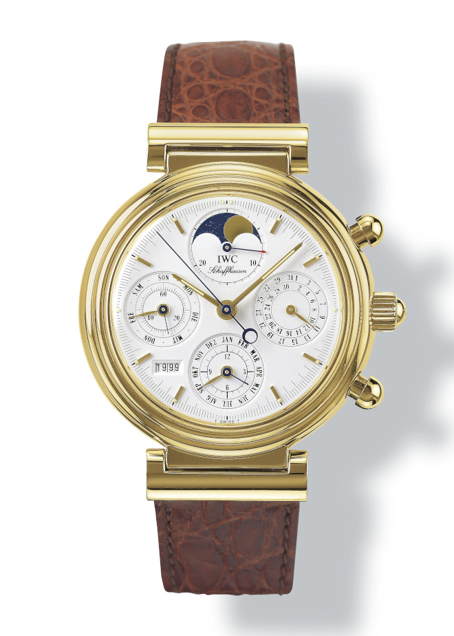
In honour of the year that will see the Perpetual Calendar complication put to good use, for our Spring 2024 issue, we take a closer look at this complication from Blancpain. More specifically the Villeret Quantième Perpétuel Ref. 6656, a model that represents the confluence between the trifecta of complexity, functionality and design. This model from the manufacture is not new per se but for 2024 it has, for the first time, been given a deep green dial inspired by the fir forests of the Vallée de Joux and paired with an elegant red gold case, giving us the perfect opportunity to revisit the perpetual calendar complication, a complicated that many collectors would probably have on their grail list.
THE DIFFERENCE A DAY MAKES
To understand what makes a perpetual calendar so special, one must first go back to the basics of the date function. At its most basic level, the date mechanism simply follows the advance of the hour hand. For every 24 hours that pass, the date wheel is advanced one day forward. If all months had 31 days this complication wouldn’t have a problem because mechanics thrive on repetition (I recommend playing the video game Opus Magnum to better understand what I mean). However, as we know, some months have 30 days while others have 31. If this was the only variable in a calendar, then, still a perpetual calendar wouldn’t be too difficult to make as the mechanism only has to compensate for two variable factors. Adding on yet another layer of complexity is the fact that February has 28 days which makes this month out of the 12 yet another anomaly which has to be mechanically adjusted.
For each layer of ‘rule’ added to a calendar the mechanics inside have to increase exponentially in terms of complexity to comply. For example, the traditional date complication is simple to manufacture because it follows one rule, and the human (wearer) will manually compensate for the discrepancies between the different days of the month. This means that the date wheel will just automatically advance to 31 every month and five times a year this must be manually corrected.
The next layer of complexity is a movement that can discern between the months that have 30 and 31 days and automatically advance the date as such. This is the function of an annual calendar complication. To achieve this, engineers devised a special cam that takes into consideration the pattern of days in the month within a 1-year cycle. But, as the name alludes, the Annual calendar still requires one manual adjustment to the date every year which is in February, regardless of whether it is a leap year. Interestingly enough, even though the perpetual calendar was invented by Thomas Mudge around the 1760s it was only in 1996 that the simpler annual calendar was invented.
For a perpetual calendar to work, the mechanism within the movement has to be capable of not just ‘understanding’ the patterns of 30 and 31 days within a year, it also has to ‘remember’ that February has only 28 days. And the most important of which, is it has to keep track that every four years, during a leap year, there is an extra day on February 29th. Explaining the mechanism to achieve this would probably take more pages than we have for this article so for the sake of brevity, the ‘memory’ of a perpetual calendar can be boiled down to a cleverly designed cam that records the length of months in a four-year cycle. For this Ref. 6656 specifically, the cam is based on an 8-year cycle recording two consecutive leap years, which can clearly be observed on the subdial at 12 o'clock. On paper, it may seem simple enough to add one day to February every four years, but in reality, the Perpetual calendar is even more complicated than the fan-favourite tourbillon and is probably closer in number of parts to a minute repeater.
Within this new version of the Villeret Quantième Perpétuel Ref. 6656, beats the calibre 5954 automatic movement with its integrated perpetual calendar complication. It is capable of offering a power reserve of 72 hours when fully wound and offers the same anti-magnetic properties thanks to its silicon hairspring.
Even though the word perpetual suggests that the watch need not ever be adjusted, Blancpain’s perpetual calendar, and for that matter almost all perpetual calendar complications are not perfect because they still must be manually adjusted in 2100. If you take the rule that a leap year happens every year divisible by four, then technically 2100 should be a leap year. But it’s not. This is because the exact time that Earth makes a full rotation around the sun is not exactly 365.25 days but rather 365.2422 days. By this logic, if we continue to apply the leap year rule, after a couple of hundred cycles, our seasons will start to get out of sync. Therefore, when the Gregorian calendar (the one we use today) was invented it stated that century years would have to be divisible by 400 for it to be a leap year. Thus 2100, 2200 and so on, will not be leap years to compensate.
BETTER SAFE THAN SORRY
On the subject of manual corrections, the perpetual calendar complication can be notorious when it comes to its adjustments. In perpetual calendars of the past, it has been said that manipulating and adjusting the watch at certain times could easily damage the watch earning it a round trip home to Switzerland and along with it, a large bill for the repairs. And this forbidden period was between the few hours before midnight and the few hours that followed. During this time, the calendar indications are changing, and any manual correction applied could easily damage the delicate gears.
With the Villeret Quantième Perpétuel Ref. 6656 from Blancpain, this is no longer an issue as the watch designers at the manufacture have managed to eliminate this risk entirely. When the user tries to make the adjustment while changes are happening, a clutch disengages the system to prevent any damages from occurring. But the ability to do this doesn’t come without its cost, and according to Blancpain, they needed 40 per cent more components compared to a traditional complication to achieve this. Of course, all of this is hidden beneath the dial so all the wearer sees, is a clean and elegant design on its top side.
Another testament to the usability of Blancpain’s perpetual calendar movements is the fact that since 2005 they have introduced a patented system of manual adjustment – under-lug correctors. Traditionally these manual adjustment mechanisms have always been built into the sides of the cases. In fact, most other perpetual calendars still use these correctors, which appear as small dimples on the case of the watches. The clever use of under-lug correctors by Blancpain enhances the watch in two ways.
The first of which is purely functional where instead of needing a tool to depress the dimples on the case, the lever on the underside of the lugs can be manipulated using one’s fingernails. Secondly, the discarding of these dimples can now allow the watch case to have an entirely smooth surface, adding heaps to the elegance of the watch. This is especially prominent in the case of the Reference 6656 where the beautifully minimalistic dial is complemented by the blemish-free red gold polished case.
MOON FACE INDICATOR
Okay, before you grab your pitchforks protesting this sub-heading, it is indeed quite a literal reference to the little face present on the moonphase indicator on the dial. The moonphase has always been a significant part of Blancpain’s history; One could even say that it is the perfect representation of Blancpain’s ethos as a watch company.
As the story goes, the legendary Jean-Claude Biver said when he bought Blancpain in 1982: “There has never been a quartz Blancpain, and there never will be.” Back then, even the Swiss watch brands were starting to dabble with quartz technology during the era of the quartz crisis. But Blancpain took an opposite stance, instead, doubling down its efforts to cement the mechanical watch’s place in contemporary times by demonstrating how quartz could never replicate the complexity, craftsmanship and history of traditional watchmaking. One of the first complications they decided to make in its modern era was a moon phase indicator in 1983.
Looking at the moon phase indicator on the new Villeret Quantième Perpétuel Ref. 6656, I feel like the face on this moon is portraying something akin to an all-knowing smirk. Perhaps it knows that Blancpain’s choice to make a statement with this complication basically predicted the role of the mechanical watch for contemporary times, not just for Blancpain, but arguably for the entire luxury watch industry that exists today.
The design of the dial is the same Ref. 6656 that was first launched in 2018 which also served as a replacement for the Ref. 6057 which offered a similar design, day, date, month and leap year indicators in three subdials, but in a smaller 38mm case. The new Ref 6656 on the other hand is housed in a 40mm red gold case complete with the collection’s signature double-stepped case. Last but certainly not least, the new look is also defined by the mesmerising, deep green of the dial. The colour along with its sunburst pattern was inspired by the fir forests of the Vallée de Joux that surround the Grandes Complications workshop where the watch is meticulously crafted by its master watchmakers.
It’s Decision Time for This Watch Savant
It is somewhat ironic that as an editor of a watch magazine, I rarely buy watches. Perhaps it is the fact that we see so many insanely interesting timepieces that it can sometimes be paralysing to choose just one. Every time I think I am settled on a timepiece, something even shinier comes along and it is hard not to go "Now, hang on a minute." So, when the Editor of WOW Singapore extended the invitation to contribute to this story, he was essentially saying: There is a gun to your head, you must choose.
For this story, I decided to split my choices between two categories. One is something I can realistically buy now (exchange rate issues basically) and one that I would consider buying if, like Huell in Breaking Bad, I was laying down on a huge stack of cash, preferably Swiss Francs.
Paulin X The Armoury Modul a "Hong Kong Dial"
This watch checks quite a number of boxes for me. Let me start with the dial. As someone of Malaysian Chinese ethnicity, I have long been obsessed with getting a watch with Chinese characters on the dial. For a long time, the Seagull 1963 was at the top of my list to accomplish this goal but these days, there is just too much uncertainty about where those watches are produced. Enter the Paulin x The Armoury Modul A “Hong Kong Dial”.
Paulin actually hails from Scotland and just recently became the sister brand of yet another darling of the watch microbrand scene, Anordain. Anordain is another brand definitely on my radar, making beautiful enamel dials that cost a fraction of what big brands are asking (you see what I mean about choices?). So anyway, the Chinese characters come from Paulin’s collaboration with The Armoury which was founded in Hong Kong by Mark Cho and Alan See. The term Hong Kong dial is a playful reference to the classic California dial which combines Roman and Arabic numerals in a very recognisable configuration. And for this watch, instead of the Arabic numerals, they use Chinese characters.
The second box that this watch ticks has a diameter of only 35mm. I do not know whether it is a sign of old age but as the years fly by, I have found myself drawn to smaller and smaller watches. I used to think 42mm was the perfect size, but ever since my father loaned me his Rolex Oysterdate Precision Ref. 6694, which is a tiny 34mm watch, I now think even 38mm feels too obvious on the wrist. Even though there seems to be a contemporary trend of watches getting smaller, 36mm-esque watches can still be quite hard to come by. So, for this piece, the case size is a major influence in my decision.
Lastly, the Paulin x The Armoury watch comes with a quartz movement. Okay before the pitchforks come out, hear me out. When I first started covering watches, only mechanical watches were considered “watches”. But then, I found out about Seiko’s Spring Drive, and after seeing Accutron revived, Urwerk using an atomic clock to mimic Breguet’s "Sympathique" clock, and how Ressence uses an electronic mechanism to enhance its mechanical function, I have come round on the whole idea of the quartz movement. It is, after all, a huge part of watchmaking history. So, the fact that the Paulin x The Armoury Modul A “Hong Kong Dial” comes with a quartz movement is actually quite appealing to me, especially since they even offer a transparent caseback.
The asking price is a mere USD 600. And considering the fact that the other two collaborations that The Armoury has done (H. Moser & Cie and Naoya Hida) were closer to USD 20,000 this seems like a pretty good deal.
Parmigiani Fleurier Tonda Pf Minute Rattrapante
While the first watch ticks a lot of personal watch collecting boxes, I chose this second watch because it ticks quite a number of philosophical ones. I have always found answering the question "What is your favourite watch brand?" quite tough; not because I love all my clients, I mean watch brands, equally but because I am of the opinion that any big watch brand is only as good as its leadership.
Think about it: Rolex is no longer helmed by Hans Wilsdorf; the founder of the contemporary A. Lange & Söhne has passed on; and Abraham-Louis Breguet is only with Breguet in spirit. Each of these companies is led by a board of directors, shareholders and/ or CEOs. And if the leadership is good, the brand makes incredible products... Georges Kern transformed Breitling, and hopefully, Universal Geneve in the near future, and Jean Arnault’s entry into Louis Vuitton’s watchmaking division has given us the new Tambour and a brilliant collaboration timepiece with Akrivia. This brings us to the watch in question. Guido Terreni assumed the role of Parmigiani’s CEO in 2021, resulting in the sublime Tonda PF collection. I find myself thinking would it not be nice to be part of this pivotal moment in the brand’s history?
Needless to say, I think the watch is simply gorgeous. My favourite part has to be the dial and the Grain d'Orge guilloche pattern on it. It gives the dial a subtle texture, from afar it looks like a matte finished watch and when you look closer, you discover these intricate patterns. And having seen and tried these watches on, I can say they are extremely comfortable to wear.
As for the specific reference, however, I chose the Minute Rattrapante for an entirely different reason. The Minute Rattrapante is a complication that hides a second-minute hand beneath the conventional one. Then, when either the pusher at the 8 or 10 o’clock position is activated, the hidden minute hand steps out in 5- or 1-minute increments (respectively) and remains static. Then as the conventional hands continue to track the minutes, it catches up to the second rose gold hand.
"The Tonda PF Minute Rattrapante is an expression of why people love traditional watchmaking"
This complication is in essence just a minute tracker and at its core, will give you the same functionality as a rotating bezel would. And this is precisely why I absolutely love the Minute Rattrapante. Forget that it is a world-premiere mechanism, I am more enamoured with the fact that it takes such an over-engineered approach to solve a problem that probably did not exist. I just wish I could have been in the meeting room when this idea was first pitched.
Even as absurd as the statement above sounds, it is precisely why you and I are in love with traditional watchmaking. Watches are not a necessity but possibly a necessary justification for all that time spent wasted at our ‘jobs’ (a reference to those of us working in the trade – Ed). Be that as it may, this Parmigiani Fleurier Tonda PF Minute Rattrapante is close to MYR150,000, so I suppose it will likely remain on this wish list for quite some time to come.
This article was first published on WOW’s 2024 Legacy Issue
G-Shock Creates Their Latest MRG-B2000SG With Traditional Samurai Crafts
Celebrating G-Shock’s deep connection with Japanese culture, Casio turned to the country’s history, more than 400 years in the past, resurrecting the soul of the Samurai to influence the creation of the brand new MRGB2000SG. This fantastic watch was designed alongside the creation of the Shougeki-Maru: Gai, a unique kabuto helmet made by two of Japan’s nationally acclaimed artisans - Kobayashi Masao and Suzukine Yuzan – especially to celebrate the MR-G series.
Transferring all the intricacies of the helmet onto the watch was no easy feat. However, Casio managed to accomplish this through a number of highly unique design characteristics. The first and most discernible of which is the outer bezel of the watch. Here, the master metalsmith, Kobayashi Masao, chiselled indentations onto the metal bezel, creating a unique rock-grain relief pattern. Additionally, the ferocious tiger found on the maedate crest on the helmet is also hand-engraved onto the bezel.
The case of this extravagant watch is crafted using ionised titanium making the watch incredibly light despite its size. Additionally, the case is also finished with a deep-layer hardening process which increases its scratch resistance while also revealing a unique crystalline pattern that encapsulates the entirety of the watch. The white Dura Soft band was chosen to reflect the white ito odoshi (overlaying plates of armour bound together with white string) of the Shougeki-Maru: Gai. This strap, made with soft fluor rubber is flexible on the wrist and has excellent durability and stain resistance.
The MRG-B2000SG also represents a confluence where craftsmanship meets technology. Despite all the oldworld techniques utilised on its exterior, the internal electronic movement of the watch offers a host of new-world technologies. First, the watch is powered by the sun, through Casio's Tough Solar system. Then, the watch is also capable of calibrating its timekeeping in a myriad of ways. It receives radio signals periodically throughout the day to synchronise the time and also it can be adjusted through a Bluetooth connection with a smartphone. In terms of functionality, the watch offers a dualtime configuration with the ability to adjust for 27 different time zones and for those who might travel to seasonal countries, it can even automatically adjust for daylight savings time.
The MRG-B2000SG is a limited edition of only 700 pieces worldwide, with only five units in Malaysia. It is available at the G-Shock stores in Lalaport and IOI City Mall Putrajaya at a retail price of MYR 30,995.
Ressence Brings a Novel Approach to Timekeeping Legibility
There is a reason why the watches in the independent watchmaking landscape look so different from one brand to the next. Unlike the traditional brands which have existed for centuries and have developed their own rigid design and watchmaking principles, those that venture into independent watchmaking do so for a variety of different reasons. Some go at it to break the rules of horology, others want to bring back the most traditional forms of watchmaking. For Ressence however, their goal was simple, to make a watch that tells time in the most legible and practical of ways.
Ressence Type 1 M
This quest for legibility was the brainchild of Benoît Mintiens, the founder of Ressence. In his words “A product only gets its reason from its function. A product that has no function has no reason to exist. A watch is made to express time and so we thought, how can we maximise that?” By looking at this problem from through the lens of someone from outside of the watchmaking industry, the result is as innovative and as unorthodox as we soon found out.
Just by looking at the watch, its dial is unlike anything else on the market. The concept takes the basic premise of regulatorstyle watches and separates the hour and minute functions detaching them from the central axis that most watches use. The kicker is that as the minutes tick by, the entire disc rotates stringing along the little subdial for the hour that rotates on its axis as well. To aid in its legibility, the dial is also curved so it sits as close as possible to the domed sapphire crystal.
Ressence Type 3 EE
Although the Ressence watches, like the colourful new Ressence TYPE 1° M from their core collection, look to be on the funky, playful side, all of their watches actually pack some really clever innovations just beneath the domed dial. Arguably, there will be a camp of people that will not consider these innovations serious “horology” techniques, but it doesn’t change the fact that these are mechanical complications in their own right.
To drive this unique style of time telling, Mintiens imagined the ROCS module which stands for Ressence Orbital Convex System. The basic premise of this module is a series of gear trains that sit just underneath the convex dial and allow the watch to move in its orbital way. Meeting Mintiens at The Hour Glass boutique recently he demonstrated just how this system works, and although the gearing itself doesn’t look all too complicated, the innovative bit is that this entire module can be driven by just the minute function on a standard movement.
Yup, you read right, most of the watches from Ressence’s repertoire function with an ETA movement. Of course, considering the asking price, the ETA movement they use is not exactly just the stock 2824 calibre. Instead, they use the base ETA movement as their canvas, disassembling it to remove the components that are unnecessary leaving just the minutes function. Then, they have to replace specific parts with that made of titanium because according to Mintiens, the torque generated by the ROCS module can sometimes break the stock components. Additionally, the barrel also has to be replaced as more power is needed to drive the orbital geartrain of the mechanism. “The barrel has to be replaced to one that is almost similar to a barrel you would find on a chronograph movement,” he explains. Still, this method of using ETA bases remains more cost-effective than actually buying the components and assembling the entire thing themselves.
Speaking to Mintiens, he reiterates “I am interested in watches because it is an interesting product. I am a product designer, so I am interested in products more than I am interested in watches.” In looking at the watch from this viewpoint, Ressence is not afraid to explore options that are unorthodox within a traditional watch industry. For example, the idea of filling a watch with oil would normally destroy a mechanical movement but in the pursuit of legibility, Ressence created the Type 3, which does exactly that. The concept of filling the dial with oil comes from the principles of light refraction. Because oil and glass share similar refraction properties, it tricks the eye, making the dial look like it is right on the surface of the crystal.
To do this, the entire top half, including the ROCS module, is submerged in oil leaving the base movement below in a normal air-filled chamber. Then, to transmit the minute information from the base movement to the ROCS module which is now separated, they use micro-magnets to relay information. The easiest analogy to explain this is the magnetic aquarium cleaners where the one outside the aquarium is magnetically attached to its counterpart inside allowing the user to wipe the inner glass by moving the component on the outside.
For Ressence the fact that it was born outside the watchmaking industry gives it an unbridled approach to watch design. “Normal watchmaking always starts with the movement so we [Ressence] have a different approach leading to a different result. And all this stems from the design thinking approach where you really try to put the user at the centre of everything and work around the user and not around the movement and to me this is something that comes from the design world.”
Ressence is one of those brands that truly offers a product unlike any other in the current watch industry. Having been born in Antwerp, Mintiens says “Belgium is sandwiched between France and Germany; the French take design very seriously, the Germans are serious, and Belgians have Belgitude, meaning we don’t take ourselves very seriously.”
Urwerk’s Latest Addition to Their Time and Culture Series of Watches Travels to the Ancient City of Ur
As Martin Frei, one-half of the founding members of Urwerk puts it “To make watches, one must first be interested in time.” Indeed, Urwerk is a brand that not only pushes the boundaries of timekeeping from the mechanical sense but also from a philosphical perspective. Previously they made a device with a 1,000-year indicator and today, they offer up a timepiece that pays tribute to one of the pioneering civilisations to keep time, the Sumerians, inhabitants of Ur.
This watch, the Urwerk UR-100V “Time and Culture II” is particularly important to the brand as the ancient city of Ur is where the Ur in Urwerk comes from. Interestingly, when we had a conversation with Frei on one of his visits to Kuala Lumpur, he mentioned that the whole “Time and Culture” collection was actually inspired by a customer from Singapore who requested from Urwerk a timepiece that looks back at the history of timekeeping. From there, the Time and Culture I was born. This first watch reproduced a replica of an actual Mayan calendar that was engraved in stone on the dial. And now, for the second watch in this collection, they travelled to the heart of the Mesopotamian civilisation.
The main engraving on the dial of this watch bears an insignia which the Sumerians used to represent the sun god. Here, depicted in its original 2,000-year-old form, it is still surprisingly contemporary bearing four points that today represent the four cardinal points: North, South, East and West. Throughout the dial, the intricate engravings mirror authentic Sumerian sky charts, highlighting their observation of the night sky and also some say the base foundation of Astronomy as we know it today.
Just as with the first watch, the etchings on this version have also been engraved by laser and the ridges are satin-finished. The entire dial has also been given a blue tint as a reference to lapis lazuli, a stone that is linked to Innana, the goddess of Love, War and Fertility.
Powering the watch is the Calibre UR 12.02 movement but a nice touch for this timepiece is that two additional indications have been added to the dial. When the arrow disappears from the minute counter at the 6 o'clock position it will next show up at the 10 and subsequently 2 o’clock position. These two counters track first the 477.29 kilometres covered every 20 minutes indicating the distance travelled by each inhabitant of Ur as the earth rotates around its axis; next is the 35,742 kilometres that the earth travels as it rotates around the sun within a 20-minute window.
Chanel's Pursuit of Creativity
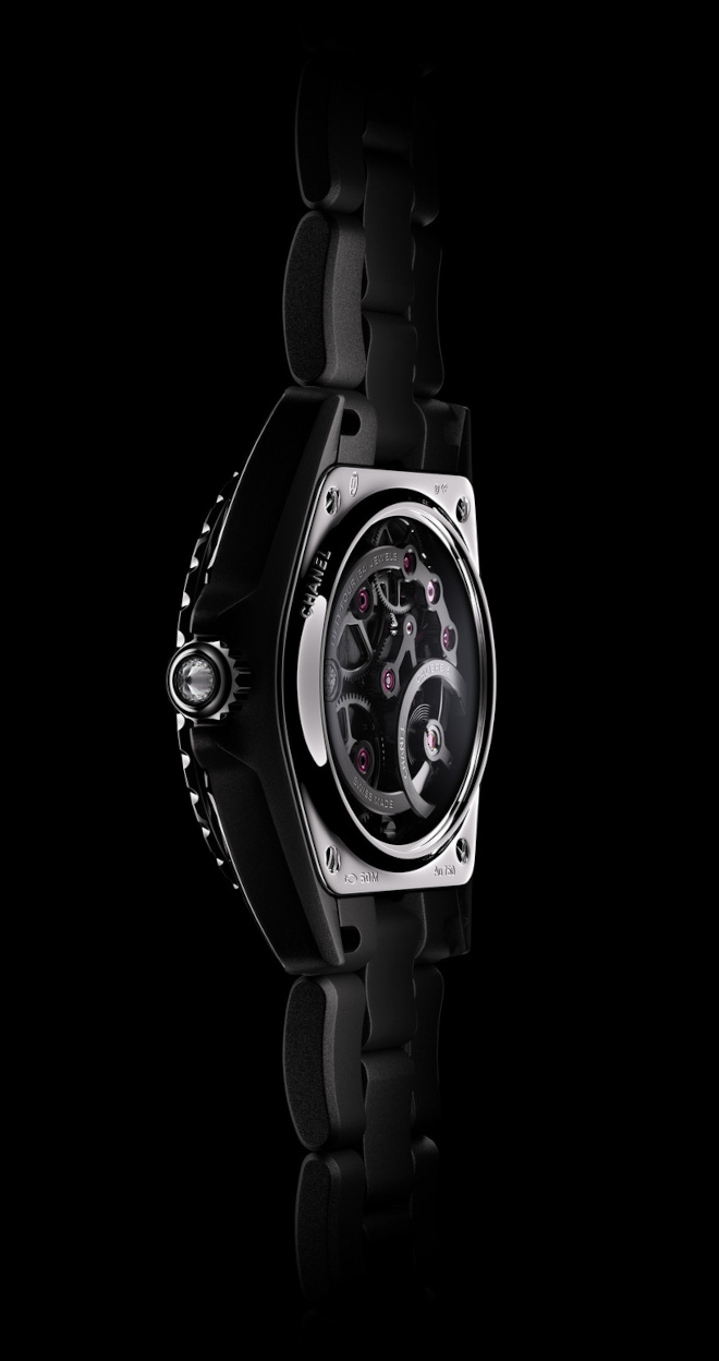
The Chanel J12 Hyper Cybernetic offers the same pixellated case but set with a stunning array of diamonds
When it comes to Chanel, they are in the business of designing timeless icons. This is not a statement to throw around lightly; but consider the Chanel suit and the perfume Chanel No. 5, both were created in the 1920s and nearly a century on these luxury items from the house of Chanel are still being made, with their original design ethos intact. And in a world where attention spans seem to get increasingly shorter, this is really saying something. So, naturally, when Chanel embarked on creating a timepiece, it was not entirely unexpected that it take on the same genre- defining qualities as well. We are talking, of course, about the Chanel J12.
Sure, the watch was designed long after the founder’s passing but by then, the core values of Chanel’s DNA had already been well established. The Chanel suit was the product of integrating masculine elements into feminine clothing and Chanel No. 5 was created to dispel the notion that an elegant woman needed to smell exclusively like a bed of flowers. The common denominator between the two? A pursuit of creativity, unshackled by conventional norms. And this is perhaps the reason Chanel’s creations stand unmoved through the test of time. The J12 was cut from the same cloth, as it were. Imagine creating a watch with a material that was rarely used in the watchmaking industry, a material reserved for aerospace travel at that. This is the J12, unapologetically different and it is through this ethos that its legacy remains entirely secure, even more than two decades on.
Incubation In Ceramic
To understand the allure of the J12, one must first travel back to the year 2000 when its legend began. Famously, the J12 was created by Jacques Helleu, the Artistic Director at Chanel for over 40 years. Helleu long admired the chassis lines of racing cars but more importantly, he was totally enamoured with the regal silhouettes of the America’s Cup yachts. In fact, the watch’s namesake, J12, comes from a category within the America’s Cup, the J-class and its 12m long yachts.
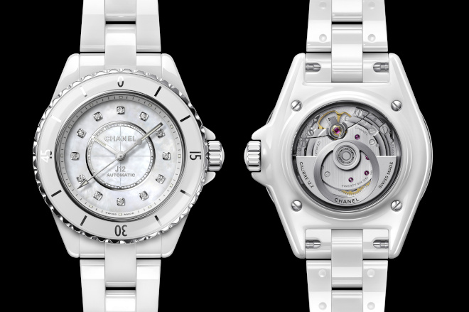
From the very first pencil draft lines, the watch was imagined to be incredibly sporty and of course, designed to be timeless. As for its material, it was only fitting that a watch inspired by racing sports be built with the most cutting-edge technology. Thus, the J12 was born with a black ceramic case that extended to the bracelet as well.
It is easy to dismiss the use of ceramic as “cutting- edge” these days as the watchmaking landscape has seen an explosion of this material in the past couple of years. However, in 2000, this material was nearly unused in watchmaking as due to its hardness, it was incredibly difficult to work with. So, as you can imagine, when the watch debuted with its slick and glossy 38mm black ceramic case and bracelet (and subsequently white ceramic in 2003), it became an instant icon, sitting on the wrist as unalterable and almost eternal as a diamond
Changing Without Changing
The Chanel J12 is often hailed as the very first watch icon of the 21st century. And therein lies the conundrum laid out before the maison: how do you take a globally recognised icon, and allow it to evolve with the times? Seven years after creating the J12, Jacques Helleu passed away and with him, the blueprint, if any, for the J12’s future.
The task of heralding this icon of Chanel into the next era of watchmaking was then placed in the hands of the current Director of the Chanel Watch Creation Studio, Arnaud Chastaingt. He had the unenviable task of giving the J12 a modern makeover without touching the very identity that built its legend and its success. How do you evolve something that is not allowed to change?
In 2020, two whole decades after the J12 first debuted, it received its first makeover, evolution, update, or whatever you want to call it. And by passing through the veil into the land of modern horology, it opened the floodgates of creativity for the J12. In the maiden year of its re-birth, the J12 brought with it a number of aesthetic changes. The bezel was refined with more notches and given a new typeface for its numerals and indexes, the width of the crown was reduced, and new indicators were added to the reworked inner railway track on the dial. The truly genius part of this update was that at a quick glance, it was a splitting image of the J12 from the year 2000. It is only when you take a closer look that you see the refinement in its details.
One refinement, and perhaps quite an important one to stake a claim to the J12’s legitimacy within watchmaking circles was the availability of a new movement that was made by Kenissi, aptly named Calibre 12.1. Before the grand reveal of the new J12, Chanel had made investments in Kenissi in 2018 and with it, came the ability to offer manufacture movements for the non haute horlogerie J12 watches.
With new watchmaking expertise slowly folded into Chanel’s repertoire, Arnaud Chastaingt now had the freedom to explore creativity in entirely different ways. In 2020, Chanel combined the black and white pillars of the J12’s design into the J12 Paradoxe and even made a fully transparent watch with the J12 X-Ray. Through Chastaingt’s redesign of the J12, the Chanel Watch Creation Studio now had a firm grasp on all of the core recognisable elements of the J12 and with it the ability to push the boundaries of its design without ever changing what the watch stood for. After all, the J12 would always have to be the J12.
Looking Into The Stars
Building on the success of that first 2020 J12 collection, Chanel has continuously sought out other universes to draw its inspiration from. In 2021, they were enthralled by the pulsing vibe of 90s electro music, and in 2022 they focused on mechanical innovation by debuting their very first in-house flying tourbillon movement, the Calibre 5 and even brought the Kenissi-made calibre to their smaller 33mm range of J12 watches. This year, they literally looked to the universe for design inspiration. With the theme “Interstellar” this capsule collection combines science fiction, space and time travel for a collection that is truly out of this world. The Chanel J12 Cybernetic is one of the watches launched this year that is perfectly able to enthral its audience even without the use of high-complication movements. The premise of the watch combines the iconic J12 silhouette with an ostentatious display of pixels almost as if it is invading the rest of the watch.
The combination of black on white is something that is not new to Chanel but the ability to fashion a highly irregular case based on pixellated graphics is one that perhaps took considerable technical know-how from the brand. Those familiar with Ceramic will know that even though it is lighter, harder, and more corrosion-resistant than most metal alloy materials found in watchmaking, it is exactly these properties that make ceramic incredibly tricky to work with. To machine such a hard material into this particular shape is one thing, then to ensure the edges are not sharp enough to scratch skin means that everything has to be refined and polished so that it retains the shape but is still comfortable enough to wear.
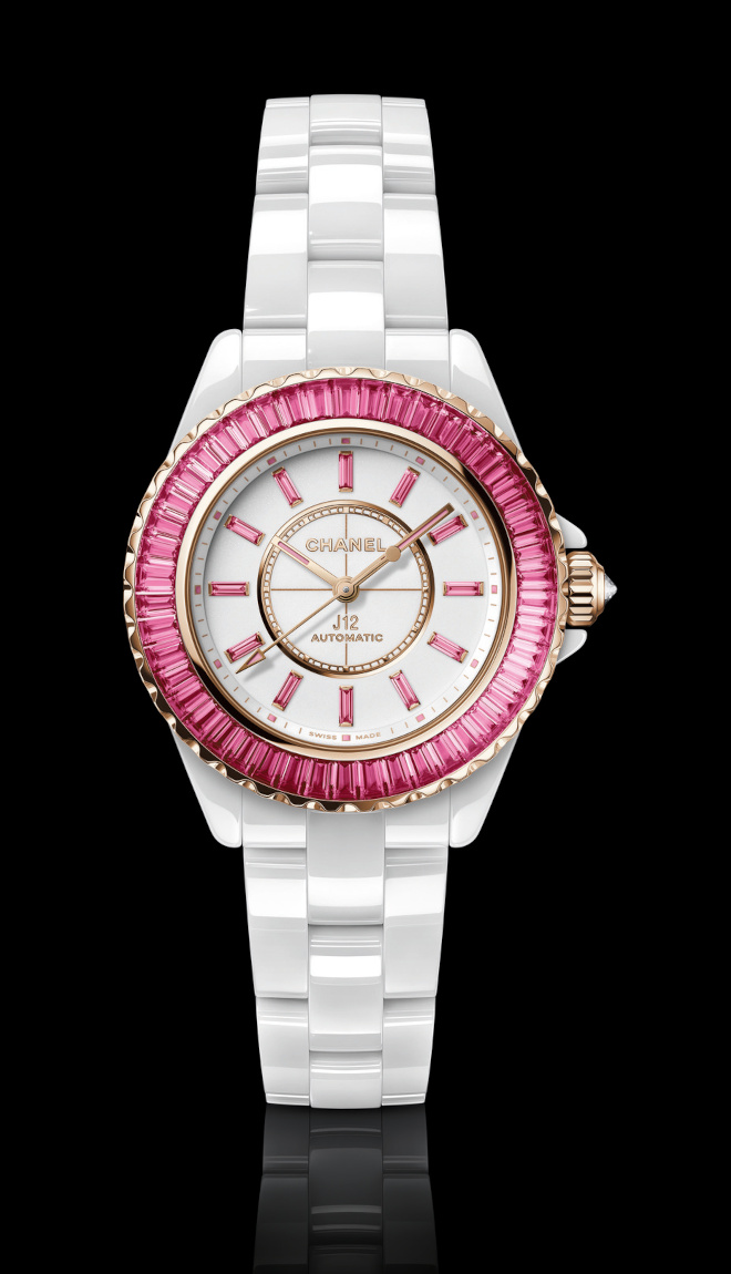
This pixelation in white seamlessly transfers onto the bezel via the interplay of black and white varnish, while on the dial, the white varnish is combined with black lacquer to complete the effect. Additionally, there is a version of this watch, the Hyper Cybernetic, with precious stones where instead of white ceramic, white gold is used for the portion of the case to allow for the setting of 116 brilliant-cut diamonds. As with all the modern J12 watches, this J12 Cybernetic is also powered by the manufacture Calibre 12.1 movement that has been Chronometer certified by the COSC ensuring the watch is as precise as it is beautiful to look at.
A Return to Classics
To an artist, inspiration can come from anywhere, even the unlikeliest of places. For Gabrielle ‘Coco’ Chanel, it is safe to say Place Vendôme in the centre of Paris held a special place in her heart. From the 1920s onwards she called Place Vendôme, more specifically the Ritz Hotel, home and around this time, the legendary perfume, Chanel No. 5, was sold in a new bottle, with a shape that evoked the octagonal silhouette of that very square. The significance of Chanel No. 5’s angular bottle is even more pronounced when combined with the fact that most perfumes of the time came in round ornate vials.

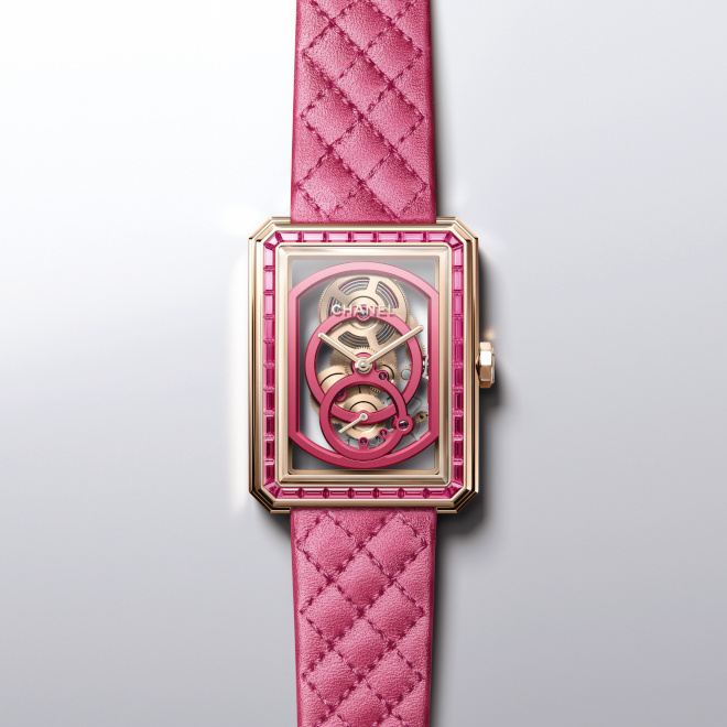
So, as you can imagine, in 1987 when Chanel decided it was time to venture into watchmaking, its very first watch created again by the legend, Jacques Helleu, had to be inspired by an element intrinsic to the core design tenants of Chanel. The shape of the Première was based on the cap of the Chanel No. 5 bottle and by association with the shape of Place Vendôme. To give the watch an undeniable link to the brand, even the strap of the watch borrows from yet another icon within their repertoire, the Chanel 2.55 Flap Bag. When the Première debuted in 1987, it was a watch that women could call their own. Fast forward to 2022, the collection is still very much alive and, in fact, has taken on a life of its own through various interpretations that range from the playful like the Première Robot to the complex like the Première Camélia Skeleton. Last year however, to celebrate the 35th anniversary of the very first Chanel timepiece, they made the Première Edition Originale, a re- issue of that very first watch from 1987.
The watch offers the same octagonal shape of Place Vendôme, and the same metal and leather double chain strap, but all of it is further refined for the audience of today. Both the steel case and strap are coated with a brilliant 18ct yellow gold which contrasts nicely against the dark colour of the leather on the strap, the black lacquered dial and the onyx cabochon on the crown. To ensure the watch is fit for daily use, it runs on a high-precision quartz movement and the entire watch is water resistant to 30m.
This year, Chanel has also announced Lily-Rose Depp as the new muse for the Première Édition Originale. No stranger to Chanel, Depp has long been a friend of the brand and one of the youngest brand ambassadors when she was cast in her first Chanel campaign when she was just 16 years old in 2015. Since then, she has represented the brands on numerous occasions including as the face of the Chanel No.5 L’Eau for a younger millennial audience. Depp is a source of inspiration to the younger generation, evidenced by her monumental 8.4 million followers on Instagram. Since her first minor appearance in the movie Tusk (2014), and her appointment as Chanel brand ambassador in 2015 she has since ventured into fashion modelling and has appeared on the cover of several of the world’s most high-profile fashion magazines. Additionally, she has also continued to expand her acting capabilities by appearing in the historical epic war film The King playing Catherine of Valois opposite Timothée Chalamet as Henry V. Most recently she made her TV debut starring in the HBO drama series The Idol alongside Canadian singer The Weeknd.
This article was first published on WOW Autumn Issue #70
For more on the latest in luxury watches, click here.