The Conversation: Engineering Success

Ingenieur Automatic 42 in black ceramic

Watches often evolve in unpredictable ways, especially if they were made to fulfil some kind of need or requirement. If said needs and requirements change, so too does the watch, or watches, in question. Take for example the IWC Ingenieur, which is experiencing a major revival at the moment that is very far removed from its debut 70 years ago.

That original Ingenieur watch was designed to meet the emerging challenge of navigating magnetic fields, alongside a host of other such watches. Watchmakers perceived a threat to the running of their creations from these fields, which would in fact go on to dominate our work and home environments. Hence, IWC introduced the Ingenieur with an automatic movement and an inner soft iron shell that would function as a Faraday cage. In 1955.

Even as the model went through a variety of changes, these elements remained consistent…until now that is. The editors of WOW Singapore, Malaysia and Thailand saw all the new models at Watches and Wonders Geneva this year; the Ingenieur in particular drew their attention. The collection, inspired not by the 1955 original but the 1976 Ingenieur SL imagined by the famed Gerald Genta, sparked their first discussion centred not on broad topics but on just one subject.

Ingenieur Automatic 42 in black ceramic

RC: Guys, we are at the beginning of something new: a brand-specific discussion among the editors!

AS: It is indeed a brand new day…in a manner of speaking. And, we’re also going collection specific. So, are we ready for the IWC Ingenieur of 2025?

RC: Presently, of all five collections listed on the IWC web site, “Ingenieur” is one of the two families named after a profession, with the other being “Pilot’s Watches”. And that reflects the focused nature or objective with which the watch was developed in the first place.

DG: I have a feeling that with such focused attention on one collection, things are about to get extremely nerdy…

AS: Nerdy? Funnily enough, we have an odd question to ponder: where to begin… The Ingenieur has had quite a number of lives and, as Ruckdee noted, it remains only the second such model (named for and aimed at a specific profession) in the brand’s history. Why is it a watch for engineers? Well, from what the brand says, it all comes down to the antimagnetic properties of the watch. The Ingenieur was literally engineered to face the challenges of an electronic world.

DG: It has such a fascinating back story. But let’s not forget, IWC is in Schaffhausen which is nearer to the German side of the Swiss border and you know the reputation that the Germans have for their engineering. It makes sense that way back when, IWC probably thought that hey, there are a lot of engineers around here; they need to tell time; magnetic inference is a problem; and we have a brilliant solution!

RC: Good point made there, Daniel. I first discovered IWC as a resolutely sober, white and black brand, with a heightened sense of engineering, and no obvious partnership or celebrity endorsement. Having said that, I have a confession to make. When I was much younger, I didn’t know that the very first Ingenieur was round! At the time, I thought the Ingenieur SL designed by Gerald Genta in 1976 was already the beginning of the collection. Then I discovered that I was not sufficiently educated, because the very first Ingenieur was in fact a round watch known as Ref. 666 in 1955 or exactly 70 years ago.

Ingenieur Perpetual Calendar

AS: IWC is very Teutonic, that is true, and it was a champion of tool watches. Still is, in important ways that are today most evident in both this collection and the Aquatimer. Where water-resistance is the name of the game in dive watches, IWC foresaw that mechanical watches needed protection from the magnetic fields of the electronic devices that were becoming ubiquitous in the second half of the 20th century. That is where the story from the original from the 1950s still plays a part, although I join Ruckdee in only recalling the 1976 Ingenieur SL.

DG: I wonder what it was that made the watch unsuccessful when it was launched in the late 1970s? Officially they say the design was too visionary, but I suppose there should be more factors in play here as well right? Could it have been the quartz watches that were probably gaining momentum around the same time? Or maybe even the asking price was too high? Does anybody know what the Ref. 1832 cost at the time it was made?

RC: No, I don’t know the original retail price of the Ingenieur SL. But I think I know why it is so collectible right now: not so many pieces were made! IWC’s latest information notes, and I quote, “With the modesty and sobriety of a tool watch manufacturer, IWC chose a different approach and marketed the Ingenieur SL exclusively to engineers in the years to come. However, for this target group, Genta’s design was simply too bold and too visionary. And so, between 1976 and 1983, only 598 pieces were produced and sold.”

AS: There are boons to making only a very limited number of pieces, especially to collectors. Now, aside from being a famous maker of tool watches, IWC is a brand that wants to sell a lot of pieces so it is perhaps unsurprising that the Ingenieur’s first run ended in the 1980s. However, there was clearly a tonne of unrealised potential in the collection as the brand returned it to the lineup as the mechanical watch revival got underway at the start of the 21st century. To be clear, the collection was quite respected when it came back but IWC has fiddled with the design a number of times before hitting its stride in 2023, when the first four models appeared in the current style.

RC: I was not a fan of contemporary, round Ingenieur watches when they made brief resurgences during that fiddling phase. So, I was very pleased in 2023 when IWC did what they did: formally re-establishing the collection on the aesthetic basis of the Genta-designed Ingenieur SL. The size is also good and safe at 40mm.

“When I was younger, I didn’t know that the first Ingenieur was a round watch known as Ref. 666 in 1955” said by Ruckdee Chotjinda, Editor-in-Chief, WOW Thailand.

AS: There are some characteristics that define the Ingenieur, particularly the Genta-era Ingenieur SL that Ruckdee referenced there. The integrated bracelet form is, of course, a key part of the winning formula, but so is the industrial vibe of the bezel and the dial. For the longest time, and until this year, it was also the presence of the soft-iron inner case that marked the Ingenieur; that was the Faraday cage, of a sort, that gave the watch its impressive antimagnetic credentials.

RC: I don’t know the average magnetic levels in our daily life or around specific devices, but the standard Ingenieur Automatic 40 in stainless steel with the said soft-iron inner case offers magnetic resistance to the level of 40,000 A/M, whereas the ISO standard requires a dive watch to be magnetic resistant to only 4,800 A/M. More superficially, I was thrilled to see how they brought back the “grid” dial of the Ingenieur SL. I think it gives yet another important signature to this highly technical collection of timepieces.

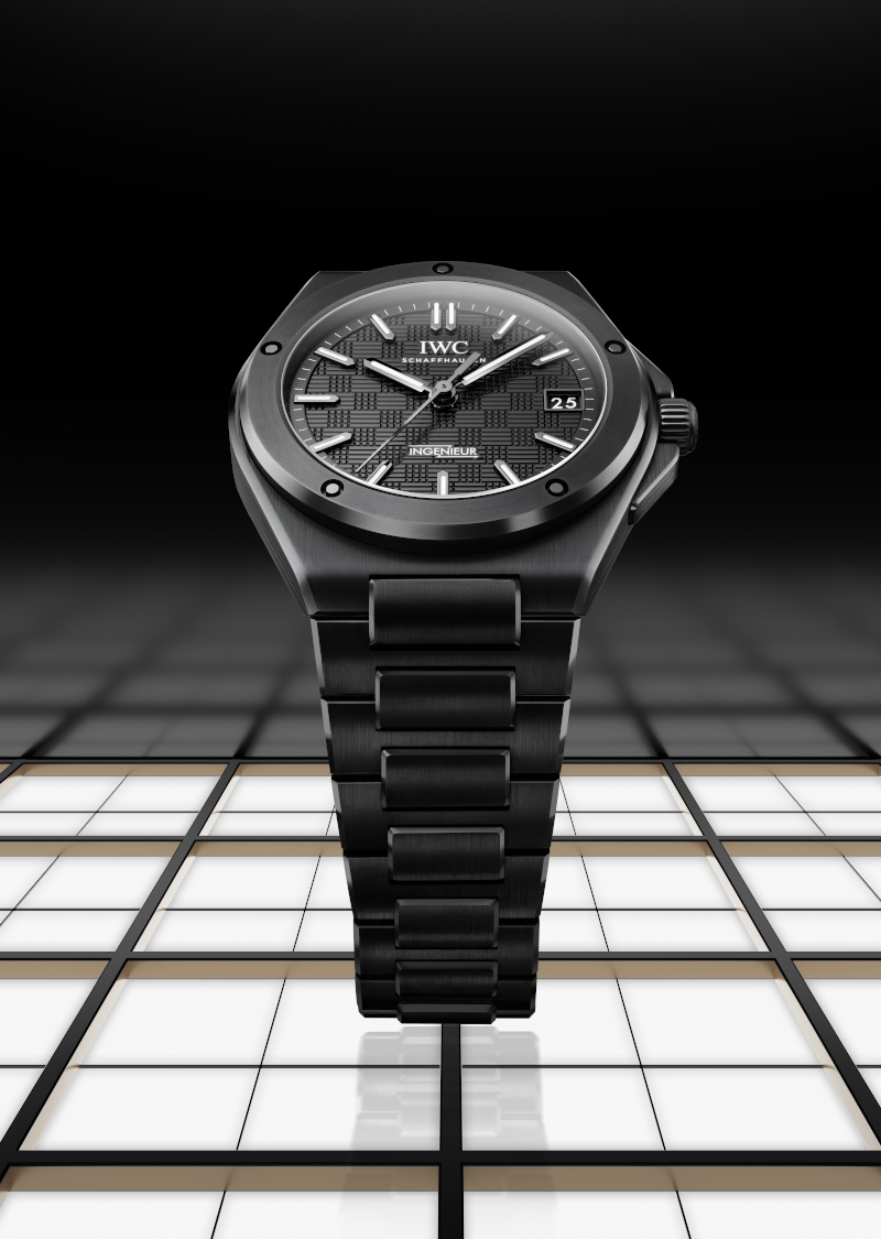
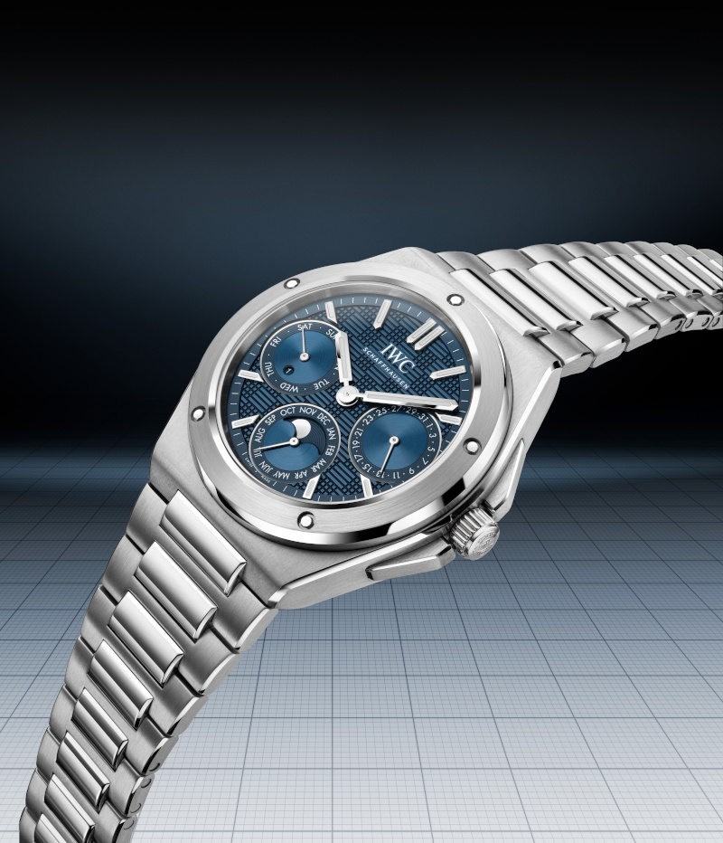
AS: Moving right along, after those four watches from 2023, the brand found its footing and decided to go all-in here. There are now 12 models in the Ingenieur collection, including its first-ever perpetual calendar model and an incredible ceramic model. Sizes now range from 42mm to 35mm, with that perpetual calendar model coming in at a unique 41mm.

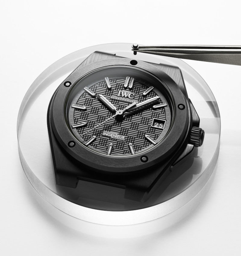
DG: I am not at all surprised that IWC decided to add a ceramic model to its collection; the material is gaining traction in the industry and has been doing so in the last couple of years. What did surprise me, however, was IWC’s heritage with this material. The brand made the first zirconium oxide black ceramic case in 1986. And apparently there was also another Pilot’s watch in black ceramic in 1994. All of these were before my time covering watches but these days, I think IWC is investing heavily in developing ceramic materials. The firm has Ceralume, which successfully integrates Super-LumiNova® pigments into ceramic, and the collaboration it did with the German Aerospace centre introduced fibre-reinforced ceramic as a viable material. So, I think it was only natural that IWC brought its expertise with ceramic to the Ingenieur collection. And I suppose with ceramic being a non-magnetic material, this fits into the whole antimagnetic ethos of the Ingenieur.

Stylised view of the principal components of the Ingenieur Automatic 42 in black ceramic

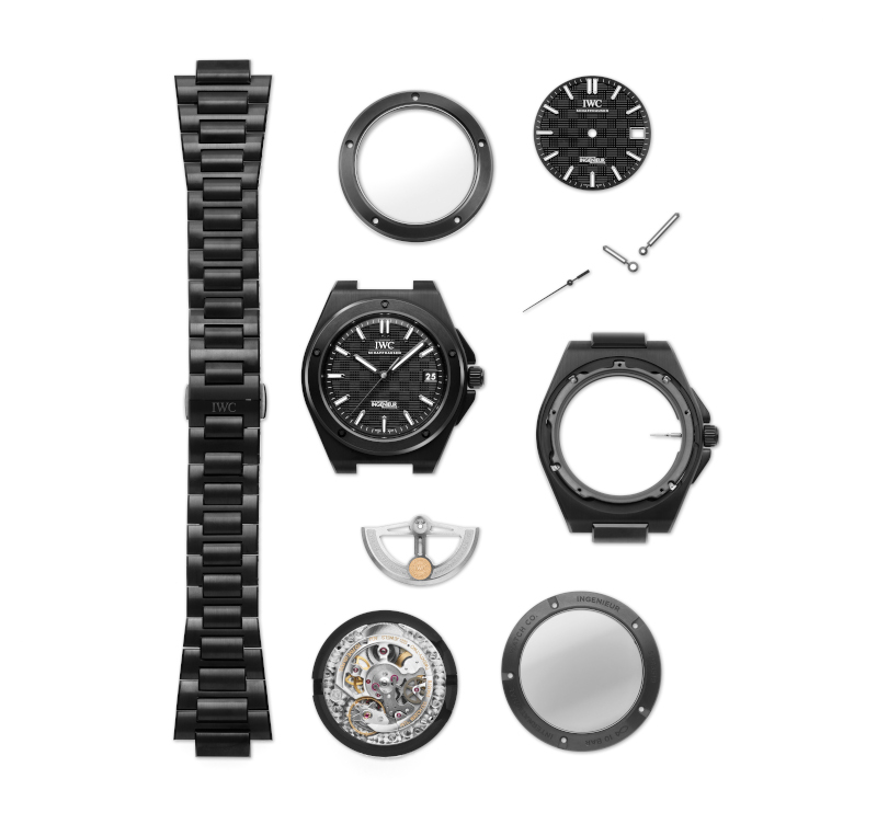
AS: You know, people do say it is all about details in fine watchmaking, which is what IWC does these days, and the new ceramic Ingenieur gets it right. I was surprised to learn that the crown and crown guards are also in ceramic, and so is the caseback. As you know, although we did not say it properly for the record, the five screws visible on the bezel are functional, connecting the three parts of the case to each other. The Ingenieur has only featured this as a key element now, with the 1976 debut going with a different case structure, and it is important to the feel of the reimagined watch. This sort of thing is part of the reason that ceramic watches often do not have ceramic casebacks. I presume this is something IWC wanted to figure out before getting into ceramic here because Daniel is right to note the general proficiency the brand has demonstrated with ceramic (since 1986 with reference 3755 in fact but we will get to that shortly).

RC: One thing caught me by surprise, though, and that is the size of the new ceramic Ingenieur. Unlike the Ingenieur Perpetual Calendar 41 with extra indications to display, the Ingenieur Automatic 42 in ceramic is a three-hander so, at first, I didn’t know why it had to be 42mm when it could have been in the same 40mm size as the models in stainless steel and titanium. My initial guess was that it was due to complications with the case construction and ceramic parts and all. But then I looked closer and discovered that a totally different movement was used! The Ingenieur Automatic 42 in black ceramic is powered by the larger Calibre 82110, which is also visible through the tinted sapphire crystal caseback. The Ingenieur Automatic 40 in stainless steel or titanium is equipped with Calibre 32111, which belongs to a totally different IWC movement lineage, not hidden behind the closed case back.

DG: You know you still could be right. It could be due to the complications with the case construction that they have to use a different movement. Additionally, it could also be that because the ceramic is in black, they needed to use a larger case to give the watch the intended appearance on the wrist. Maybe a fully black 40mm watch would look closer to a 38mm on the wrist?

“I think it was only natural that IWC brought its expertise with ceramic to the Ingenieur collection. After all, it is a non-magnetic material”— Daniel Goh, Editor-in-Chief, World of Watches, Malaysia

RC: This is why I like chatting with you guys. You expand my perspectives! While we won’t know for sure until we ask IWC what its intentions or constraints were with regard to the ceramic Ingenieur being larger than the rest, it is cool to ponder at the possible reasons and the effects they bring. I, for example, didn’t think about the effect where a black ceramic 40mm watch has the potential to look smaller than its measured size. But I agree that, as things stand now, the current Ingenieur watches in different materials look appropriate for their respective persona. Ashok, what do you think?

AS: I like the story of the ceramic model, and how IWC had to come up with neat engineering solutions to make the case construction work. Also, the little things such as the aforementioned crown and guards – having these made in matching black ceramic is going the extra mile. You only need to imagine how specific this process is – only this model uses such components, in the entire IWC range. This kind of production fastidiousness (and ultimately, exclusivity) is what fine watchmaking is all about. If you really consider it, the case (and components) of this 42mm watch is worth an entire article, and we did toy with that idea right here before going in this direction. As for the size, I think it was the decision to use the Calibre 82110 movement that defined it, and probably some sort of consideration on minimum sizes for water-resistance and perhaps even those little components! Truth be told, integrated watches wear a bit bigger than you might expect so I would love it if there was a 40mm version but, on the other hand, some differentiation is very desirable. To finish here, I wish that the dial was also in ceramic, with this same design (i.e. the grid pattern) of course! Something to look forward to perhaps, and more realistic (maybe) than a smaller size…

Ingenieur Automatic 35 in 5N gold case

DG: I second that idea for a dial in ceramic. IWC, if you are reading this…

RC: It’s not a must for me. But if they can make a ceramic dial without losing the grid pattern then I am in, otherwise I would prefer for the dial to stay as is. So what is your favourite, current model Ingenieur then? Daniel? I do like the new Ingenieur Automatic 42 in black ceramic and my wrist can take the size, but I am still partial towards the Ingenieur Automatic 40 in stainless steel with Aqua dial which I find to be quite refreshing – it is not too green and already not blue.

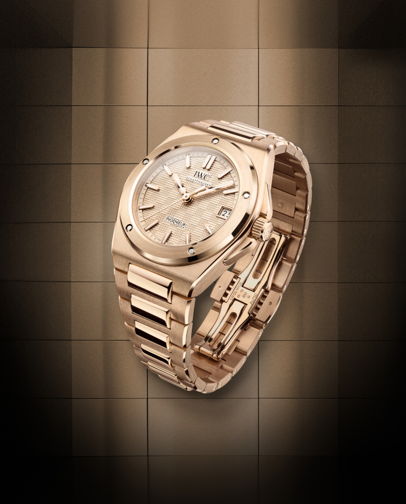
DG: Anyone who knows me will know that although I love the technical complexities of making a material like ceramic (pressure and fire, what’s not to like?) I think the size will be a tad bit big for my personal tastes. So, for that reason, I think the new 35mm Ingenieur is a pretty compelling release from the brand this year. And if we are talking full fantasy, how about that 35mm Ingenieur in full 18K 5N gold. How baller is that?!

AS: I do like the smaller releases here, again mainly because of that whole integrated bracelet thing. Also, great that IWC went with yet another movement for the smaller models, Calibre 47110; this does wonders for that model differentiation that I keep harping on. All too often, brands will just go with one movement in cases of multiple sizes and that irks me, as it does Ruckdee too! I think the decision to have every size and specification (the ceramic model and the perpetual calendar) in the new Ingenieur range have its own movement is a deft touch, even if it probably was not decided in this way.

“I applaud the decision to equip every size and specification in the Ingenieur range with distinct movements” — Ashok Soman, Editor-in-Chief, WOW Singapore

RC: Oh, don’t get me started on an open case back with a much smaller movement than case. We don’t have the pages for my rant. But where the Ingenieur is concerned, so far everything is proportionate and well-thought-out to me. They have regular, smaller and larger case sizes. They have steel, performance materials and noble metal. And, with the perpetual calendar being added this year, even before there is a chronograph, we can anticipate the latter next year, perhaps.

AS: I am pretty sure that we can expect more in ceramic from the Ingenieur, given the history of material innovation at IWC. Not at all a stretch to see a perpetual calendar in the mix, especially since IWC introduced ceramic to watchmaking with a perpetual calendar in 1986, although in the Da Vinci line. And the brand does have some expertise in making complicated watches in materials such as ceramic, and of course hybrids, including Ceratanium. Honestly, the Ingenieur collection is just brimming with potential on the material front. And yes, the thought of IWC introducing a chronograph with ceramic pushers did occur to me too, mostly because the Pilot’s Watch Performance Chronograph Perpetual Calendar Digital Date-Month already has such a thing, but in Ceratanium!

DG: It is exciting, isn’t it, when a brand introduces a new collection, especially one with such a cool origin story and more importantly, with a design that can speak to contemporary tastes. The expansion of the line has already begun and I am sure if you look at IWC’s playbook, the gears are already churning for the next few releases. Predictably we will probably see line extensions for the newly launched references in the coming years but I am pretty sure that there will still be a few surprises up IWC’s sleeve. I wish IWC would do a limited-edition reissue of the original SL reference 1832 but it seems highly unlikely. Even the watch they put on Brad Pitt’s wrist for the shooting of the film – F1 – was apparently a modified version of an original watch. But, one can dream right? In any case, it is great to see the positive reception of the Ingenieur and I am definitely looking forward to covering its future.

Ingenieur Automatic 40 in 5N gold case

This story was first seen as part of the World of Watches Malaysia Summer 2025 issue

The Zeitwerk Date Goes for Pink Gold

A. Lange & Söhne Zeitwerk Date Ref. 148.033

When A. Lange & Söhne first announced that the Zeitwerk was getting a date complication in 2019, everyone expected them to add another [date] aperture that would jump, just like the hour and minute counters. It’s the most common way for watches to convey the date, and it made sense, considering how the Zeitwerk is the ultimate ticker watch. This is, after all, the first mechanical wristwatch to display hours and minutes numerals that jump instantaneously.

Then came the questions: where would they squeeze in this new complication? Would they have to sacrifice another feature, like the power reserve indicator? Would a date display disrupt the symmetrical equilibrium of the watch?

But the engineers at A. Lange & Söhne are an ambitious lot, and they refused to compromise. To solve this, they reimagined what a date function could look like. They began by imprinting the 31 days of the month onto a glass ring that encircles the dial. A small red marker glides beneath each numeral, highlighting it in red to signify the date. This subtle act of ingenuity not only helped the Zeitwerk Date remain cohesive in its design language within the Zeitwerk family, but also preserved its visual balance and symmetry.

For those who enjoy a bit of whimsy in their watches, I implore you to imagine the red ring progressing around the dial like a loading bar for the month.

A new member

Six years later, Lange is finally giving the Zeitwerk Date a sibling—a blonde one. Previously available only in white gold, the Zeitwerk Date is making a grand re-entrance with a pink gold case. The new look is paired with a hand-stitched, dark brown alligator leather strap, which helps hammer home a warmer tone for the watch. Visually, it’s far dressier than its older sibling, aligning more closely with Lange’s classically rooted DNA, which might appeal even more to brand loyalists.

The grey dial from the first iteration remains, providing a neutral, muted backdrop that allows the radiant pink gold to stand out even more. The visual contrast between monotony and extravagance creates a serene yet elegant effect, fitting, considering the rather hefty price tag that accompanies the watch. The beauty of juxtaposition, baby.

Beyond that, the design elements remain largely unchanged. The two large apertures for the hour and minute numerals are still present, as is the date function that circles them. The horizontal time bridge continues to frame both the small seconds sub-dial at 6 o’clock and the power reserve indicator at noon, all within the same 44.2mm case dimensions.

Two pushers flank each side of the watch, one at 8 o’clock and the other at 4. The 8 o’clock pusher controls the red ring that is beneath the 31-day ring, allowing you to position it precisely. Meanwhile, the pusher at 4 o’clock adjusts the hour display independently of the movement’s switching cycles. This means you don’t have to press the pusher sixty times just to advance an hour ahead—something that would not only be very tedious, but also save the watch’s mechanisms a tremendous amount of wear.  There’s also a crown at 2 o’clock, which will, of course, advance the minutes.

If it ain’t broke…

Inside the new Zeitwerk date beats the same calibre that powered its predecessor: the ol’ reliable L043.8. It’s a manual calibre that beats at a frequency of 18,000 semi-oscillations per hour, and it requires a winding roughly once every 72 hours. Having a power reserve of three days is no small feat, considering the power required for the hour and minute numerals to jump as often as they do (exactly 1,440 times a day), and as precisely as possible.

If you’re curious to learn more, we explored the mechanics of the calibre in greater detail here. But essentially, Lange’s engineers discovered that by flipping a large mainspring upside down inside the barrel, it allows the piece to be wound from the inside, generating more power and torque than a typical mainspring. Thus, it achieves a 72-hour power reserve, doubling the 36-hour capabilities of its predecessor.

All this is available for your viewing pleasure through the sapphire crystal caseback, where you’ll get to witness the 516-part calibre at work. Solarisation and engravings of the brand name can be found on various wheels and bridges, all reinforcing the idea that what you’re observing isn’t just a mechanism—it’s poetry in motion.

This article was first seen on Esquire SG.

Bigger isn’t always better as demonstrated by this new 38mm Fifty Fathoms from Blancpain

I think we wouldn’t be remiss in saying that when it comes to Blancpain their Fifty Fathoms dive watch acts almost as if a calling card for the brand. They have long argued that it was the first dive watch ever made and since its creation in 1953, by the brand’s CEO Jean-Jacques Fiechter, the design has hardly changed. And it is true that if something isn’t broken, why fix it? And so for this year in 2025, Blancpain has relaunched the Fifty Fathoms yet again, but this time in a smaller 38mm size.

From an outsider’s perspective, the simple addition of a new size is nothing quite so exciting. Still, from a watch enthusiast’s perspective, especially one who has long been eyeing the Fifty Fathoms but had slightly smaller wrists this is a momentous announcement from the brand. At 38mm, the core Fifty Fathoms collection is now complete with a large 45mm reference, a more average 42mm reference and for smaller wrists the new 38mm watch.

Although the idea of creating a smaller Fifty Fathoms watch, complete with the collection’s signature DNA may seem like a simple shrinking of the existing watch, in reality, it is hardly just that. Oftentimes the designers at Blancpain have to meticulously redesign each element of the watch including the hands and indices so it maintains the visual harmony of the original. What this translates to in terms of production is a recalibration of the many CNC (Computer Numerical Control) machines that cut and create the case, bracelet and many other components of the watch.

Inside the watch, Blancpain has installed the manufacture calibre 1150 that beats at a slower frequency of 3Hz. Although this frequency is slightly lower than the average, normally at around 4Hz, the automatic movement is then capable of a massive 100-hours of power reserve. Additionally, the movement also has a silicon balance spring that has a resistance to magnetism.

In the years that Blancpain have been making the Fifty Fathoms for the luxury watch market, they have added various materials to the collection, each speaking to a different type of collector. The stainless-steel variant will obviously remain as the core model in the Ref. 5007’s range and sits at the more affordable end of their pricing spectrum. But for the high-rollers you can even get this 38mm Fifty Fathoms in their signature grade 23 titanium for that ultra-technical, lightweight ethos or for the one that enjoys diving into investor meetings and boardrooms, there is even a version in 18K red gold.

With the advent of this smaller size, Blancpain has also taken the opportunity to create two more feminine options with mother-of-pearl dials. One comes in a powerful black colour scheme with an 18K red gold case but arguably the flashier of the two is a unique pink Fifty Fathoms that offers a matching pink bezel. Each dial will come with a dégradé effect on the mother of pearl lending it a touch more sophistication to an already very elegant watch.

Feeling Bleu? After 25 years of black and white, CHANEL's J12 finally sees in colour

CHANEL J12 Bleu with sapphire indices

The J12 is a watch designed at its very core to be ahead of its time. For one, when it was conceived back in the year 2000, it was difficult to imagine a haute couture house like CHANEL creating such a serious and technically challenging timepiece. Secondly, for a watch to debut in a material like ceramic, which until then was not widely used for watch cases due to its manufacturing complexity, was a bold statement on the part of CHANEL. Again, nowadays ceramic has been steadily gaining traction with most of the well-known watch brands having at least one reference in this scratch- and corrosionresistant, hypoallergenic material. Over the years, the ceramic J12 has slowly cemented its place as an icon not just in fashion circles but increasingly in watchmaking conversations as well. 25 years after the first J12, CHANEL is poised once again to introduce the latest evolution to this storied collection, for the first time taking the watch out of a monochromatic theme and introducing it in a brand new colour. As CHANEL puts it, “It’s not black. It’s not white. It’s Bleu.”

Perhaps one of the reasons that made the J12 so unlikely was also one of its greatest strengths. Coming from a fashion house and not a watchmaking name with a century or so of history since its founding, CHANEL was liberated from constraints while designing the watch. Its creator, the then chief designer of the brand, Jacques Hélleu, looked away from the elements familiar to fashion and instead turned his attention towards other things he loved, like automobiles and sailing. Thus, the use of a high-tech material like ceramic was chosen as opposed to the soft and feminine textile inspirations of high fashion. Today, the arrangement for CHANEL, at least for its watchmaking division, mirrors this type of independence. Yes, it is owned by the same company, but its watchmaking facilities sit separately in the cradle of Swiss watchmaking, La Chaux-de-Fonds, while its brain, is located in the heart of Paris, Place Vendôme. There the director of the CHANEL Watchmaking Creation Studio, Arnaud Chastaingt, inconspicuously gives life to all of CHANEL’s timepieces, enjoying the same freedoms of design as Hélleu once did.

ICON IN THE MAKING

Chastaingt has had an immensely important influence on the history of CHANEL watchmaking and the evidence is compelling. Since he took on the role as the director of the Watchmaking Creation Studio back in 2013, he has expanded the line of CHANEL watches beyond just the J12 and Première to include BOY·FRIEND, CODE COCO and MONSIEUR which have all since become staples of CHANEL watchmaking. On the more technical side, the facilities at La Chaux-de-Fonds have, under Chastaingt’s direction, created five in-house calibres bringing to life creations such as the MONSIEUR in 2016 with a jumping hour and retrograde minutes indicator, two skeleton calibres for the Première Camélia Skeleton and BOY.FRIEND Skeleton both of which have taken home respective awards from the Grand Prix d’Horlogerie de Genève (GPHG).

Within the J12 collection, Chastaingt was the maestro of its evolution. In 2019 he orchestrated a complete redesign of the iconic J12. The changes were slight: a few millimetres more for the dial opening, slimmer typography, a refined bezel design, and a slimmer crown, but compared to the daunting prospect of redesigning such a recognizable icon, these changes were momentous in effect. Finally, the J12 was updated for contemporary tastes.

Arnaud Chastaingt, Director of the CHANEL Watchmaking Creation Studio

Following the aesthetic redesign there was also a push for the J12 to become more “serious” in the eyes of modern horology enthusiasts. First, they had to do away with cookie-cutter movements and instead assemble a true manufacture movement, the Caliber 12.1, through a collaboration and eventual investment into Kenissi. Then it was the introduction of complications into the collection like the in-house Calibre 5 which gave the J12 its first tourbillon. Before that, it was Calibre 3.1, an extremely skeletonised movement to complement the transparent nature of the sapphire J12 X-Ray. Today, CHANEL is positioned as a serious player in the current luxury watch industry. Through its partnership with Kenissi, they have even updated the smaller, 33 mm J12 watch with a manufacture movement, when many other of its contemporaries still rely on quartz movements at that size. Then there is the investment, acquiring stakes in not just Kenissi but also important pillars in independent watchmaking like MB&F.

BLEU, THE NEW BLACK

25 years is a long time to stay relevant, especially if one does not have hundreds of years of history to fall back on. Thus, for CHANEL, this year they have decided to unveil what can be considered one of the most fundamental changes to the J12 collection since it was created back in the year 2000. Ever since its inception, the watch has taken on a glossy black exterior. This was the original icon. In 2003 a completely white ceramic version of the J12 watch was introduced and this black and white monochromatic configuration was pretty much how it stayed throughout the years regardless of its function, movement and design inspiration. This year, for the very first time the J12 collection introduces colour. The choice of hue is blue, or more specifically, Bleu a colour exclusive to CHANEL.

CHANEL J12 Bleu in 38mm

We have been writing about ceramic for quite some time now because, as we have earlier established, it is currently quite a trendy material. And as simple as the introduction of a new ceramic colour may seem, the manufacturing process of the material makes it far more complex. Especially if, like CHANEL, there is a specific hue of Bleu that needs to be achieved.

“The duality of black and white is obviously an essential code in CHANEL’s aesthetic vocabulary. But colour has always been omnipresent in CHANEL creations. Blue has always been part of the House’s colours, imprinting its vibrations in fashion, fragrances or jewellery, but it is revealed today in a unique hue for CHANEL watchmaking. In optics, black and white are not considered as colours, they are shades. Black is the absence of colour and light. As such, I dreamed of giving a colour to black, illuminating it with blue. I dreamed of a blue with a rigorous elegance, not quite black and not quite blue. Five years of development were required to obtain this ceramic colour and the ultimate choice of this shade of blue was sparked by emotion.” Chastaingt explains.

Five years to create this particular shade of Bleu is not long if you consider the process of making ceramic. Unlike traditional cases in metal alloys, which are usually forged into solid tubes before being cut and milled into specific shapes, ceramic components are pressure moulded into their final form. Then, the entire component has to go through a sintering process which means it is heated at extreme temperatures so the material can harden into the finished product. To bring colour to ceramics, pigments are usually added to the mixture before being injected into the mould. The heat oftentimes alters the colour of the pigments so depending on how high the temperature goes, how long it stays at that level and perhaps even how fast the temperature drops along with how long it is cooled can affect the exact shade of the final product.

It is worth noting too that the combination of parameters during the sintering process can also affect the integrity of the ceramic meaning that there are constraints to how much the engineer can alter in the pursuit of a specific colour. An added layer of complexity to this process is also due to the J12 having a fully ceramic bracelet. There is a reason why it has taken most other brands so long to be able to offer ceramic bracelets. Unlike the case of the watch which is usually in a fairly large block, the bracelet is made of tiny little components that are assembled together. Smaller components mean less surface area and this could also affect the sintering process and, in effect, alter the colour of the end product. So for this, the engineer then has to rework the formula and retweak the parameters to ensure that in the end, both the bracelet and case match each other perfectly.

The CHANEL J12 Bleu 28mm Sapphires replaces the ceramic center link with a row of baguette cut sapphires

If you are looking intently at the images thinking why does a simple colour change give this J12 such a drastically different look, it is because that is not the only ‘first’ for this new J12 bleu. Since its creation, the J12 has always had a glossy finish and this is the first collection to offer the J12 with a matte tone. This finish along with this darker shade of bleu really gives the J12 a completely distinguished look and feel. It is right that CHANEL insists the J12 Bleu is not black or white.

It is really impressive how on the surface all the codes of the J12 are visible in plain sight but together with the Bleu and the matte textures the collection takes on an entirely different demeanour. This could very well expand the clientele of the J12 to a whole new segment of watch enthusiasts, one which perhaps felt that the glossy black and white was a tad too elegant and required something a little sportier and more dynamic.

SHADES OF BLEU

This is not to say that the new Bleu can’t be dressed up to be elegant or sophisticated. The beauty of debuting a new colour in such a well-established collection like the J12 is that they have ample room to fan out. The new Bleu encompasses eight J12 watches. Where the standard 38mm J12 with the matte Bleu ceramic exudes a more dressed down, sporty charm, Something like the J12 Sapphire indices, like the one we put on the cover of this issue, or even better yet, the J12 with the fully paved sapphire bezel will look right at home at a gala dinner. The use of sapphires really offers a natural fit with the J12 Bleu collection and because the Bleu colour surrounding the sapphires is of a darker shade, the precious stone itself takes on this more subtle gleam.

The CHANEL J12 Bleu Diamond Tourbillon watch is set with approximately 4 carats of baguette-cut sapphires and a 0.16 carat brilliant-cut diamond on the tourbillon

The availability of both the 38 and 33mm sizes in Bleu ceramic with or without the precious stones means that there is ample choice depending on wrist size. Although traditionally 33mm was marked as a ladies’ size, one could argue that these days it wouldn’t be remiss to see a man, maybe with a smaller wrist, rock a 33mm watch with the same confidence. This brings back the J12 to its original ethos where it was designed to be a unisex timepiece, unconstrained by traditional gender rules. And of course, with each iteration having its own manufacture movement – Caliber 12.1 and Caliber 12.2 – the only real difference is which size fits better. And with both these movements Chronometer certified by the Contrôle Officiel Suisse des Chronomètres (COSC), they always run within a deviation of -4/+6 seconds daily.

On the top end of the J12 Bleu spectrum, sits the J12 Bleu Diamond Tourbillon watch. The J12 Tourbillon with the Calibre 5 movement always had this gigantic diamond sitting on the tourbillon cage, mesmerizing the wearer as it gracefully rotates with the spinning of the tourbillon complication. However, with the J12 Bleu, the contrast that this 65-facet solitaire diamond offers with the darker Bleu, and even the 34 baguette-cut sapphires set on the bezel, makes it look like a beacon in a sea of navy.

Lastly, although it is not made with ceramic, the J12 Bleu X-Ray is worth mentioning. Because of its transparent nature, the blue of the J12 finally allows light to penetrate its material resulting in a new shade of blue, inspired by the colours of the sea and the sky on a clear day. The case and bracelet for this masterpiece took over 1,600 hours of work meticulously sculpted from a single block of synthetic sapphire. This material is another brilliant one for watchmaking, one with its own set of wonders and complexities. So much so, that perhaps it should be a story left for another day.

With a sapphire case, light penetrates almost every component of the CHANEL J12 Bleu X-Ray watch giving it a decidedly different hue as compared to the rest in the J12 Bleu collection

The J12 Bleu represents a grand step forward for a collection that has essentially remained steadfast in its demeanour for the last 25 years. Now that we finally see the J12 in colour, it opens up the possibilities for what comes next. We have seen some pink utilised in the collection, but this was achieved through the use of precious stones. Do we finally see a pink ceramic J12 soon? Or does this open up the J12 to even more of the brand’s emblematic colours? Don’t hold your breath, however, because if it took five years to perfect the new Bleu, who knows when the next colour will arrive. As Voltaire once said, “Perfection is attained by slow degrees; it requires the hand of time.”

Sincere Fine Watches Unveils Jacob & Co. in Malaysia with “The World Is Yours” Exhibition

A new era of haute horlogerie unfolds in Malaysia as Sincere Fine Watches welcomes Jacob & Co., a Maison synonymous with audacious creativity and technical brilliance. To celebrate this prestigious partnership, the brand debuted The World Is Yours exhibition in Pavilion Kuala Lumpur, offering collectors and connoisseurs a rare encounter with Jacob & Co.’s most extraordinary timepieces. Unveiled during an intimate cocktail soirée on 23rd May 2025, the exhibition is a visual symphony of high watchmaking and avant-garde artistry. The World Is Yours runs until 15th June 2025, inviting guests to immerse themselves in horology at its most daring and opulent.

At the heart of the showcase lies the Astronomia Revolution Four-Axis Tourbillon, a mesmerizing choreography of movement and precision that challenges the very notion of timekeeping. A world-first high complication, this symphony of mechanical engineering innovation achieves this feat by equipping the watch with a three-axis tourbillon. Then, as the entire tourbillon cage is rotating around the dial, this adds a fourth axis to its rotation thus making it the first ever four-axis tourbillon. Additionally, For those captivated by the synergy of haute horlogerie and high jewellery, the exhibition presents masterpieces adorned with scintillating gemstones, including the Bugatti Chiron Tourbillon Baguette, Brilliant Baguette Rainbow, Caviar Tourbillon, Fleurs de Jardin, and Mystery Tourbillon. Each creation is a testament to Jacob & Co.'s ability to transcend convention, crafting horological works that are as opulent as they are technically formidable.

Amplifying the experience, Jacob & Co.’s Lead Watchmaker, Mr. Bahman Tagharrobi, engaged personally with guests, offering a glimpse into the Maison’s mechanical mastery. His insights into the visionary engineering and avant-garde spirit behind Jacob & Co.’s signature timepieces deepened appreciation among collectors and enthusiasts alike.

Mr. Bahman Tagharrobi, Lead Watchmaker, Jacob & Co.

“Sincere Fine Watches Malaysia is proud to onboard Jacob & Co., a distinguished Maison now represented across the entire Sincere retail network. Known for its bold design and technical ingenuity, Jacob & Co. brings a striking dimension to our horological offering at SHH Pavilion Kuala Lumpur,” says Mr Ong Ban, CEO of Sincere Watch Limited. Jacob & Co. timepieces are now available in Malaysia exclusively at SHH Pavilion Kuala Lumpur.

Blancpain’s Bathyscaphe appears in a fully ceramic construction

Blancpain Fifty Fathoms Bathyscaphe Quantième Complet Phases de Lune. Image credit: Photography Soon Lau / Awesome Images Studio; Art Direction Joyce Lim

If you are looking at the feature image of this article you would have probably come to the same conclusion we did at first, asking why is there a complete calendar with a moonphase indicator on a dive watch? Indeed, the very function of the dive watch is to time a dive in minutes with the core principle of having a unidirectional bezel so this timing mechanism can’t be accidentally interrupted. We had the same thoughts at first but as it turns out, the Blancpain Fifty Fathoms Bathyscaphe actually does have a historical reason why the collection bears not just the complete calendar complication but also a slew of other functions like a day-date at one point in time and also a chronograph to name a few, and it is not just chalked up to watchmaking now traversing into the realm of luxury timepieces. In this cover story we will take the time to get into it, but first, just to set the stage, I suppose we ought to take a deeper dive into the history of Blancpain’s diving watches.

IT CAME FROM BENEATH

In 2023 Blancpain celebrated the 70th anniversary of the Fifty Fathoms collection. And to celebrate, they released a slew of fantastic, limited-edition models. As is customary, each time a media outlet decided to write about one of these watches, they dug deeper into Blancpain’s history re-telling the origin story of what many consider the world’s first modern dive watch, the Fifty Fathoms. For the sake of brevity, we will not go in-depth into this story once again. In a nutshell, the impetus for the first Fifty Fathoms came when the then CEO of Blancpain, Jean- Jacques Fiechter, himself a diving enthusiast, had a near-fatal accident whilst diving. He decided then to devote the company’s resources to creating a more reliable tool for divers so they never had to experience what he had. Thus, the Fifty Fathoms was born.

Fiechter on his dives in the South of France. It was on one of these dives that he realised the importance of having a reliable timing device underwater

In 1953 around the time that this was happening, it is worth noting that diving was still considered an extreme sport, something that only serious enthusiasts would consider. This is very much the opposite today where one can become a certified PADI Open Water diver in as short a time as three days. The Fifty Fathoms of the 1950s was designed with this in mind and was intended to be sold only in diving shops as an essential element of a diver’s kit or issued to military personnel. Therefore, the watches didn’t quite take into consideration questions like how well they sat on the wrist or did the size fit the trend of watch wearers of that generation. No, it was a dedicated tool, made to serve its ultimate function as a time instrument for use underwater. The term Fifty Fathoms was derived from the measurement of distance. With a fathom measuring 6 feet, 50 fathoms indicate 300 feet which is roughly 100 meters. Even today, the ISO 6425 standard that governs the horology industry’s divers watches also stipulates that if it were to be called a divers watch it must have a water resistance of 100m.

Thus, because the Fifty Fathoms was designed as a tool, the initial watches were made with a 41mm diameter. Today this size may seem closer to a midsize case, especially for a dive watch but considering that most men’s watches at that time measured 32 to 34mm, 41mm was shockingly huge to the general public. It was around 1956 that Fiechter then had the idea to take what made the Fifty Fathoms successful and transform it into something smaller to suit the tastes of the general public. And thus, the Bathyscaphe was born.

It is a little ironic that what was essentially a watch that could be used both as an everyday timepiece and as a casual dive watch would be named after a vessel that would eventually be the first vessel to reach Challenger Deep in the Mariana Trench, the deepest point on Earth. It is known that Fiechter was an acquaintance of the man who designed the Bathyscaphe submersible, the Swiss Scientist, Auguste Piccard, through his affiliation with diving-related events. Perhaps this is why he named the collection Bathyscaphe, after a friend. Another theory to consider, and this is neither confirmed nor denied by Blancpain, is that perhaps at the time, the Bathyscaphe submersible was built with cutting-edge technology, a representation of modernity which Fiechter likened to Blancpain’s new Bathyscaphe collection branching out from the Fifty Fathoms.

Image credit: Photography Soon Lau / Awesome Images Studio; Art Direction Joyce Lim

The Blancpain Bathyscaphe debuted with a smaller case size, and in subsequent years since the Blancpain Bathyscaphe launched, they even started adding various complications that would be functional to the everyday user including a date, in some instances, day-date indication and in its modern form, chronographs, and even complete calendars with moonphase indicators. Which, in a roundabout way, answers the question we put forth at the start of this article.

SCRATCHING THE SURFACE

At about this point in the article you might be wondering why we are featuring this collection as it is not exactly new. And the answer to that can be found within its case and bracelet – ceramic. Outside of watchmaking, the ceramics we are often acquainted with are almost all ornate and beautiful, however, they are also incredibly fragile. This simply won’t do for an instrument that was designed to accompany its wearer as they go about their day, or in the case of the Bathyscaphe as they venture to depths unknown.

The ceramics used in watchmaking retain all of their beauty and ornateness, if you will, but shed all notion of fragility. Within the industry, the ceramic material is prized for its durability, lightness, hypoallergenic properties and above all, its hardness which makes it impervious to all but the most forceful attempts at scratching its surface. There is a test in the industry known as the Vickers hardness test which pushes a diamond tip into a material and calculates various parameters to determine hardness. Just as a comparison, gold which is known to be one of softest watchmaking materials, comes in at about 100 Vickers. Traditional stainless steel has a hardness of around 250 Vickers. Blancpain’s favorite Grade 23 titanium is harder at 300 Vickers. But the type of ceramic Blancpain uses for its watchmaking, zirconium dioxide, sits at the pinnacle of hardness with a whopping 1,200 Vickers.

For all its desirable properties, the biggest barrier for watchmakers to use this coveted material is the complexity of its manufacturing process. Imagine, if you will, that this material that boasts such incredible hardness starts off as a fine zirconium oxide powder. The powder is mixed with high-tech pigmentation and binders before being dried in a spray drying atomization process. Then this powder has to be either pressed or injection molded, both at incredibly high pressures into the desired shape.

Probably the hardest part about ceramic manufacturing comes from the sintering process. To obtain the hardness level of 1,200 Vickers, the sintering process puts the raw material into an oven and baked at high temperatures. Although the explanation seems simple, the actual process is anything but. It requires careful management of the temperatures, the length of the sintering process, the rate at which the temperature increases and even how the finished materials cool. Any miscalculation in these parameters and the finished product may not have the intended effect or even worse, be rendered unusable. And if you consider the tight tolerances needed in watchmaking and the shrinking that occurs during sintering, this alone is enough to create a hurdle that many watch manufacturers are unable to cross.

It is also because of this Sintering process that only certain colours can be created for ceramics. The ratio of pigments and the exact recipe needed to achieve the intended colour is one thing but imagine then having to put this whole thing through a high-temperature sintering process, which causes many of the pigments to change colour. For example, the pigment for black ceramic is usually grey or tan before heating. As of now, Blancpain has managed to perfect the recipe for three colours including black, blue and green. There is also a special grey plasma colour that resembles stainless steel. This unique version of ceramic requires an additional heating process at high plasma heat levels transforming the zirconium oxide into zirconium carbide.

As complex as the above steps were, here things get even more ridiculous. Remember we were mentioning just how incredibly hard ceramic is as a material? Well once the case nears the final shape, it now has to be machined to get the precise shape, along with the interior elements that house the bezel, movement and caseback. And because the material is so hard, many of the tools required to cut and grind the case have to come with diamond tips, one of the few commercial materials left that is harder than the ceramic case.

This means that even polishing the case of the Bathyscaphe has to be met with the same fervour. A simple satin finish, normally quite easily done on stainless steel watches now requires many hours of highly skilled handwork. To demonstrate the finesse that Blancpain’s craftsmen have, they even managed to polish the areas between the lugs where no one ever looks. Just as an indication of its complexity, Blancpain estimates more than 50 facets on their case, where each needs to be addressed by the finishing craftsmen, one by one, facet by facet, often several times per facet.

50 facets may seem like a crazy amount to hand-finish but consider that just last year, Blancpain introduced a fully ceramic bracelet. These bracelets are more complex than most traditional bracelet constructions with multiple links, termed “maillons” with connectors on either side. All these components are made in ceramic which means each of these small parts has been meticulously pressure injected, sintered and finally finished by hand. Here with so many moving parts, the tolerances are even tighter because if the fit of the elements is too loose, the bracelet will be sloppy and if they are too tight there is a risk of it binding. Just to produce the bracelet alone, Blancpain has filed for two separate patents on the process and even the metal pin that binds the links, has a patent for its cam-like shape. 

BATHYSCAPHE OF TODAY 

Finally, it is only after setting the scene for the Blancpain Fifty Fathoms Bathyscaphe Quantième Complet Phases de Lune, that we can properly understand what makes this watch worth the nearly MYR 120,000 asking price. Of course a good chunk of this comes from the complexity of manufacturing the ceramic bracelet, we’re talking a nearly MYR 40,000 price difference between this and the sailcloth strap version. There is a cute anecdote that Jeffrey Kingston wrote in the 24th issue of Blancpain’s annual Lettres du Brassus magazine where he mentioned having accidentally left his ceramic Bathyscaphe in a room with a big, 40kg, German Shepard dog. When he returned sometime later, the sailcloth strap was torn to shreds while the watch was still pristine, without even a hint of a scratch or blemish, even under the scrutiny of a watchmaker’s loupe.

Bathyscaphe Chronographe Flyback

Of course, you would want a such sturdy and reliable material protecting the complex Calibre 6654.P movement that beats within the Bathyscaphe. The complete calendar, mechanism within the watch displays the day, date and month requiring only five adjustments a year, for the months that have less than 31 days. This is less complex than the annual calendar complication which automatically adjusts for the months that have 30 and 31 days. The annual calendar still needs to be adjusted once a year during February as it has less than 30 days regardless of whether or not it is a leap year. The next step is the perpetual calendar which we have written extensively about in the last few issues of World of Watches Malaysia. Even with the need to adjust the calendar five times a year with the complete calendar, users don’t need to fret as the Calibre 6654.P has safeguards built in that allow adjustments any time of the day without damaging the delicate internal mechanism.

Image credit: Photography Soon Lau / Awesome Images Studio; Art Direction Joyce Lim

Additionally, the Calibre 6654.P also brings with it yet another heritage of Blancpain, the moonphase indicator. As the story goes, during the height of the quartz crisis, Blancpain famously stood firm against ever making a quartz-based watch. And to demonstrate that this electronic technology can never usurp the romance of a complex mechanical timepiece they doubled down on the moonphase indicator complication. Today, the Blancpain moonphase stands as a symbol of the revival of mechanical watchmaking. This combination of complications, paired with the new, technologically advanced ceramic case, represents a fantastic marriage between technology and tradition.

Staying true to the Bathyscaphe’s legacy as a dive watch meant for the casual, everyday wearer, the collection also houses other complications originally not meant for dive watches like the flyback chronograph. This complication that allows a quick resetting of the chronograph hand without having to stop the measurement of elapsed time was developed for the aviation industry to measure fuel consumption or the time taken to travel between waypoints. The flyback chronograph finds its way onto the Bathyscaphe collection via the Calibre F385 movement which offers a column wheel system and a vertical clutch for chronograph aficionados. Moreover, the beat rate for this movement is also increased to a higher 5Hz so that the chronographs can be accurate to 1/10th of a second. 5Hz means the regulating organ of the watch is oscillating at 36,000 beats per hour translating to 10 beats per second thus with the right scale, the wearer will be able to track the precision of the timekeeper up to 1/10th of a second. Due to its complexity, the watch is priced similarly to the complete calendar mentioned above.

Finally, for the base Bathyscaphe in ceramic, the model is available with a date indication between the 4 and 5 o’clock position. Interestingly the watch is powered by Blancpain’s Calibre 1315 movement which, like all of Blancpain’s movements, was designed, developed, produced, assembled and adjusted in-house. Additionally, it offers a staggering 5-days of power reserve and this is achieved through the use of three series coupled barrels. The watch is still housed in the same 43.6mm case even with its lack of complication, which is the same size as the flyback chronograph and complete calendar versions. One reason for this could be due to the complexity of manufacturing these cases, it is more cost-effective for Blancpain to make all three variants the same size so they don’t have to recalibrate the machines for each different reference of the ceramic Bathyscaphes.

Although the size of these Bathyscape ceramic watches is considered quite large at 43.6mm, it is worth noting that in stainless steel, the Bathyscaphe still comes in a variety of sizes, even scaling down as small as 38mm to fit practically every wrist size and taste preference. Today, the Bathyscaphe can also be found in a variety of colours and case materials including this ceramic version, 18K gold and even grade 23 titanium. The variance in material, colours and complication continues to propagate the legend of the Bathyscaphe as the more casual cousin of the Fifty Fathoms and this story doesn’t look like it will be changing anytime soon.

Image credit: Photography Soon Lau / Awesome Images Studio; Art Direction Joyce Lim

Parmigiani debuts a stone blue colour with their new Tonda PF in 950 platinum

When the Parmigiani Tonda PF collection was launched, it firmly planted a flag, making a statement that the new brand direction was all in on subtle, quiet luxury. And just when you thought that the Tonda PF collection could not get anymore pure, they went and launched the 36 mm version with no date. And it seems like Parmigiani has done it again, taking their purest form of watchmaking and giving it an even more sublime update. We are talking, no doubt, about their Tonda PF Micro-Rotor Platinum Stone Blue.

With all the stone dials being thrown about, it is easy to mistake that Parmigiani is hopping onto the bandwagon as well. However this Stone Blue actually refers to the specific shade of blue that the brand has decided to use on the dial. Since the launch of the Tonda PF collection, they have been pioneering a bunch of muted colours not commonly seen on other watches. The recently launched Sienna Gold is one of them, and if you look at their Tonda PF Hijri Calendar, the Viridian Green they use is really quite a unique shade. Even the Toric Petite Seconde with its Grey Celadon dial is entirely unique.

In this watch, the Stone Blue is set to be yet another classic for Parmigiani offering the tried and tested blue dial but with a hue that is entirely in keeping with the purity element of the Tonda PF collection. In preserving this minimalism, they have even removed the fantastic grain d’orge guilloché texture on the dial, instead opting for a simpler sand-blasted finish so the colour really the star of the show. We would have liked to see Parmigiani use the same techniques from their Toric dials which are hand-grained on this model but alas we get one that is sand blasted. Hand graining is a more appealing of course, but sand blasting will potentially mean faster production times for the watches which will perhaps result in a shorter waiting list. Regardless of the finishing technique, the watch still achieves the intended effect.

The dial does loose the texture of the grain d’orge guilloché pattern that seems to be the calling card for the Tonda PF collection but fortunately a little bit of this still remains and can be found engraved onto the micro-rotor visible through the caseback. The watch uses the same Calibre PF703 movement that offers a rotor in 950 platinum and thanks to all the bridges that are curved the gold-tone bits that peek out are quite astonishing to see.

From the name you can probably tell that the entirety of the case is made from 950 platinum which extends to the bracelet as well. Platinum is a much-loved material in watchmaking due to the soft, white-grey hue it exudes and as many owners will testify, has a much more intense shine than white gold. This subtly elegant material paired with the Stone blue of the dial is a fantastic combination and as much as it tries to hide its beauty, will definitely be identified by watch afficionados in the know.

The Tonda PF Micro-Rotor Platinum Stone Blue is priced at MYR 441,100

Lange Celebrates The 30th Anniversary of The LANGE 1 in 2024 With Two Limited Edition Collections

From left: The LANGE 1 and LITTLE LANGE 1 in 950 platinum with black onyx dial

Almost every modern luxury watch brand has a watch collection that is intrinsic to its brand identity. And for A. Lange & Söhne, it is undoubtedly the LANGE 1. The LANGE 1 is one of the few watches in history that can truly be considered an icon of modern watchmaking. The asymmetrical layout of its dial is not just representative of Lange’s brand DNA but it quite literally represents the cornerstone on which the contemporary version of A. Lange & Söhne was built upon. In 1994, when Günter Blümlein and Walter Lange unveiled the rebirth of Glashütte watchmaking, there stood Blümlein next to a giant print of the LANGE 1 Ref. 101.001. Therefore, to celebrate the LANGE 1’s 30th anniversary is to also celebrate 30 years of A. Lange & Söhne’s new era.

The LANGE 1 (left-most) was present ever since the brand relaunched in 1994 after the reunification of Germany

The LANGE 1 (left-most) was present ever since the brand relaunched in 1994 after the reunification of Germany

In an interview that Blümlein did with the famed author of watch books, Gisbert Brunner, in 1994, he said: “The 1994 A. Lange & Söhne wristwatches and all upcoming models are anything but epigones of watchmaking legends.” This was the mindset of the brand ever since it was revived. Creating watches that follow the attention to detail and craftsmanship of traditional watchmaking only in spirit. Everything else had to be befitting of the times. The LANGE 1 was a great example of this, as its now iconic asymmetrical design was practically unheard of back in the 1990s and represented a great risk, especially for a first collection. Back then, watchmaking in Germany, more specifically in Glashütte, was nowhere near what it is today with sometimes multiple manufactures lining the same street in this small town. And for a German brand to try and penetrate the upper echelons of watchmaking, a realm mostly conquered by the Swiss back then, they definitely received their fair share of scepticism and criticism.

A. Lange & Söhne, however, were confident of what they had with the LANGE 1 because, despite the irregular positions of its dial elements, they had put a considerable amount of thought into its design. According to Alp Sever of Langepedia, Helmut Geyer, Annegret Fleischer, and Kurt Klaus, the team behind the LANGE 1 along with Blümlein spent years perfecting the proportions. “Once they arrived at the asymmetric layout, countless hours were dedicated to refining the placement of each indication, rotating and adjusting until they achieved the design that is now widely regarded as an icon.” Interestingly, when you overlay a grid of golden-ratio guidelines over the LANGE 1’s dial, each component falls at intersecting or important points of this mathematical ratio that guides the most beautiful occurrences in nature.

From left: The LANGE 1 and LITTLE LANGE 1 in 750 pink gold with a blue dial in 925 silver

In the last 30 years, the design of the LANGE 1 has barely changed, even when they launched a smaller version with the LITTLE LANGE 1. Its design identity is widely associated with German watchmaking, to the point that there are other brands with Glashütte on the dial that try to create a similar asymmetry to their dials. The design however remains distinctly Lange as there is even an anecdote that the big-date aperture was, in fact, inspired by the five-minute clock that sits in the Semper Opera House in Dresden. The original clock in this building was built by Johann Christian Friedrich Gutkaes with the help of his soon-to-be son-in-law, F. A. Lange.

Today, 30 years after the first LANGE 1, the brand is launching two new references of the LANGE 1 and LITTLE LANGE 1 to mark this momentous milestone. The first reference combines the elegance of a 950 platinum case with the shimmering jet-black nature of Onyx. This marks the first time that this rare gemstone has been used in the LANGE 1 collection. Next comes a version clad in the warm tones of 750 pink gold. For this version, the dial is crafted out of 925 silver in blue, also a rare feat in watchmaking.

Despite both the LANGE 1 and LITTLE LANGE 1 having different case sizes, 38.5mm and 36.8mm respectively, both are still powered by the same Lange manufacture calibre L121.1 movement. This fantastic hand-wound movement offers all the hallmarks of German watchmaking including the use of a three-quarter plate. Additionally, all the intricacies specific to Lange are also present, such as the use of untreated German silver, the screws held in place by gold chatons and blued screws, along with the hand-engraved balance cock. And yes, as per Lange’s practice, each of these movements is also assembled twice. The LANGE 1 references are limited to only 300 watches each while for the LITTLE LANGE 1 each is limited to only 150 pieces worldwide.

“The LANGE 1 is a timepiece that unites everything that distinguishes a refined mechanical watch: originality, timeless elegance and horological precision, down to the last detail,” explains Wilhelm Schmid, A. Lange & Söhne CEO. “When it was launched thirty years ago, it broke the existing design rules and defined its very own style. This innovative force is embodied by our ambition to never stand still.”