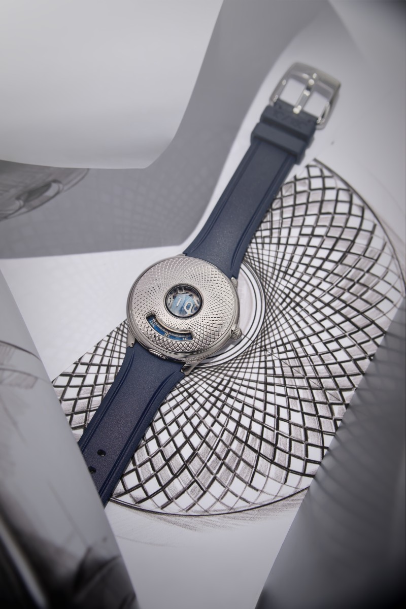
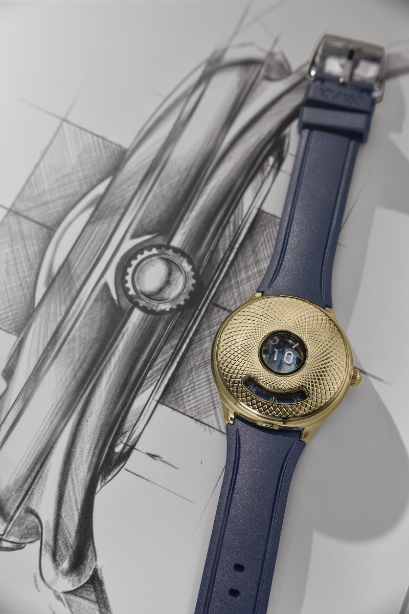
If memory serves, 2025 was a great year for jumping hour complications. Several brands made their additions to the foray, but alas, it seemed like the horology world saved the best for last. Debuting in November, Czapek unveiled its rendition of the jumping hour mechanism, the Time Jumper, just in time to celebrate its 10th anniversary. Surviving for a decade may seem inconsequential in an industry where most of the big brands celebrate their anniversaries in the realm of centuries. For an independent brand, however, 10 years is an incredible achievement. And with that, they launched a watch that is befitting the magnitude of its celebration.
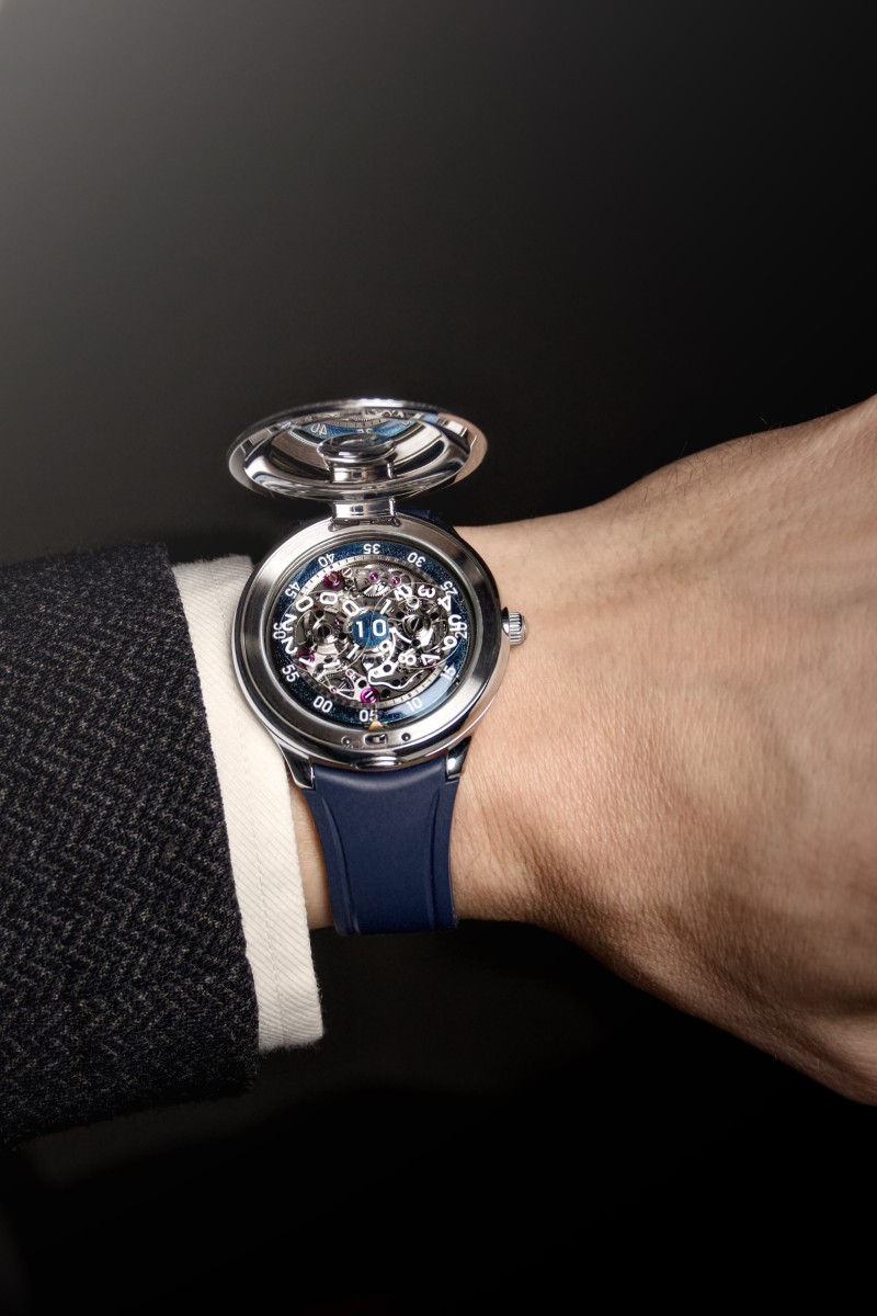
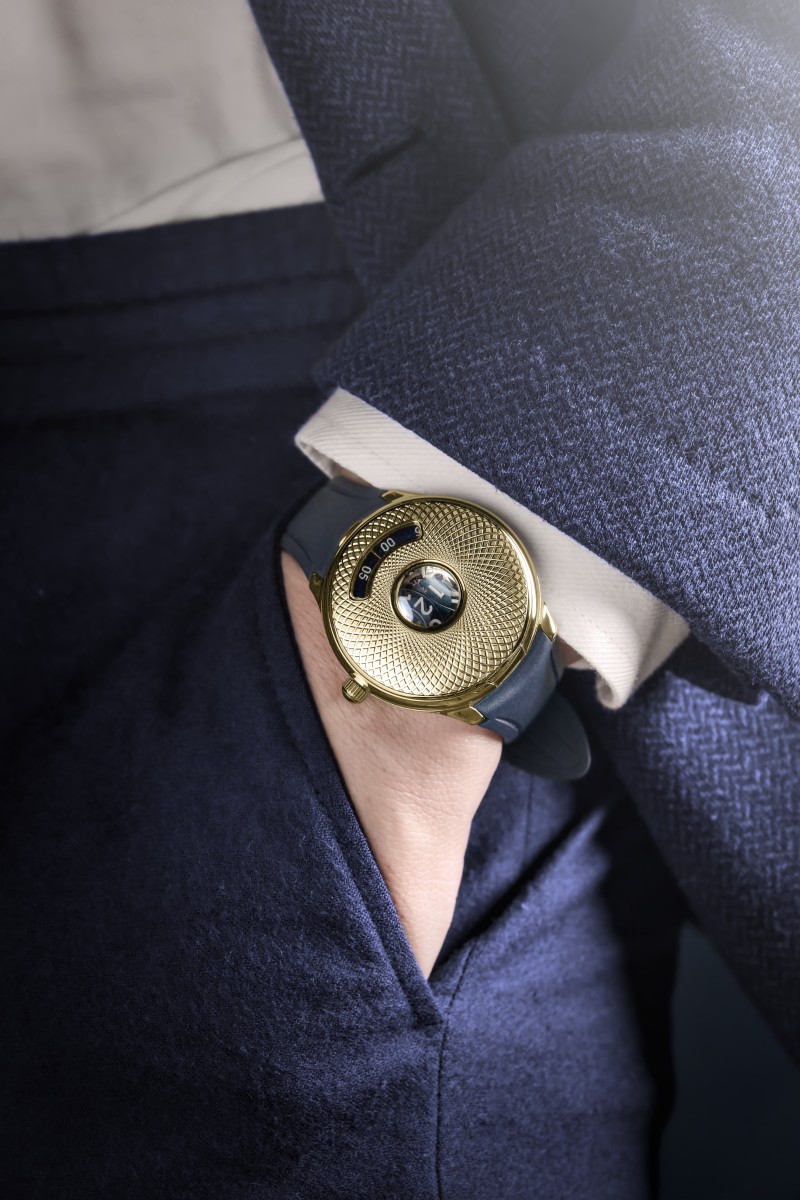
The Time Jumper is insanely cool. There is a huge digital jumping hour display smack in the centre of the dial surrounded by a traditional guilloche pattern. And if you feel like this pattern seems to be sucking, drawing the eye towards its centre, it is because it was made to do this intentionally. The design on the half-hunter cover is quite sculptural as it is curved like a pebble to give the wearer the illusion that all is being sucked into the centre of the watch, almost like a black hole. And what is at that centre point is worth gazing into. The tricky bit that comes with most jumping hour mechanisms is the amount of energy it takes to instantly ‘jump’ the hour disc, but Czapek seems unfazed by this. Their jumping hour is not the traditional single 12-hour disc as most complications of this sort seem to use, but rather, they employ the use of a big-date-style double-digit display and even offer it in a 24-hour configuration.
This is the power of their new Calibre 10. And this version, the Calibre 10.01, is imbued with the technical innovation, both a première and patent-pending two-disc jumping hour. The Calibre 10 was developed to be an in-house base calibre for more complications that Czapek wants to explore within the next 10 years. To be clear, with each new complication, they will redesign and re-engineer the Calibre 10 so it integrates the complication rather than just develop modules that will fit onto the existing infrastructure. This is counterintuitive to the standard approach of watchmaking driven by commercial or industrial optimisation, but extremely valuable to genuine collectors of horology.
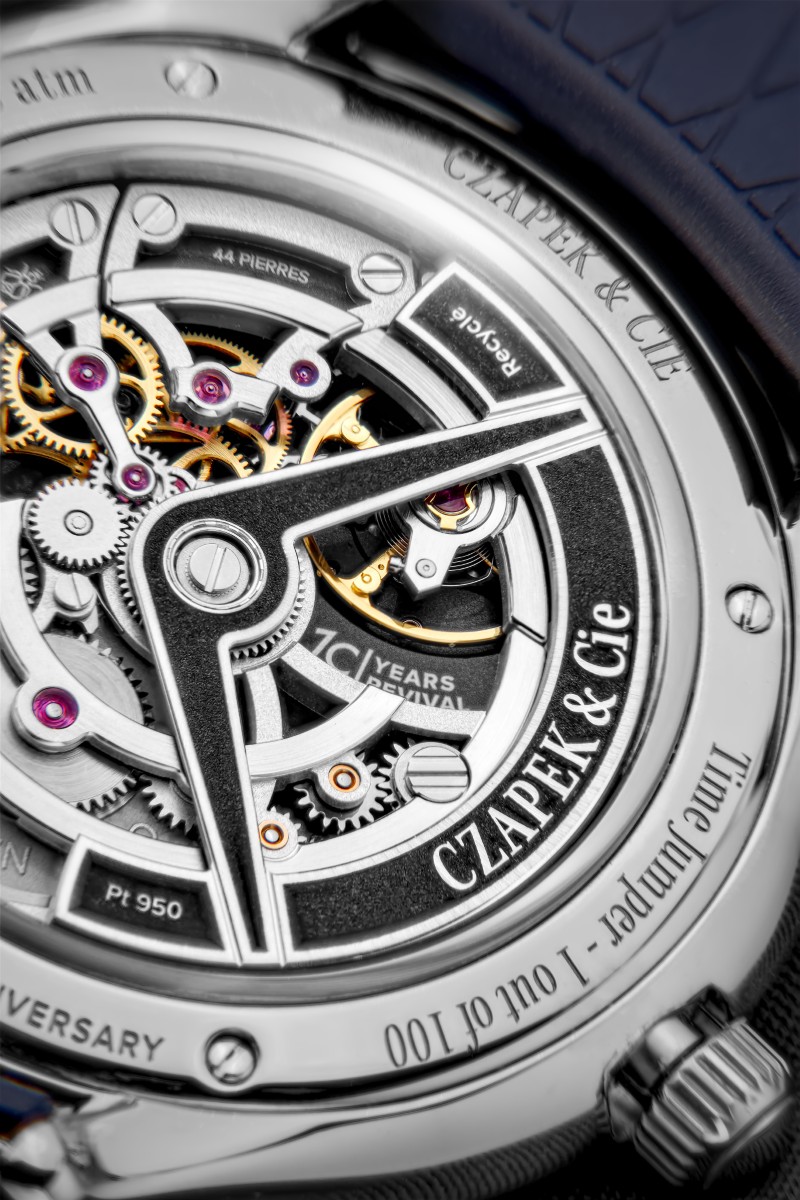
For the curious, the half-hunter case thankfully opens, revealing the inner workings of the movement. This is quite reminiscent of “popping the hood” of the car, where the sleek exterior juxtaposes against the complex engineering of the engine and other components that give the car its raw power. The Calibre 10.1 from the dial side doesn’t disappoint in this regard with enough mechanical theatrics to keep the viewer transfixed. Even on the caseback, the self-winding rotor is skeletonised and made of recycled platinum, offering all the hallmarks of a Czapek movement, like the contrasting rhodium-coated bridges with blackened plates. The Time Jumper will be available in two case materials: stainless steel with a white gold guilloché inlay, limited to 100 pieces; and a full yellow gold case and inlay, limited to only 30 pieces.
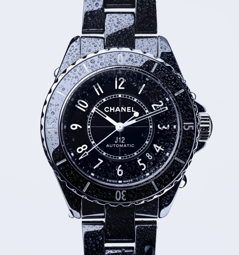
Chanel’s J12 has remained an icon since its creation and yet it can still surprise with each new launch
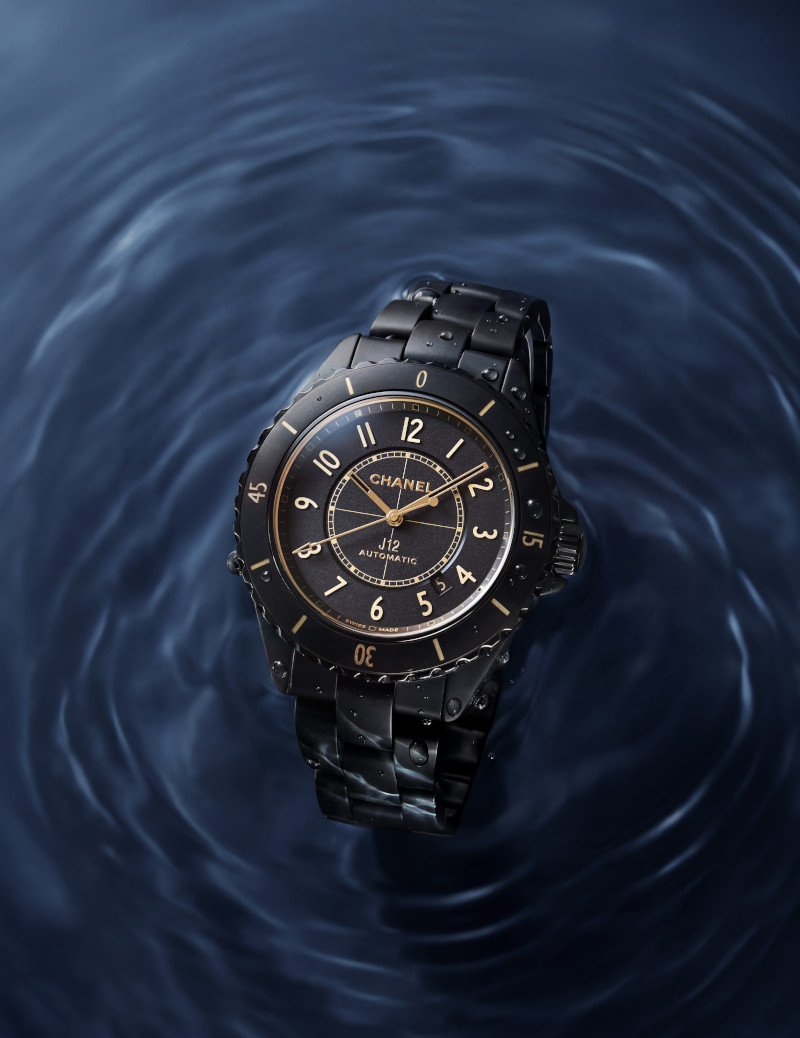
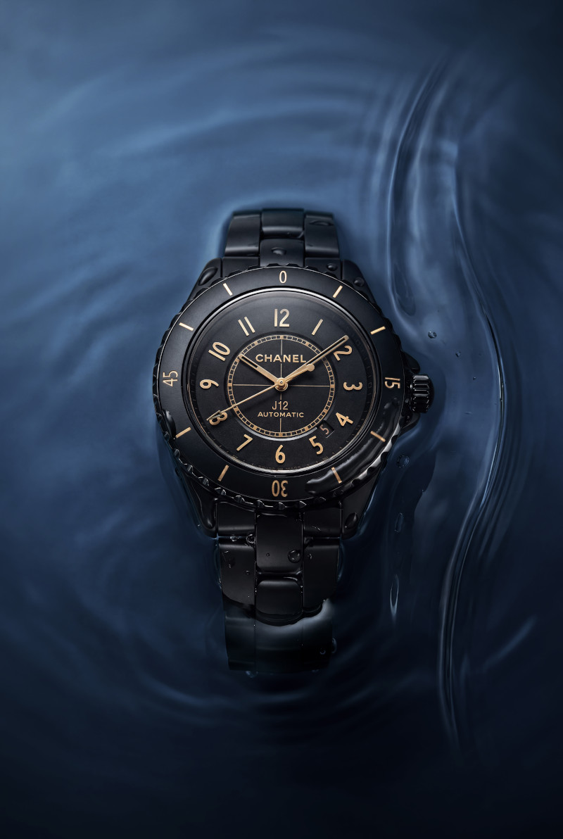
The new Chanel J12 in 42 mm matte; Styling & Art Direction Sarah Saw; Photography Li @ Helli Studio
Be water, my friend These were the words immortalised by the late Bruce Lee. And in a nutshell, the philosophy calls for adaptability. Just like water takes the form of any vessel it is put in, or absorbs force with a sense of fluidity and grace, dispersing the violent energy transforming them into mere ripples on the surface, water is mouldable to fit its most immediate needs. Yet, as formless as it is, given enough time, water can cut through stone. It is at once soft and sturdy.
The reason, however, this particular bit of philosophy works perfectly as an opening to a story about the Chanel J12 is that it serves as a great way to describe what is happening with the collection. For about 20 years since the J12 was first launched in 2000, there were only two colours of the J12, and two case sizes, 33 and 38 mm to choose from. Then in the last five years, the J12 blossomed. Redesigned for the contemporary age, updated with serious watchmaking movements, and last year, for the first time ever, the J12 came in a new blue colour, and with it a new matte finishing as well. And the expansion isn’t slowing down. This year Chanel is updating this iconic collection once again adding new sizes and a new finishing for the iconic black J12.
Its newfound versatility is one thing, but the watch as always exudes the robustness that comes with using ceramic. During its launch, it was already a material ahead of its time, in 2026, it has become a material that most brands want to use in their collections but struggle with its difficult manufacturing process. A watch that combines both versatility and robustness; Doesn’t this philosophy now seem like a perfect analogy to explain where the collection stands today?
Birth of An Icon
To understand the evolution of the J12, naturally one must first return to the year of its birth, at the start of a new millennium, the year 2000. The watch was the brainchild of Jacques Helleu, Chanel’s Artistic Director overseeing perfumes, beauty, watches, and fine jewellery, for more than four decades. As with many great timepieces, the J12 began as a personal pursuit: Helleu wanted a watch he himself would wear, one that matched his own impeccable sense of style. He had long admired the sculpted lines of racing machines, but it was the majestic silhouettes of America’s Cup yachts that truly captivated him. The name “J12” itself pays homage to the J‑Class category of these 12‑metre vessels.
The America’s Cup has always been fertile ground for luxury inspiration. Picture a race that distills human skill, engineering innovation, and flawless team orchestration into a single, high‑stakes contest. It unfolds on open water, pitting a challenger against a defender, with the winner claiming not just the trophy but the glory and the right to boast until the next duel. Even today, Chanel’s passion for boat racing persists with them being the first Timekeeping Partner and Title Sponsor of The Boat Race, one of the world’s oldest and most famous amateur sporting events, taking place over over 4.25 miles of tidal Thames in west London between Putney and Mortlake.
This blend of motorsport dynamism and nautical elegance became the foundation of the J12’s identity. From its earliest pencil sketches, the watch was envisioned as unapologetically sporty yet inherently timeless. And for a creation inspired by speed and performance, only the most advanced material would do. Thus, the J12 emerged with a full black ceramic case and bracelet — a bold choice at the time.
Today, ceramic feels almost commonplace in watchmaking, but in 2000 it was anything but. Its extreme hardness made it notoriously difficult to shape, and it was far more familiar as a protective coating on aerospace components than as a watch case. So, when Chanel unveiled the J12 with its sleek, glossy 38mm ceramic silhouette (followed by the white ceramic version in 2003), it instantly became an icon — a watch that sat on the wrist with the permanence and purity of a gemstone.
Evolution of Form
The Chanel J12 is frequently celebrated as the first true watch icon of the 21st century. And with that accolade came a challenge for the maison: how do you guide a globally recognised icon forward without compromising what made it iconic in the first place?
J12 in 42 mm ceramic; Styling & Art Direction Sarah Saw; Photography Li @ Helli Studio
The responsibility of ushering this emblem of Chanel into a new era eventually fell to Arnaud Chastaingt, the current Director of the Chanel Watch Creation Studio. His task was as delicate as it was daunting: to modernise the J12 without disturbing the very essence that cemented its legend. How do you evolve something that, by its nature, resists change? Chastaingt has had an immensely important influence on the history of Chanel watchmaking and the evidence is compelling. Since he took on the role as the director of the Watchmaking Creation Studio back in 2013, he has expanded the line of Chanel watches beyond just the J12 and Première to include BOY·FRIEND, CODE COCO and MONSIEUR which have all since become staples of Chanel watchmaking. So, if anyone could reimagine the J12, it would be him.
In 2019, nearly two decades after the J12 first appeared, it underwent its inaugural transformation. By stepping into the realm of contemporary watchmaking, the J12 unlocked an entirely new creative chapter. In this first year of renewal, the watch introduced a series of subtle yet meaningful aesthetic refinements. The bezel gained additional notches and a refreshed typeface for its numerals and markers; the crown was slimmed down; and the inner railway track on the dial was reworked with new indicators. The brilliance of this evolution lay in its restraint: at a glance, it looked almost identical to the J12 of 2000. Only upon closer inspection were the quiet sophistication of its updates revealed.
Tech Talk
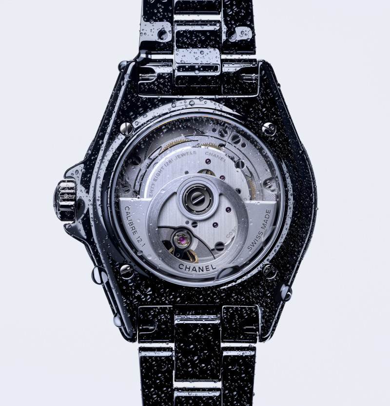
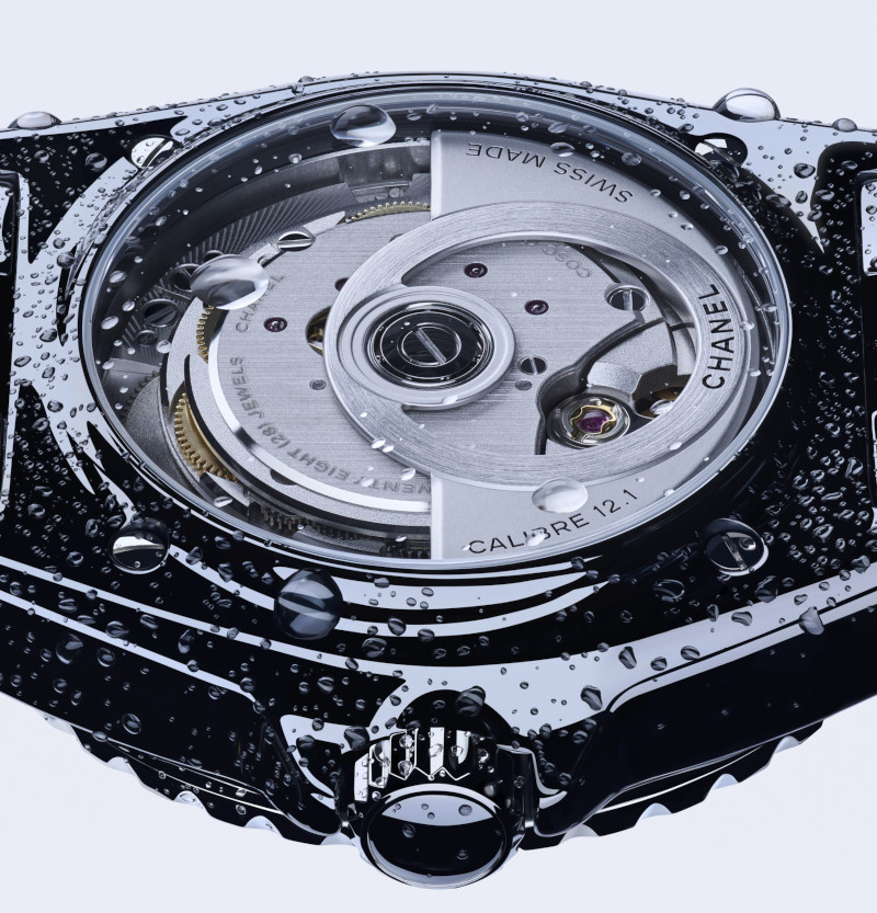
The aesthetic evolution was paired with a deliberate repositioning of the J12 as a credible force in contemporary watchmaking. And at this level, simply making superficial adjustments to pre‑made movements and assembling them into the J12 was never going to suffice. Thus, they had to move away from cookie‑cutter movements and instead adopt a true manufacture movement, the Caliber 12.1, through a collaboration with, and eventual investment in, Kenissi.
The Calibre 12.1 represented a new era for the J12 giving it a movement that could withstand the scrutiny of the Contrôle Officiel Suisse des Chronomètres (COSC). The movement is Chronometer certified meaning that it must adhere to the deviation rate of -4/+6 seconds per day making it as accurate as it is reliable. The movement also guarantees 70 hours of power reserve, well in excess of traditional standards. The best part of it all is that it manages to do all this with no fewer than 191 components squeezed into mere millimetres of thickness. In 2019, Chanel announced the purchase of a 20 per cent stake in Kenissi, just a year after they announced an investment in F.P. Journe. This effectively signalled that the brand was serious about its place in the horological food chain.
Through this partnership with Kenissi, they were not only able to equip the J12 collection with a manufacture movement that is both precise and reliable, but in 2022 they also introduced the Calibre 12.2 — a smaller‑sized mechanical movement, also made by Kenissi, for their smaller J12 size. This reduced version of the Calibre 12.1 was designed specifically to fit their smaller 33 mm models. Whereas most other brands choose to place quartz movements in watches of this size, Chanel decided it was worth investing in the creation of a smaller mechanical movement to offer its female clientele a more sophisticated expression of the J12.
Both Calibre 12.1 and Calibre 12.2 have a distinct visual aesthetic. Visible from the transparent caseback, the circular rotor, specifically crafted by the House, resembles an observatory clock. Through the openworked oscillating weight, the lively mechanism is fully visible and forms a perfect circle, a design that highlights Chanel’s obsession with balanced proportions and the discreet power of lines.
Mastery Over Materials
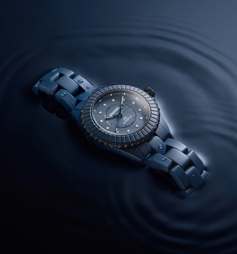
From the very beginning, the J12 was defined by its glossy black exterior, the original icon in its purest form. In 2003, Chanel unveiled a full‑white ceramic version, and for years this monochromatic duo of black and white became the visual language of the collection, regardless of function, movement, or design inspiration. Last year, however, Chanel announced a major update to their collection offering the iconic J12 in blue. A blue so far on the darker end of the spectrum that it is almost black.
The Chanel J12 in 33 mm blue ceramic and diamond indices; Styling & Art Direction Sarah Saw; Photography Li @ Helli Studio
They spent five years developing this particular shade of blue and it is hardly excessive when you consider the complexities of ceramic production. Unlike traditional metal cases, which are forged into solid tubes before being cut and milled, ceramic components are pressure‑moulded directly into their final shapes. They then undergo a sintering process, where extreme heat, up to 1,300°C hardens the material into its finished form. To introduce colour, pigments are mixed into the ceramic compound before moulding. However, heat can dramatically alter these pigments. The maximum temperature reached, the duration at peak heat, the cooling rate, and even the length of the cooling period can all influence the final shade of colour on ceramic.
Needless to say, the nearly three decades that Chanel has worked with ceramic has given them a vastly better understanding of how to bend this material to their will. This savoire faire is also the reason why they are able to offer the J12 with a fully ceramic bracelet. Unlike the relatively larger form of the watch case, the bracelet is composed of numerous tiny links. Smaller components mean less surface area, which can influence how the material behaves during sintering and therefore alter its outcome. Even after the sintering is done, Chanel still has to precisely shape the material to its final silhouette which requires a series of extremely precise mechanical processes. The result, however, is worth the effort as the J12’s ceramic construction is seven times more resistant than steel and can withstand extreme conditions tested via millions of abrasive grains, thousands of impacts and dozens of hours under the sun’s UV rays.
Last year with the arrival of a new colour, Chanel had also added a new matte finishing to the J12 collection which transforms it entirely. While the mirror polished J12 will remain as the iconic model for the collection, the matte finishing on the J12 expanded the possibilities. It gave the J12 a more dynamic aesthetic transitioning from a more eye-catching accessory on the wrist into a quieter, more subtle form of luxury.
Size Matters
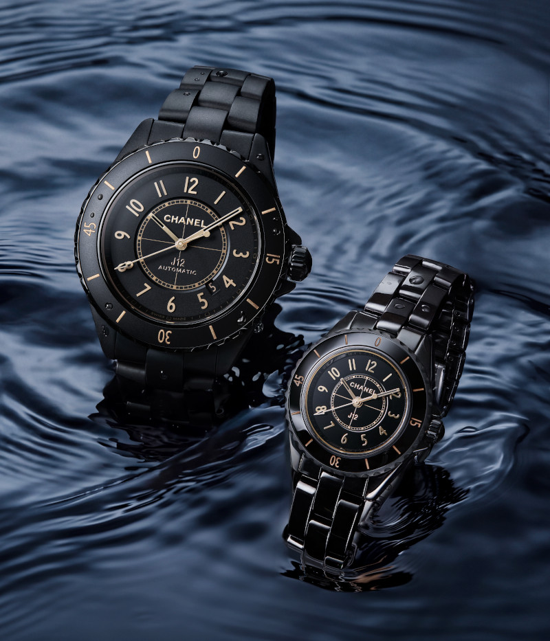
Finally, this year, the matte finish accompanies Chanel’s black J12 in the form of the J12 Golden Black. The changes are subtle, but once again the J12 is completely transformed. The combination of sand‑gold numerals on the bezel and matching indices creates an elegant yet sporty interpretation of the J12. And yes, this is the watch that introduces the first matte‑black finish in the collection. Adding to its sportiness, the J12 Golden Black also debuts a new 42 mm diameter, giving those with larger wrists the ability to wear a J12 without it appearing comically small.
At the other end of the spectrum, Chanel will also debut another new size for the J12 this year: 28 mm. The 28 mm J12 Golden Black will feature a quartz movement, as there is currently no mechanical calibre suited to such a small case size. It will also come with a polished finish instead of the matte finish found on the 42 mm model. The 28 mm, however, will not be limited to the Golden Black colourway; instead, it will be offered in six new models, including one paired with a black rubber strap.
The J12 with a 42 mm case (left) and 28 mm (right) sizes are new sizes for this iconic collection; Styling & Art Direction Sarah Saw; Photography Li @ Helli Studio
The full J12 range now spans 28 mm, 33 mm, 38 mm, and 42 mm, meaning there is a proportionate option for nearly every wrist. Then come the colours and finishes: polished or matte, black, white, or blue. The range is remarkable. With all these options, the J12 collection has become incredibly versatile. It represents a departure from the monolithic ethos of the original J12, evolving into a collection that celebrates diversity in its wearers. Thankfully, the design codes of the J12 have become so iconic within the industry that even with resized cases and new colours, a cursory glance is enough to identify the watch as a Chanel J12. It remains the same watch through and through, only now, there is a near‑perfect fit for almost every taste. So, I ask you again: has the J12 become water?
Watches & Wonders Geneva Round Up!
This is it folks, Watches & Wonders 2026 officially begins! And after all the uncertainty in getting here, we are happy to be able to walk into the Palexpo as the chaotic whirlwind of this fair unfolds. There are a bunch of brands to get through over the course of the next four days, and of course we will try to update this space as often as we can with whatever we see so bookmark this page if you want to follow our journey or visit our Instagram account @watchwowmy. Without further ado, let’s get this show on the road! And you already know it, our first stop on this journey will undoubtedly be…
This year is a big one for Rolex as they celebrate the centenary of the Oyster, the case design that basically represents the bedrock on which the brand is built upon. There are a couple of watches made to celebrate this milestone, the most obvious of which is a special Oyster Perpetual watch offered in a unique configuration. Like on the dial where “Swiss Made” is usually inscribed at 6 o’clock, now says 100 years and on the crown, there is also the number 100 in relief. There is, also a colourful new Oyster Perpetual 36 with a multi-coloured lacquer dial with the Jubilee motif. Then there is the comeback of the Oyster Perpetual Yacht-Master II and a new gold alloy on their Oyster Perpetual Day-Date 40 and a new version of the Oyster Perpetual Cosmograph Daytona. There is too much to cover in this short space so stay tuned as we unpack the Rolex launches over the course of the coming weeks.
It is the 50th anniversary of the Nautilus and Patek Philippe celebrates this momentous milestone with three very special references and an unexpected desk clock. The Ref. 5610 marking a return to the medium size first launched in the 1980s. All three limited edition Nautilus watches for the anniversary also are made with platinum cases and offer ultra-thin case constructions making them even more comfortable on the wrist. For the ultimate Nautilus fan, the desk clock Ref. 958G is designed with the iconic Nautilus design in white gold and has an 8-day power reserve. The Cubitus gets a perpetual calendar and finally it has a form movement. Granted it was adapted from a round movement but for the Ref. 5840P, it now fills the entirety of the caseback quite nicely. As usual Patek Philippe launched a massive collection of references, something for all of their collectors which we will surely get into over the next couple of months.
There are absolutely two standout models from Parmigiani this year. The first, is the Tonda PF Chronographe Mysterieux. This is the third complication to follow in the footsteps of their fantastic GMT Rattrapante and Minute Rattrapante which cleverly hides the functions with double, superimposed hands. For this watch, they are tackling the chronograph, cleverly hiding a function that normally requires plenty of subdials with the now signature Parmigiani purity. We’ll cover in a little more detail exactly how this works, and why it is a world premiere but for now, just enjoy the marvel of how this thing functions. And next, they celebrate the 30th anniversary of the Toric with a fantastic new hammered metal technique on the dial and the best part is the double-guilloche treatment on the bridges of the movement.
While the entire watch industry has been downsizing their watches, Panerai on the other hand has maintained a steadfast attitude with their massively sized watches. But this is done with good reason and it all stems back to the fact that Panerai got their start making tool watches and with the watches made to be used in these kinds of hardcore situations, a larger watch is absolutely pivotal for legibility and reliability. One of the standouts for this year is a Luminor Destro which was inspired by the Ref. 6152, a case that helped define the Panerai of today. The Destro is the first watch meant to be worn on the right within their contemporary collection. In the past, it was not uncommon for tools to be worn on both wrists of the frogmen and so the inspiration for the Destro was absolutely rooted in this. There is also a forged titanium case and a 31 day power reserve watch which we will require far more words to explain so we will leave it at this for now, and do stay tuned.
There is no doubt that the dressy elegant watches coming out from Grand Seiko have been great in terms of size and proportions. Their dive watches on the other hand, have always seemed to be a bit more robust in size. Not anymore. Following the launch and more modest sizing of the Spring Drive UFA models from last year, they have taken the philosophy and technical knowledge to the sea for 2026 offering two beautiful divers in a very wearable 40.8 mm diameter, and 12.9 mm thickness. These dive watches are even more comfortable on the wrist thanks to the High-Intensity titanium material which makes the watch relatively light despite its very technical case construction. There are a ton of little details put into this watch, and we will be covering all of it in our full Watches & Wonders report. But for now, just enjoy the beautiful depth of the dial and also a watch they are nicknaming Mystic Waterfall.
This is a big year for Moser, they moved out of their smaller space in the Carré des Horlogers and graduated to the main hall. They may be part of mainstream Watches & Wonders but they still bring the same quirky attitude that they always had. The funniest of which, in our opinion is their latest partnership with Reebok. Yes you read that right! Reebok the shoe brand. Moser worked with them to get their iconic pump onto their watches. Where the pump was to tighten the shoe, the pump on their Streamliner is used to give power to the movement. It helps that there is also a power reserve indicator in the same eye-catctching orange to let you keep tabs on how much power you are actually pumping in. Also, they have a full ceramic Streamliner and even a smaller version of this integrated bracelet watch.
This year Jaeger-LeCoultre adds a new segment to their Hybris collection with Hybris Inventiva joining the Mechanica and Artistica. And while the Gyrotourbillon À Stratosphère within this collection is impressive in its own right, we think the bigger, more relevant launch for the majority of watch lovers is the new update to the Master Control collection. It is now an integrated bracelet timepiece which gives it a morning to night versatility. Additionally this new collection also comes in a standard date version, a date power reserve, and perpetual calendar version along with the choice of steel or gold materials meaning there are options in terms of pricing as well. The bracelet feels good on the wrist and the links have quite a special pattern to its construction as well.
This year Chopard is celebrating a small but quite impressive anniversary, the 30th year of their manufacture in Fleurier. And as you can imagine, the best collection to celebrate this occasion would be with the L.U.C which represents the culmination of the brand’s expertise in watchmaking. Of course not forgetting their Alpine Eagle which has its own share of fans, Chopard is adding a range of quite unique colours to their watches including one they are calling Mountain Glow which is a kind of champagne-ish colour. Quite beautiful in real life as it catches the light and evolves in a myriad of ways.
Travel is back in a big way and for the globetrotting wanderer, this year Vacheron Constantin is pointing the overseas in the right direction. Quite literally. They unveiled the new Overseas Dual Time Cardinal Points with four references; all made with the travel-friendly titanium material. Not only are these fantastic watches extremely comfortable to wear, they are also available in four colours that were quite surprising to see from the brand. White, blue, green and brown, each are linked to one of the four cardinal points and also all come with a burst of orange for the GMT hand. Also, there are new Historiques American 1921 models that are always great to look at. The novelty for this version is the combination of a pink gold case and blue numerals.
The capsule collection from Chanel is a fantastic collection letting the designers take inspiration from any realm that resonates with the maison. This year they are taking games for a spin. Think pixelized Coco Chanel figures, Boyfriend watches with a playing card dial and of course, a chess set in full ceramic. Unfortunately the chess set is a piece unique and has already been sold. Of course, they are also expanding the J12 line with two new sizes, 28 and 42 mm, and we think now that the matte finishing has come to the black version of the J12, it will make Chanel many new converts to the collection.
Audemars Piguet is BACK! Marking the first time the brand has joined a large-scale convention since their days at SIHH where they exited just before the Pandemic hit. As for the novelties, we managed to already see them when they did their yearly presentation near the beginning of the year. We already put up some content on that one so, do check that one out. For WWG however, we decided to instead showcase their booth, which they went through a considerable amount of effort to make it an entire experience instead of just a bunch of meeting rooms for commercial presentations. There is a library, a vault and even an atelier that bends time.
Hublot this year are cutting down the number of references they are launching (thank god) and instead focusing on a few key highlights for the year. The first collection brings their in-house Unico movements back to centre stage with Big Bang watches that offer pops of colour to highlight the important bits, like the clutch and column wheel for example. Also, there are new special editions for both Usain Bolt and Kylian Mbappé. But by far, our favourite for the year is the new Spirit of Big Bang Impact Sapphire that uses a unique material called osmium, which shimmers quite beautifully on the fractured dial.
Hermès brings us to the backstage of the theatre this year, revealing all the gears and pulleys that make the magic happen. This was the inspiration for their novelties this year, which translates to them skeletonising or open working most elements to show the wearer exactly what makes their watches tick. The recent H08 collection writes their next chapter this year by offering a new, skeletonised movement that transforms the look of the watch entirely. The H08 skeleton is entirely refreshing, bringing all the beloved elements from the original with the added allure of a skeletonised movement. Oh, and did we mention it has luminous blocks for indices?
The big news out of Cartier, at least for us, this year is that incredible bracelet on the Santos Dumont. Fantastically supple and comfortable on the wrist, it reminded us very much of the Panthère from a few years back which also had a really comfortable bracelet. However the version on the Santos Dumont is considerably more masculine, do with that what you may. Also, celebrating the 10 anniversary of the Cartier Prive, there are three watches, a mono-pusher Tortue Chronograph, Tank normale and of course the skeletonised Crash each with its own burgundy touches. And considering a Crash just broke a record at auction, you can probably guess where our attention is regarding the three.
Three letters G F J, that’s what we would say when asked about Zenith this year. On the back of last year’s relaunch of their ultra precise G.F.J. collection, this year they are adding two very special editions to the collection. One is a yellow gold version with a bloodstone dial offering that very tried and tested combination of green and yellow gold. The second and, by far, a personal favourite is the version with an onyx dial and diamond indices. The best part about this limited edition is that the case is made from tantalum. I am obsessed with the heft of the metal, and of course the Calibre 135 that beats within. Additionally the Chronomaster Sport gets a new bracelet with a ton of improvements which is impressive considering the actual size of their organisation.
It is the dawn of a new era for Corum. They are back in Swiss hands and even have a new CEO leading the brand. Since this happened last year, their first major novelties have been announced and it comes as no surprise as they chose to revamp the Admiral. It is one of the iconic anchors of Corum and more importantly it feeds the current appetite for steel sports models with integrated bracelets. The design of the new Admiral actually borrows heavily from its heritage but comes packed with a brand-new in-house movement. Equally impressive is the very retro looking bracelet that is comprised of five links with many clever design choices built in. Looking at the novelties, they are indeed off to a good start, and the fact that they are in the fair this year means they are already gearing up to bring Corum back to where they once were.
The Monarch has graced us with its presence in Watches & Wonders Geneva representing an all-new collection for Tudor. The case is angular, the dial is a vintage brown and the hands still have that cool snowflake flair. This is definitely an interesting collection for the brand as it straddles the line between vintage and contemporary, but more importantly looks like nothing else in the brand’s current repertoire. Speaking of royalty, Tudor also redesigned their Royal with a new fluted bezel, and offering the day-date combination in 40 mm and just a date with the 36 mm. There is also a new colour for the Black Bay 54 and a full ceramic bracelet thrown into the mix.
Van Cleef & Arpels lives up to their standards of poetic complications by offering this year a new entry into the Jour Nuit collections, this time, honouring the moon. The craftmanship and styling of the watch is do doubt gorgeous, but to me, the movement is something that was entirely novel. The premise of the Midnight Jour Nuit Phase de Lune watch is the massive day-night indicator that takes up the upper half of the dial. What is impressive however is the phases of the moon (hence the name) that not only indicates when the moon is in the sky but also offers an indication of its phases. This means, the moon has to be separated out onto another level adding to its complexity. Additionally, the entire thing can also be rotated on demand to let the viewer see both the sun and moon in one fell swoop. There are also a lot of interesting metiers d’art techniques on their novelties for the year and we will continue to dive deeper in the coming months.
It is all about the chronograph for TAG Heuer in 2026 and for Watches and Wonders they chose to celebrate this with, none other, than the iconic Monaco. The first and probably more relevant to enthusiast is the redesign of the square Monaco case. The new version sits tall and proud on the wrist, and is a perfect square. But just making a sharp square case will probably not be too comfortable on the wrist, so there are also some ergonomic improvements to this case on the wearability as well. On the top end there is a highly innovative new chronograph which they are dubbing the Evergraph. This uses a flexible bistable component to replace traditional components resulting in less friction and less wear and tear on the chronograph mechanism, hence the name Evergraph. And of course, they put it in a Monaco case.
Finally, the Octofinissimo gets a smaller size! Bulgari is shrinking this multi-record breaking collection, going from their 40 mm case to a more manageable 37 mm. This is not exactly in accordance with the current trend of smaller watches because also on paper it reads as 37 mm, the actual watch because of its angular and square-ish case, still wears like a 40 mm when compared to round watches. What this new size does however is reduce the overhang from the bracelets for those with smaller wrists making it much more comfortable to wear. For now, there are only three hand movements for this new size but there are a bunch of new finishings including a brushed steel and brushed gold versions which give the collection more options. I wonder if they are going to attempt breaking records with this smaller size. Now that would be a real feat, and perhaps something to keep them busy for the next 10 years…
The “highlight” for Lange this year has to be the Lange 1 Tourbillon Perpetual Calendar “Lumen”. Basically they took the most complicated Lange 1 model and made it even more complex to manufacture by replacing many of the display elements with luminescent pieces. Pay special attention to the time indicator subdial, and on the indices you will notice a new method of lume. Where the previous Lumen models use solid blocks of luminescent material for the indices, for this watch, the underside of the crystal is laser etched and filled with lume. What this does is give the indices a nice lume outline, but also because the lume is on the underside of the dial, it reflects off the components of the watch in an entirely pleasing way. Additionally, they also shrunk down the Saxonia Annual Calendar to a very distinguished 36 mm. Needless to say, they built an entirely new movement for this.
From the skies into space, IWC takes that leap offering a new watch called the Pilot’s Venturer that was designed from the ground up for astronauts. The main thing to understand here is that because astronauts generally wear thick gloves, they designed this timepiece to be set without a crown. Instead, there is a little slide button on the side of the case and pushing it allows the wearer to set the time via the bezel. The watch is also a true GMT which if you are in space can be used to track the timezone of your loved ones back home. If you are not planning to go to space in the near future however, the new perpetual calendars with the ProSet mechanism which allows setting forwards and backwards is one that will probably be more meaningful. And how can we forget, Ceralume has also come out of the concept phase and is now available on a production model as well.
When it was first launched, the Ulysse Nardin Freak was revolutionary for the watch industry. And over the last 25 years, the brand has slowly been updating and innovating the technology of this unique timepiece. And all this experience culminated into their launch for Watches and Wonders 2026, a watch which they are calling the Super Freak. Two flying tourbillons on a 10° incline, linked by arguably one of the smallest differential systems. And the entire thing is on a flying carousel movement that rotates on its own axis. There is a ton of technology within this mechanical contraption. We will get to that soon enough, but for now please just enjoy the theatrical performance of the Super Freak.
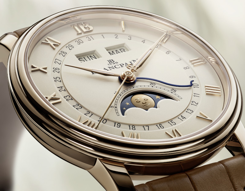
Blancpain's latest Villeret update is complexity disguised as simplicity
Villeret Quantième Complet
If I were to ask, right now, what Blancpain is known for, the answer would invariably be the Fifty Fathoms. Quick, what is the other collection that Blancpain produces? It is only the most invested of the watch nerds that can immediately answer Villeret. It is true that Blancpain is often synonymous with the watch that has sparked many debates about the world’s first dive watch, the Fifty Fathoms. However, all things considered, this feat represents but a drop in the ocean (sorry, couldn’t resist) of Blancpain’s history.
What if I told you that within Blancpain exists a separate timeline where its movements, especially the ultra-thin ones, were once renowned in the industry and even supplied to brands like Patek Philippe, Audemars Piguet, and Vacheron Constantin? The legacy of this savoir-faire suddenly becomes conspicuous when you shift your attention to the Villeret collection, where most of the traditional complications are found. There is no better time to pay attention, because recently Blancpain updated this collection with 16 new references within three iconic models. At the centre of it all is a gorgeous, earthy colour palette of brown and beige that recalls the magic of the golden hour.
A TALE OF TWO CITIES
The Blancpain insignia clearly indicates that the brand was first established in 1735, making it one of the oldest watchmaking brands still in existence today. However, to really understand Blancpain in its current form, there are actually two separate timelines that eventually merge in relatively recent times. The first is, of course, the one with Jehan-Jacques Blancpain, who registers himself as a watchmaker in Villeret back in 1735. Jehan-Jacques’ grandson, Frédéric-Louis, would later go on to upgrade the Villeret workshops and, in turn, his son Frédéric- Emile Blancpain would then rename the company to Fabrique d’horlogerie Emile Blancpain and turns it into the largest watch manufacture in Villeret.
Betty Fiechter who ran Blancpain from 1932 until her retirement
Then begins the next chapter in Blancpain history, where Frédéric-Emile Blancpain, upon his death, leaves the company to his long-term assistant, Betty Fiechter, in 1932, who became the first female CEO of a leading watch company. Then, in 1950, Betty brings her nephew, Jean-Jacques Fiechter, into the fold, co-managing Blancpain until she retires 20 years later. The story of how Jean-Jacques Fiechter and his personal experience with diving gave birth to the now legendary Fifty Fathoms dive watch has already been immortalised and recounted numerous times, especially so in 2023 when the brand celebrated the 70th anniversary of the Fifty Fathoms.
Before moving on to the next chapter of Blancpain after Fiechter’s stewardship, its best we rewind the timeline to 1859 for the second track that is paramount to Blancpain’s history. For this, we journey more than 100km southwest of Villeret to the Vallée de Joux, more specifically Le Brassus, where Louis-Elysée Piguet transforms an old mill into his watchmaking workshop. Louis- Elysée Piguet is a name that is not quite commonplace in today’s horology landscape. No, he is not the Piguet from Audemars Piguet, but rather, he is the founder of what will go on to become the important movement manufacture, Frédéric Piguet.
I can’t go into the entire history of Frédéric Piguet here, as I neither have the space nor the knowledge for this. However, what I can say is that the gist of it is that they were important players in the horology innovation space and were important movement suppliers to some of the biggest names in the watchmaking industry. One such example is the Frédéric Piguet Calibre 21, which, at 1.75mm thick, held records as one of the thinnest movements. It was made in 1925, and the movement, along with its derivatives were used by the so-called holy trinity of watchmaking: Patek Philippe, Audemars Piguet and Vacheron Constantin, and even brands like Jaeger-LeCoultre and Cartier.
Villeret Extraplate with an opaline dial and stainless steel case
At about this point, one must be wondering why all of this is relevant to our story about Blancpain, and the point of convergence lies in the chapter right before the Blancpain we know today which is a part of The Swatch Group. In 1961, Blancpain became part of the Société Suisse pour l’Industrie Horlogère (SSIH) alongside Omega, Tissot and Lémania as the movement producer for the group. However, by 1982, Blancpain was no longer as active as it once was, and it was Jacques Piguet, the heir to the family business created by Louis-Elysée Piguet, who bought Blancpain from the SSIH.
Jacques Piguet’s intention was to link Frédéric Piguet movements with the Blancpain brand. And to accomplish this, he teamed up with Jean-Claude Biver, who together coined the now immortal slogan “Since 1735, there has never been a quartz Blancpain watch. And there never will be.” To demonstrate how serious they were at the time about preserving traditional watchmaking, they set out to create a collection of six masterpieces: a complete calendar moonphase, ultra-thin, perpetual calendar, minute repeater, split-seconds chronograph, and flying tourbillon. And the true reason all of this is relevant to a story about an update to the Villeret collection is that these six masterpieces were all created with a design philosophy that is still very much alive in the Villeret collection of today. Just do a quick online search for these masterpieces, and you will see the resemblance.
The Villeret Quantième Complet with an opaline dial, stainless steel case and an alligator leather strap
Just to showcase the success of this philosophy and perhaps to highlight the appetite for traditional mechanical watches that persists until today, Hodinkee indicates that Jacques Piguet and Jean-Claude Biver acquired Blancpain in 1981 for CHF 21,500 and in 1992, he sold both Blancpain and Frédéric Piguet to the SMH (Swiss Corporation for Microelectronics and Watchmaking Industries) which will later on become the Swatch Group, for a whopping CHF 60 million. In 2010, Frédéric Piguet was merged into Blancpain, and this is also the reason why, although the name of the collection and indeed the birthplace of Blancpain is in Villeret, they no longer have facilities there. Instead, they operate out of three locations, Le Brassus and Le Sentier, both locations tied to Frédéric Piguet’s manufactures and a watch finishing department in Delémont, which was created in June 2022 through the merger of the Manufacture with Simon et Membrez SA. In fact, remember the old mill that Louis-Elysée Piguet bought in 1891 in Le Brassus, it is now a Blancpain workshop, renamed “The Farm”, where the most demanding and challenging complications are produced.
VILLERET AND BEYOND
Even though we have established that the modern Blancpain no longer has a presence in Villeret, the town still remains an important place in the brand’s history. Villeret, pronounced “ville-ray,” has a quirky backstory whereby an anagram of the word was used as the name of the company. It was about the time when Betty Fiechter took over the running of the brand, and due to Swiss law, they had to rename the company because it was no longer family owned. And it was then they renamed the company Rayville SA, an anagram of Villeret. And if you’ve ever seen a Fifty Fathoms watch with the name Tornek-Rayville on the dial instead of Blancpain, there is a whole other story about how this company was formed to supply the United States Military divers in the 1960s. But, I digress. Anyway, the gist of it is that the name Villeret remains incredibly important to Blancpain. It was in Villeret that Jehan-Jacques Blancpain first registered himself a watchmaker back in 1735, and thus, today, the most classical expression of Blancpain’s watchmaking is cradled within the collection of the same name.
The Rayville S.A. building after Blancpain was briefly renamed during the Fiechter era.
It was during the Jacques Piguet era of Blancpain where perhaps the spirit of today’s Villeret collection took form. The dedication to preserving and, more so, advancing mechanical watchmaking was a bold statement when you consider that during this time in the 1980s, many timekeepers were turning to quartz movements, which were more affordable to produce and could be done in greater quantities. The complete calendar moonphase launched in 1983 marked a turning point in the brand’s history. “This timepiece was more than a tribute to horological tradition,” recalls Marc A. Hayek, President and CEO of Blancpain. “It opened new perspectives and reignited interest in mechanical watchmaking.”
The list of references within the Villeret collection reads like a compendium of horology. It starts from the deceptively simple ultra-thin model and works its way up in terms of complexity to include tourbillons, complete calendars, perpetual calendars, minute repeaters and a combination of complications. One particular Villeret model that I remember being impressed by was a reference combining the Tourbillon and Carousel which then led me to discover the important distinction between the two. Even when they achieved the highly complex and, at the time, world premiere, Chinese Calendar in 2012, it was housed in the Villeret collection. The underlug correctors for perpetual calendars which was also patented in 2005, the Villeret collection. And the latest, world premiere, the Grande Double Sonnerie, which is discussed at length further back in this issue, you guessed it, the Villeret collection.
The Blancpain Villeret Quantième Complet (left) in a 40 mm red gold case and Villeret Quantième Phases de Lune (right) with a 33.2 mm red gold case
The point is, while the Fifty Fathoms can oftentimes be the dominant collection within Blancpain, because everybody loves a good dive watch story, the Villeret collection traces the roots of Blancpain as watchmakers. It blows past the 1953 timeline of the Fifty Fathoms going back centuries instead of decades, to a time when the Blancpain name and Louis-Elysée Piguet were renowned for the ingenious design of their movements.
THE GOLDEN HOUR
The Villeret collection officially adopted its name in 2003, but as we have previously established, its true impetus dates back to 1983 with the launch of the, then, smallest complete calendar moonphase of its time. Not only did this first timepiece make a statement about Blancpain’s commitment to mechanical watchmaking, but it also represents the merging point with Frédéric Piguet and with it, its centuries of horology know-how. The timepiece from 1983 also defined the codes of the Villeret collection, namely its double stepped case and understated aesthetics, a design philosophy which still persists in the modern Villeret collection.
Last year, when Blancpain announced an update to the Villeret collection in the form of the Golden Hour, we thought it was just a couple of new colours for the dial. We were, undoubtedly, mistaken because unpacking this release, which comprises 16 new references across three references and two case sizes, it is obvious that this represents a new path forward for the storied collection. The dial, of course, represents a huge part of this update with new autumnal shades, including a stately opaline and a sublime golden brown dial with a sunburst pattern that will add to the variety of the Villeret silhouette. However, under the scrutiny of a loupe, the new Golden Hour collection represents far more than just a colour update. There are plenty of design details that have been subtly adjusted to bring the overall package to the next level.
The signature double stepped case has been adjusted so the bezel is slimmer, giving the watch the aesthetics of a larger dial without having to actually increase the case size. Then, the thinner profile, along with the reworked lugs and larger crown, work together to lighten the case without compromising on its presence on the wrist. Additionally, the 12 on the dial has also been replaced with a “JB” symbol to further pay tribute to Jehan- Jaques Blancpain, the founder. On the back, the oscillating weight has now been open worked to a larger degree so that it doesn’t hinder the view of the movement through the caseback. And with the addition of a system of interchangeable straps and clasps, the watch is now a lot more pleasant to wear.
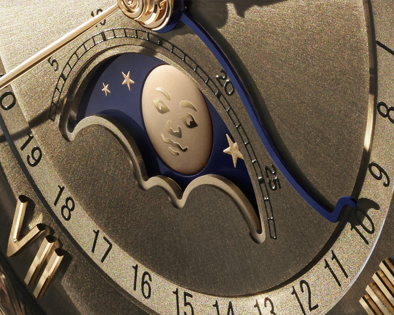
By far, my favourite update to the Villeret collection is the change to the iconic moonphase indicator. Firstly, the aperture has been enlarged so you see more of the moon, and now their expressive moon face has been transformed to an applied gold moon dome that has been satin finished. Reading this, it may not seem like such a big deal, but put the old and the new moonphase side by side, and the improvements to its legibility are obvious. And speaking of legibility, all 16 references have also been given Super-LumiNova on their hands.
These improvements to the Villeret collection will be adopted across the three references in the Golden Hour update. This includes the complete calendar with a moonphase indicator in a 40mm case (Villeret Quantième Complet), an ultra-thin automatic three-hand model also in the same case size (Villeret Extraplate) and a moon phase calendar in a smaller 33.2mm case (Villeret Quantième Phases de Lune). Each of these models will come with a choice of the opaline or golden brown and will offer either a stainless steel or 18K red gold case.
“The Villeret embodies the very essence of Blancpain,” concludes Marc A. Hayek. “Each of its evolutions, therefore, requires great attention. It is both the expression of our watchmaking tradition and the proof that timeless elegance can always be reinvented with subtlety. One is never overdressed or underdressed with a Villeret.”
Rolex celebrates 2025
In 2025 Rolex defied expectations with their novelties. It celebrated not just craftsmanship and design but also pushed watchmaking innovation to new horizons. Perpetually driven by their will to do things better, more efficiently and more durably, they push themselves and the art of horology to the next level.
Chanel’s New J12 Campaign Celebrates Its Provenance As A Modern Watchmaking Icon
The ocean has always been the ultimate proving ground for both man and machine, a vast blue expanse that remains a challenge to all who seek adventure on its horizon. From the legendary trials of the Greek mythological hero, Ulysses, to the gruelling determination of solo trans-Atlantic navigators, the sea’s influence spans the ages. It was this exact spirit, a universal instinct for exploration, that birthed a modern watchmaking icon: the Chanel J12.
To understand the J12, you have to look toward the horizon at the sleek silhouette of a racing yacht. Jacques Helleu, the late Artistic Director for Chanel, didn't set out to make just another fashion accessory; he envisioned a sports watch that spoke the language of competitive sailing. The result was an exceptional creation that revolutionized the world of watchmaking from the moment of its birth. While the collection has since expanded into brilliant whites and deep blues, it began with a singular, disruptive challenge, the decision to create an entirely black watch. Black was the natural choice, as Mademoiselle Chanel famously noted it as the colour which surpasses all.
For Arnaud Chastaingt the current director of the Chanel Watchmaking Creation Studio “[The] J12 was born from an act of radical creation. Without compromise or permission, it took hold like a revolution, challenging the traditional codes of watchmaking. This unbridled creation literally changed my perception of watches and was an inspiration to me. So much more than an icon, J12 is a manifesto of emancipation and audacity: it’s resistant to everything, especially trends.”
What makes the J12 a permanent fixture on the wrists of serious collectors isn't just the branding, it’s the material science that asserts itself through surprising durability. The J12’s signature ceramic is a study in contradictions, offering an invincible softness that feels as smooth as silk against the skin while remaining seven times more resistant than steel. The journey from raw powder to a finished case is a high-stakes gauntlet where raw material is placed in a mould and subjected to a combination of heat and pressure to give the piece its basic shape. The ceramic only acquires its legendary resistance to scratches and the effects of time after being heated to over 1,300°C in the Manufacture. After cooling the craftsmen at the Chanel manufacture refine the rough shape through a series of mechanical processes requiring extreme precision before a final polishing stage makes the material shine. It is this highly technical process that elevates the J12, allowing it to stand tall in the horology industry overpowering the stigma that some collectors put on the “fashion label watch”.
Yet another reason for its legitimacy in the industry is the Calibre 12.1, a state-of-the-art self-winding Manufacture movement. Assembled at the Kenissi Manufacture, which is co-owned by Chanel, the Calibre 12.1 provides the horological prowess to match the watch's iconic exterior. The sapphire crystal case back of the J12 can now proudly reveal this movement, rendering the invisible visible and proving that for Chanel, the reverse side must be as beautiful as the front. Designed by Arnaud Chastaingt, the movement features a unique circular rotor that turns slowly like an observatory clock.
This movement is far more than a highborn design; it is a genuine example of technical design that proves its reliability day after day. Chronometer-certified by the COSC, the Calibre 12.1 is at the very least accurate to -4/+6 seconds deviation per day, and guarantees a power reserve of 70 hours, which is well in excess of traditional standards. With water resistance up to 200m, the J12 is designed to maintain its allure whatever the tides may bring.
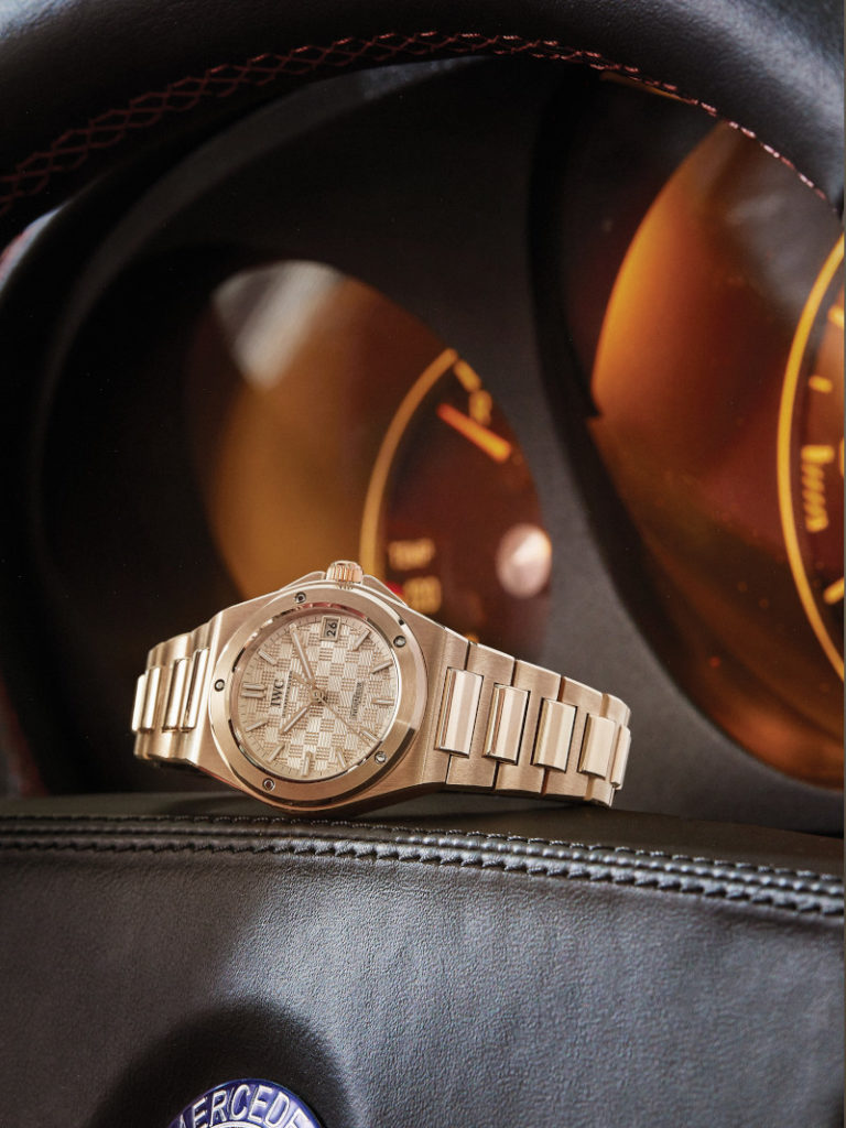
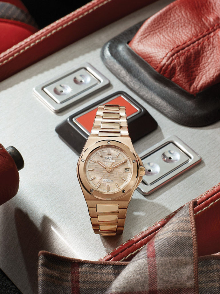
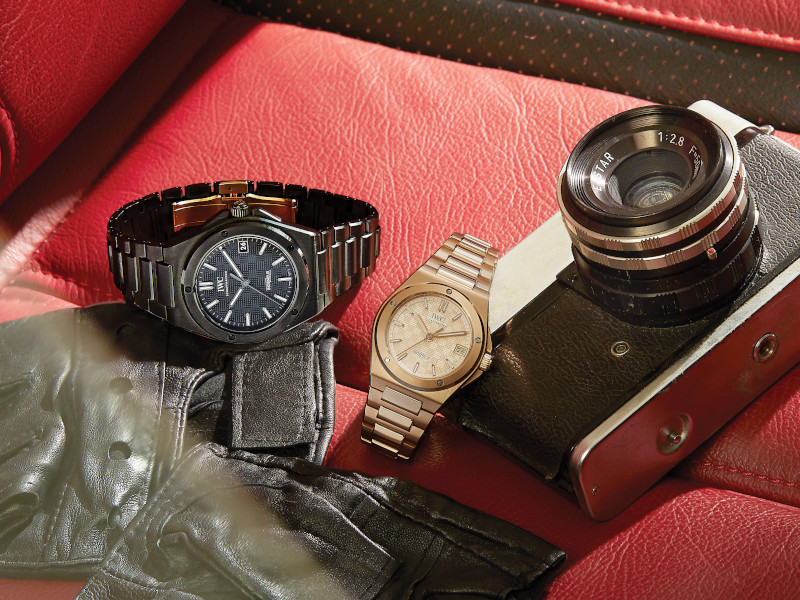
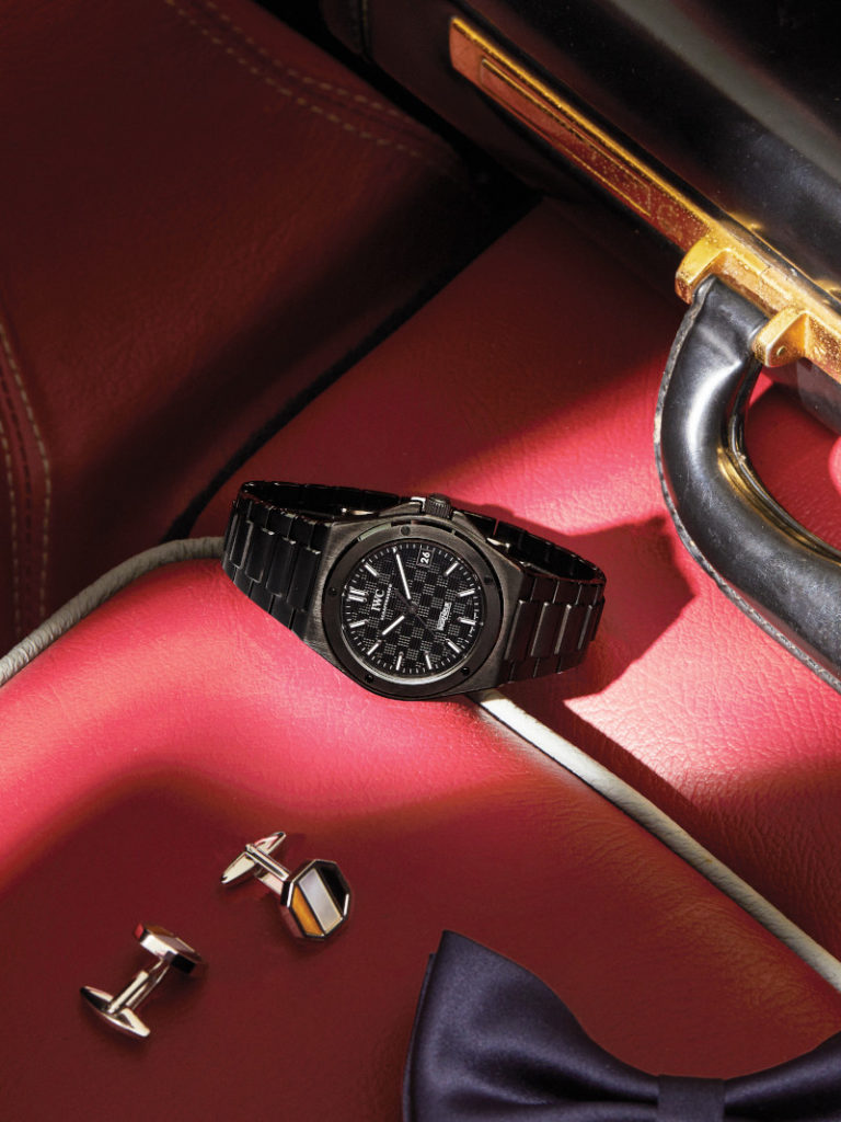
The Fall and Rise of IWC's Famed Ingenieur
IWC Ingenieur Automatic 35 in 18K 5N gold | Photography Xerxes Lee; Photographer's Assistant Din @ Awesome Image Studio; Styling & Coordination Sarah Saw
They called it their most brilliant failure. And frankly, I respect that IWC had the guts to label their original Ingenieur for what it was. A brilliant failure. Sometimes in the watch industry, things don’t work out, and whether it’s the design or marketing, or a combination of these and perhaps other factors, the Ingenieur didn’t quite become a sensational hit. Not many brands dare to admit when they got it wrong. But IWC did, and as the decades crept by, the collection was slowly consigned to obscurity, going to rest within the brand’s vast archives.
Unlike time, which steadily moves forward in a linear fashion, trends tend to be cyclical, and now, 70 years later, the demand for sporty, more casual timepieces with integrated bracelets is peaking in demand. This was exactly the moment that IWC chose to bring back this so-called failure. They had the chance to look with fresh eyes upon the Ingenieur collection and right the wrongs of their predecessors. With all of their amassed technical experience, design refinement, and business acumen, in 2023, the Ingenieur was relaunched, this time to an audience hungry for everything it stood for. And IWC is confident that timing, tastes, and savoir-faire are in alignment. They are confident that this time they have got it right because for 2025 the Ingenieur line has been expanded to encompass a variety of case sizes, material options, and even its first complication.
MOMENTOUS FALL
Much like the executives at IWC, to understand why the early Ingenieur failed, one has to travel back in time, going back to the impetus of its creation. At the time, IWC thought they had identified a gap in the market, making a watch that was targeted directly to engineers. Hence the name, Ingenieur. The idea was to offer a timepiece that was highly resistant to magnetism, which would thus appeal to the engineers as they often work with machines that generate significant electromagnetic fields.
The original Ingenieur SL or Ref. 1832
The very first Ingenieur was launched in 1955, the Ref. 666, and IWC put a soft iron cage between the case of the watch and the movement to protect the regulating organ from the magnetic fields. The resulting watch was antimagnetic up to 1,000 gauss, which roughly equates to 80,000 A/m. According to Christian Knoop, IWC’s Chief Design Officer, this method of using a soft iron cage to shield the movement from magnetism had already been developed earlier for the Pilot’s Watch Mark 11 in 1948 for the British Royal Air Force and was adopted for the Ref. 666. What is new for this Ingenieur, however, was the Calibre 8531 that was the first of IWC’s movements to use the now-famed Pellaton winding system. Although this meant that the watch was incredibly functional, the sacrifice came at the cost of a greater thickness. Reports suggest that the Ref. 666 was 36.5mm in diameter and 13.2mm in thickness.
The very first Ingenieur didn’t quite look like the Ingenieur of today. Instead, it was dressier and came without a bezel. The true spiritual origin of today’s Ingenieur came a little later in 1976 with the debut of the legendary Ingenieur SL “Jumbo”. Not much has been said about whether the Ref. 666 was successful, but it was replaced in 1967 with the Ref. 866, and already by the end of the 1960s, there were talks of a “new, heavier Ingenieur Steel model” among IWC’s management. Gérald Genta was already known to IWC, having designed a steel chronograph model for the brand in 1967, which never materialised. So, they commissioned him to create this new Ingenieur, and in 1976, the Ingenieur SL “Jumbo” Ref. 1832 was born.
The legendary watch designer Gérald Genta
The Ref. 1832 was nicknamed “Jumbo” because it came in a 40mm case, normal by today’s standards, but quite a bit bigger than the watches of the 1970s. Just as the original Ref. 666, the Ingenieur SL also had a soft iron inner case which shielded it from magnetic fields of up to 80,000 A/m. Funnily enough, when asked what the SL actually stands for, Hannes Pantli, IWC’s veteran Sales and Marketing Director, says, “They did not have any specific meaning. For the Italians, it meant “Super Lusso”, for the French “Super Luxe”. But you could also have interpreted it as “steel” and “luxury”. To be honest, we never actually committed ourselves, and that is why there’s never been an official answer to the question. The truth is that we were inspired by a well-known model produced by a German car manufacturer.”
Unlike some of the other Genta-designed watches of the time, the Ingenieur just never found its footing. It could have been that the watch felt large, heavy, and almost bulky on the wrist for the watch wearers of the time, in contrast to the slim and precise quartz watches, which were starting to flood the market. It could also have been that the Ingenieur SL commanded quite a high asking price at CHF 2,000. According to Patli, “The termination of the Bretton Woods agreement in 1971 uncoupled the convertibility of the US dollar to gold. In the early 1970s, a dollar was still buying you 4.30 Swiss Francs, but by 1978 the rate was down to less than 1.50. That made our products much more expensive abroad.”
Between 1976 and 1983, IWC tried various iterations of the Ingenieur, some in a steel-gold combination or pure gold, some with quartz movements, but it just never found commercial success. Within this time, just a little over 1,000 pieces were sold. As you can imagine, when collectors started to become aware of this Genta-designed gem in the 1990s, it suddenly became one of the most sought-after watches from IWC’s history, driving prices sky high. Demand and supply, simple as that.
SECOND WIND
In the decades that came after the Ingenieur SL, IWC has tried many times to revive the Ingenieur collection without much impact on the market. With the version that was relaunched in 2023, however, they may have found a winning formula. Interestingly, according to Christian Knoop, there was an idea to just re-issue the original Ingenieur SL, which I think would appeal to quite a number of watch collectors, but Knoop says, “Initially, we discussed that idea but quickly discarded it because merely reissuing a historical design does not fit in with our aspirations for the Ingenieur collection. As engineers and designers, continuously improving and perfecting something that already exists is our DNA. Evelyne Genta, Gérald Genta’s long-time spouse, business partner, and founder of the Gérald Genta Heritage Association, told us her husband was constantly developing his ideas and refused to cling to old designs. Ultimately, that encouraged us to take the Ingenieur SL as the starting point for a new and contemporary interpretation.”
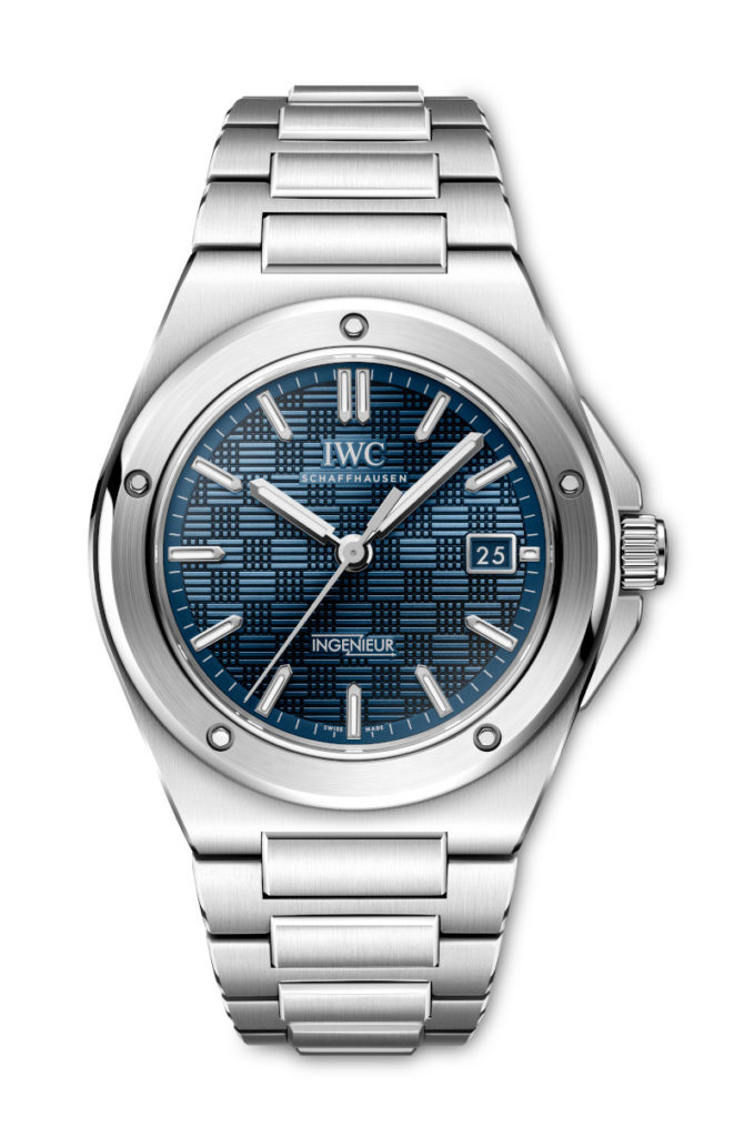
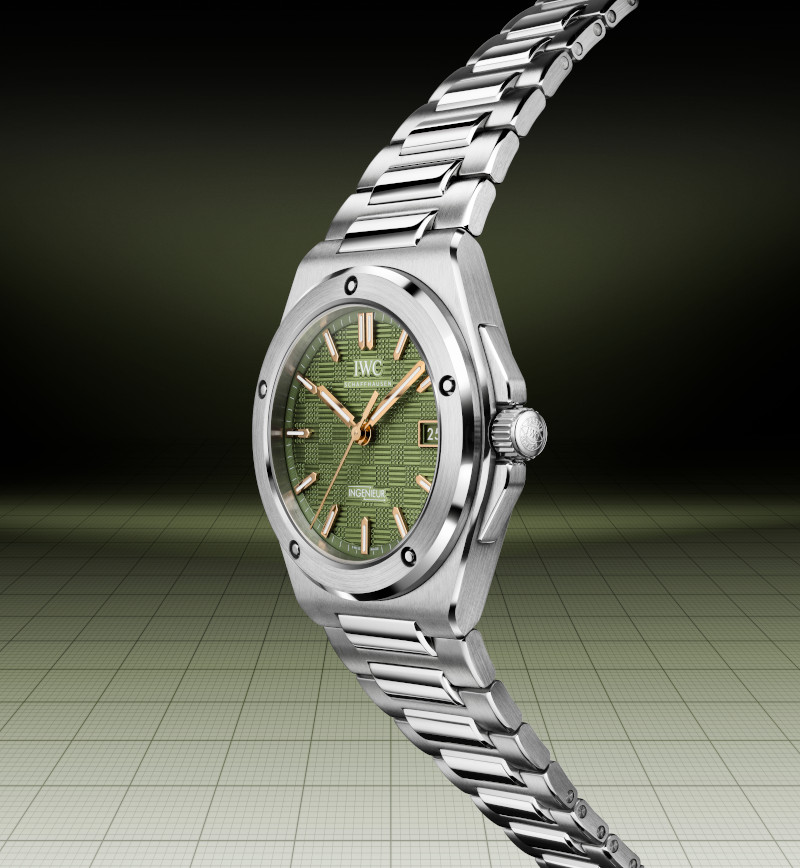
Ingenieur Automatic 40
Thus, the new Ingenieur was overhauled, completely redesigned whilst preserving the design codes established with Gérald Genta’s Ref. 1832. The iconic bezel with the five dimpled recesses still remains, along with the stylistic H-Link bracelet, but of course, with all of the incremental upgrades that IWC has garnered over its years of designing and crafting luxury timepieces. For example, one anecdote that Knoop shared about one such attention to detail is the bezel with the five recesses. On the Ingenieur SL, the bezel was simply screwed onto the case, meaning, as Knoop explains, “The position of the recesses was purely random, and they were never in the same place. I’m a perfectionist, so that always bothered me. With the Ingenieur Automatic 40, five screws now secure the bezel to the case ring. The screws have a technical function and, as a result, are always in the same position.”
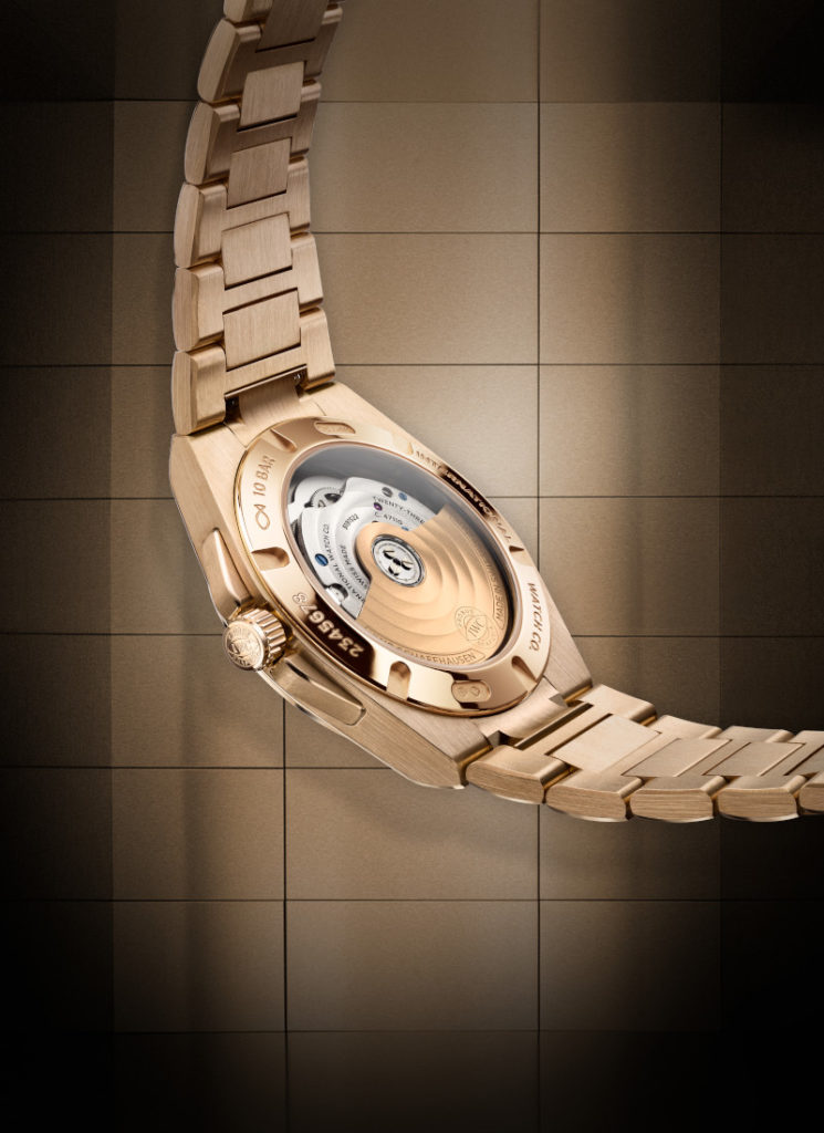
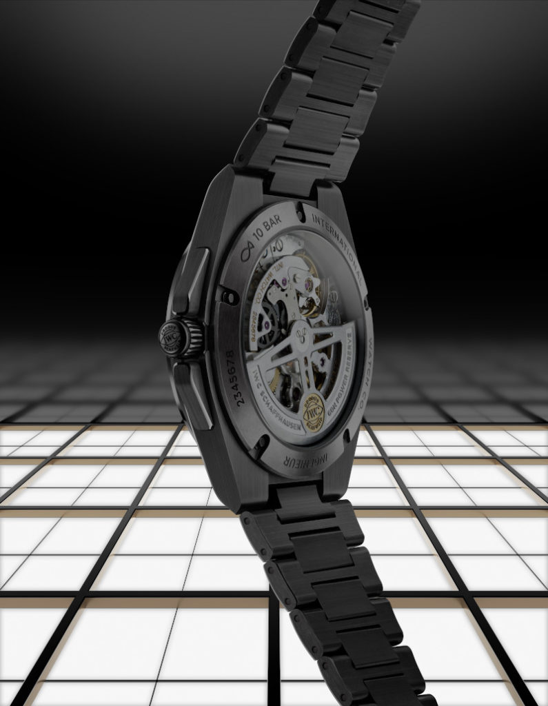
In terms of proportions, while the 40mm diameter of the Ingenieur SL was considered “Jumbo” for 1976, today it is considered quite a versatile size, and thus the new Ingenieur remains at 40mm. The thickness, however, has been reduced from the 12.5mm of the original to a much slimmer 10.8mm. Besides this, the profile of the case has also been tweaked because it takes more than just the diameter and thickness of a watch to ensure a snug and comfortable fit. After testing countless prototypes, they have added a slight curve in the case ring and a new middle-link attachment on the bracelet, which provides the watch with a better fit on the wrist. All of these improvements have been afforded to the new Ingenieur without compromising the soft iron inner case, which retains the anti-magnetism properties on which the entire collection was founded. And what would an update be if not with an improvement to its movement as well? The relaunched Ingenieur makes use of IWC’s current generation Calibre 32111, which comes with an automatic pawl winding system and 120 hours of power reserve.
With the new Ingenieur, even though it has retained the original name, it is no longer being marketed as a tool for engineers but rather a luxury timepiece that can withstand the rigours of an engineer’s workplace. And as such, there are plenty of subtle craftsmanship details added to the watch. The most obvious of which is the “grid” structure, consisting of small lines and squares, on the dial, which adds an interesting texture and more depth. Knoop adds, “We have optimised countless details you would hardly notice at first glance. For instance, the upper parts of the bracelet now contain closed links without visible pins. This feature not only enhances its overall quality but also underscores the superb finish. The integration of a clean, simple butterfly folding clasp gives full rein to the beauty of the bracelet. Another example is the slightly curved front glass. It is even more finely tuned to the overall proportions of the watch, underscoring its value and sophistication.”
Photography Xerxes Lee; Photographer's Assistant Din @ Awesome Image Studio; Styling & Coordination Sarah Saw
Two years later, as a testament to the success of the new Ingenieur, IWC has been able to build upon the foundation of the Ingenieur’s relaunch to roll out a whole compendium of references offering more options than the collection has ever had before. What is most intriguing is the 35mm case option for the Ingenieur, suggesting that the collection is even appealing to men with smaller wrists, or perhaps the brand is trying to convert some female customers to the luxury sports watch segment. What is nice about the smaller size is that not only does it offer a variety of dial options, nearly on par with the staple Ingenieur Automatic 40, but it is also available in a full 18ct 5N gold case and bracelet version. This version is simply stunning as it offers a unique combination of a tone-on-tone dial and case combination, not found in the larger 40mm size (the 40mm Ingenieur with a gold case comes with a black dial).
From left: Ingenieur Automatic 42 in ceramic and the Ingenieur Automatic 35 in 18K 5N gold | Photography Xerxes Lee; Photographer's Assistant Din @ Awesome Image Studio; Styling & Coordination Sarah Saw
I think that with this new Ingenieur collection, IWC also has more room to flex its innovation muscle. Take, for example, the Ingenieur Automatic 42 in ceramic. Sure, IWC has more than its fair share of ceramic cases, especially in the Pilot’s Watch collection, but with the Ingenieur, they are able to also showcase their manufacturing savoir-faire by offering a full ceramic bracelet to match the case. Which, if you ask a watch engineer, is sometimes harder to manufacture and to finish correctly as compared to its case. We had a full-blown conversation on the Ingenieur Automatic 42 ceramic with both the Editors of WOW Singapore and Thailand in our Summer 2025 issue of World of Watches, so be sure to check out that deep dive.
Ingenieur Automatic 42 | Photography Xerxes Lee; Photographer's Assistant Din @ Awesome Image Studio; Styling & Coordination Sarah Saw
BY THE WAY
Taking a little detour, because this issue is, after all, based on the theme of speed and innovation, we can’t help but mention the special edition Ingenieur that was released for the recent film F1® The Movie. One of the curse of being a watch guy is that even if you are just enjoying a movie, your eyes will tend to involuntarily flick to check out the wrist of the actor on screen, and if, god forbid, you see something interesting, it doesn’t matter how action packed the film is, all you can think of is: what the hell was that watch?! This was exactly what happened whilst watching F1® The Movie. That green dial Ingenieur SL-looking watch on the wrist of Brad Pitt’s character, Sonny Hayes. Yes, that’s the one.
Thankfully, there are other watch nerds out there with a better network of watch sleuths than I, because the watch in question was a prop and was never for sale by IWC. There was a whole backstory of the significance of this watch in the movie, but I will leave you to watch the film for that. The actual watch itself, however, was a timepiece inspired by the Ingenieur SL Ref. 1832 but had a fantastic green dial, no date, and the signature bezel with the five recesses had been polished. This prop was made as a collaboration timepiece between IWC and the Cloister Watch Company, a design studio that specialises in creating bespoke timepieces from vintage watches. Unfortunately, as far a we know, it is a piece unique for the film, and who knows where the watch is at the moment. Perhaps it will turn up at an auction a couple of years down the road, or maybe it will go into deep storage within the brand’s archives. What is not a piece unique, however, is the limited edition Ingenieur Automatic 40 that was launched in tandem with the film. This version was inspired by the watch of Sonny Hayes and comes with a green dial too, albeit in a slightly different shade. Limited to only 1,000 pieces, this Ingenieur takes all that retro old-world charm of the prop watch and transfers it to its modern counterpart.
LASTING IMPACT
Anyway, back to the main story, with this year’s extension to the Ingenieur line, it is a clear signal that the collection is doing well alongside its more established brethren like the Pilot’s Watch and Portugieser. What I think is fascinating for this collection is that even with the seven new references launched earlier this year, it is still early days for where this collection can go. In terms of colours and case materials, there is so much still left to explore. And this year, the collection got its first taste of complication with the perpetual calendar, but I am almost certain that IWC already has a slew of complications that will go very nicely with the Ingenieur style of watch. I mean, how can there not be an Ingenieur chronograph, right?
Ingenieur Perpetual Calendar 41
The story of the Ingenieur is a fantastic adage about how times can change. It is utterly unfortunate that Gérald Genta is no longer around to see one of his lesser-known designs brought to life in such a big way. But his widow, Evelyne Genta, is certain that he would have been pleased with what IWC has done with the Ingenieur. Watch tastes and trends can definitely be cyclical, and the Ingenieur is a great example of how an unsuccessful timepiece shouldn’t necessarily be deemed a failure. All it needs is a little time. How does that saying go? If at first you don’t succeed, try, try again.
Evelyne Genta admiring the new Ingenieur collection
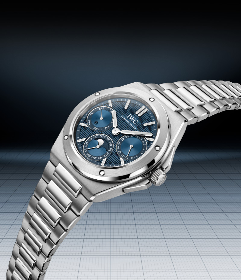
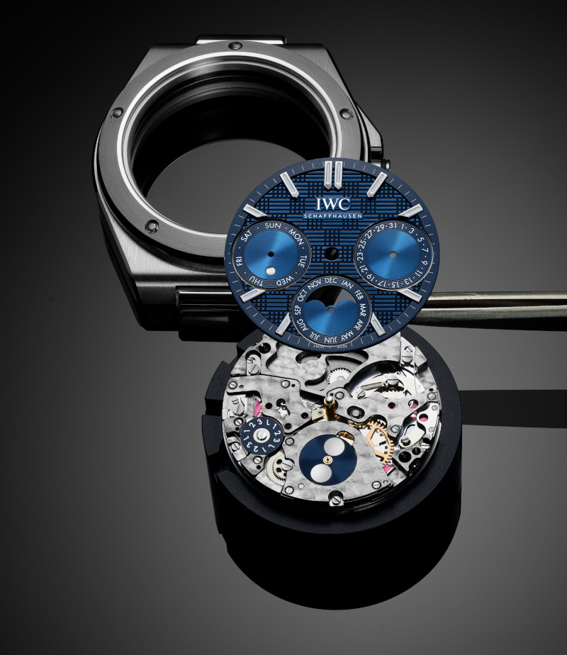
Blancpain Grande Double Sonnerie Rings It in Twice
The Grande Double Sonnerie
Without beating around the bush needlessly, a chiming or striking watch is a rarity in watchmaking. A genuine one. The rarest of these types of watches is a grand and petite sonnerie, with many specialists having decades of experience probably only ever experiencing a handful. Basically, this is the very pinnacle of watchmaking, from which you can look down and just about make out the minute repeater. Well, Blancpain has gone one better with its latest superwatch, the Grande Double Sonnerie Ref 15GSQ, a watch that adds a compelling new chapter to the story of fine watchmaking.
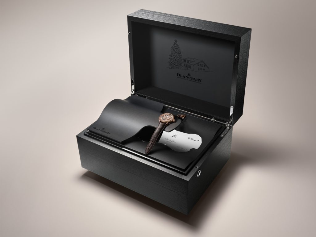
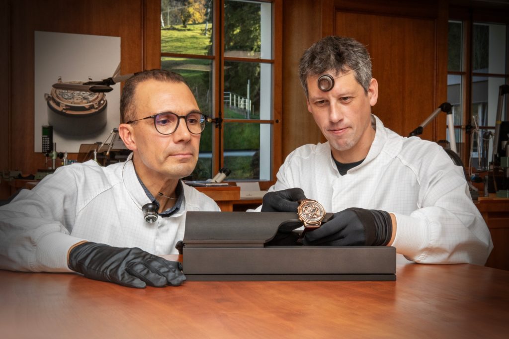
To celebrate this incredible milestone, Blancpain did the unthinkable: invite the aforementioned specialist press for an exclusive preview. The editors of WOW Singapore, Malaysia and Thailand thus all got together at the Blancpain facility at Le Brassus to discover this watch, which is the first in the world to have two selectable ways to sound the time. To be able to learn about Ref. 15GSQ from the people who made it themselves, ahead of the watch’s public debut, is invaluable.
The Grande Double Sonnerie will be presented in this special box
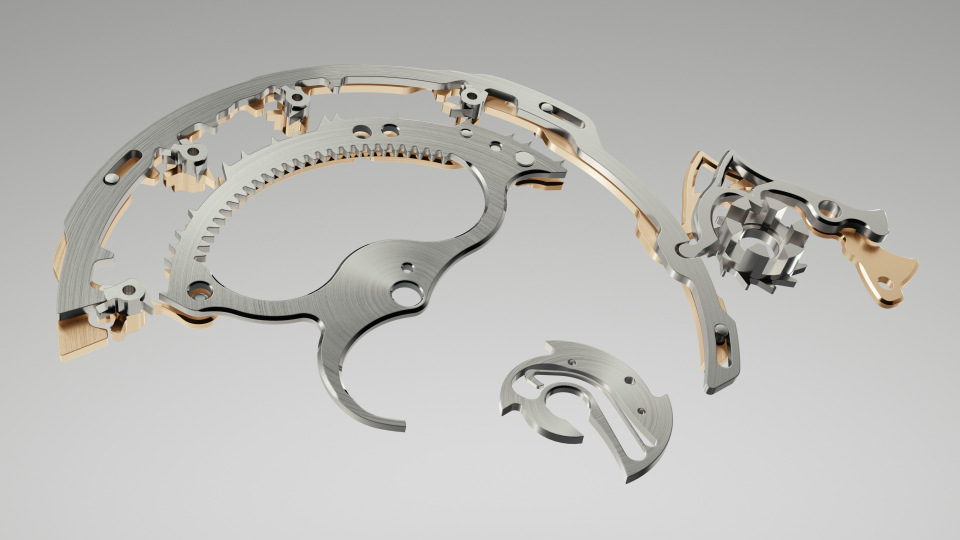
As befits such a momentous occasion, the editors devote a great deal of attention in the story that follows to how the Grande Double Sonnerie works, including a brief primer on the grande sonnerie in general. Ahead of that, here are some details on Ref. 15GSQ, of which there are two versions – one in red gold and one in white gold. This also means that the mainplate and bridges of the integrated calibre (also named 15GSQ) are executed in the matching gold. In addition to the aforementioned grande and petite sonneries, the watch also features a minute repeater; a 4 Hz flying tourbillon with silicon balance spring; a retrograde perpetual calendar; and power reserve indicators for both the chiming mechanism and the movement overall.
Daniel Goh (DG): Greetings from Malaysia! I hope everyone is well rested and acclimatised from our very secret, and at least for me quite brisk trip, to Le Brassus for a first look at this insane project from Blancpain. I think we mentioned in our last Tick Talk segment that this trip was the first time where the editors of WOW Singapore, Thailand and Malaysia were on the same press trip. And this affords us a very special opportunity to have a spirited discussion about the watch in question.
We saw the watch precisely two weeks ago and I am glad we are getting to this discussion so soon because the amount of information we received about the piece was staggering to say the least. So I think it is best we put our thoughts down on paper, while all of it is still fresh in our minds.
Ashok Soman (AS): It is certainly the first time I recall all editions being in the same presentation, outside of a watch fair! We have been at the same event or something, but not all together for just one watch. As you say, it was one heck of a watch that came with a tonne of information…and a pair of drumsticks. It was like, “What just happened…” I was tickled though that the NDA we all had to sign had the name of the watch as its title!
Ruckdee Chotjinda (RC): Grande Double Sonnerie … How about we start this article from here? Can I please have a refresher on what a sonnerie is, to begin with?
AS: Happily, Blancpain anticipated that very question and provided a neat answer, and from the watchmakers who developed the world’s first double sonnerie. So, I guess we should begin by addressing the type of watch, which is of the striking variety; it sounds out the time, basically. It is part of a grand tradition of what we in the trade call striking or chiming watches and represents the very pinnacle of fine watchmaking.
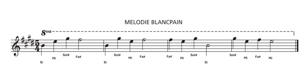
This is no overstatement. A chiming watch is at least an order of magnitude more challenging to execute than a tourbillon. A watchmaker typically can start working on tourbillons years before he or she can attempt a chiming watch. The orders of magnitude go up as you move up the scale, from minute repeaters to grande sonneries. That last was the peak, until now. What Blancpain has done here is nothing less than finding a new highest point, but I am getting ahead of myself! Let me say that the Grande Double Sonnerie sounds out the time, meaning the hours and quarters, both on demand and automatically. It also sounds out the minutes, like a minute repeater, on demand. Blancpain added a twist here, which is what elevates the watch, by giving the lucky owner not one but two musical phrases to choose from: the standard Westminster chime or a Blancpain tune!
DG: For me it was fascinating to learn that there were no wristwatch grande sonneries until 1992. This style of chiming has existed for centuries on the massive tower clocks and subsequently pendulum clocks so it was surprising that they didn’t or maybe couldn’t include this complication within the compact confines of a wristwatch until that year. One would have thought that someone would have attempted it earlier.
So basically, until 1992, all chiming coming out from a wristwatch was done via a minute repeater complication. And the difference is that a minute repeater is activated via a slide that also provides the energy required for the chiming mechanism while the sonnerie, both grande and petite, gets its energy from a mainspring within the movement. And from what we have been told from the many master watchmakers at Blancpain, the sonnerie, although similar in functionality to the minute repeater, is much more complicated to produce.
RC: Hmmm … I’m glad I asked for the refresher because striking watches have never been my forte. They account for a very small percentage of watches I see each year. I think that goes to show how rare the complication is in terms of quantity in relation to other, more common mechanisms out there. I even had to look up the difference between a petite sonnerie and a grande sonnerie before my outbound journey to Le Brassus, just to make sure that I have my facts right.
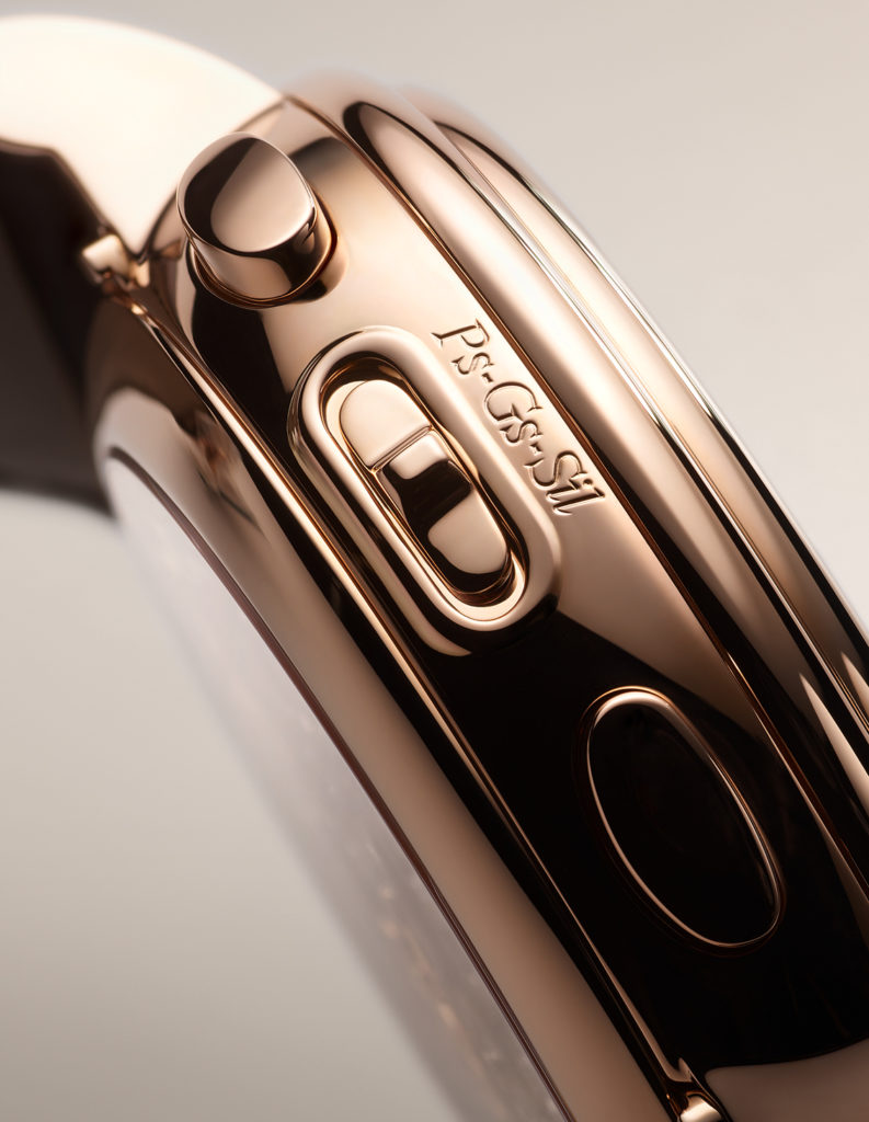
So, for the completeness of the refresher provided above by my esteemed colleagues, let me add a bit of information. Both petite sonnerie and grande sonnerie strike the hours at the top of each hour. The difference is at the quarters where a petite sonnerie would strike only the quarters while a grande sonnerie goes on to strike both the hours and the quarters. The action is autonomous (or “en passant”, as the term is often used in horological literature), unlike a minute repeater that is activated on demand. A sonnerie watch would have a selector for the owner to put it in either petite sonnerie, grande sonnerie or silent mode. The same is true for this Blancpain Grande Double Sonnerie with the “Ps-Gs-Sil” selector on the case band on the 9 o’clock side.
DG: And it is not just about the mechanical complexity with a sonnerie right, there are so many other intangible qualities to a chiming watch. The tonality, quality, and strength of the sound produced add to the appreciation of the watch, which all need exceptional fine-tuning from very experienced ears. This makes Blancpain’s Grande Double Sonnerie all the more special right? Double the sonnerie means double the effort!
Marc A. Hayek & Eric Singer
AS: We often say that a chiming watch is like having Big Ben on your wrist, as a sort of shorthand explanation. That is where the whole Westminster chimes reference comes from. With the Grande Double Sonnerie, we effectively get two clocktowers in one wristwatch. The second one is a tower of rock though because the tune was composed by drummer Eric Singer of Kiss fame. If that is not enough, most sonneries use just two notes but Blancpain doubled that too, with four notes here! And it is those four notes that form both the Singer-penned melody and the Westminster chime. As you might imagine, this means there are parallel tracks in the mechanical system tied to each melody. Crazy stuff but I will take a breath now before I race ahead of myself yet again…
DG: Can I just also add that while going from a traditional two-note to a four-note chiming mechanism may sound like a simple thing but as with most things in watchmaking, it is most definitely not. Four notes mean that the watch sounds a melody and with something as recognisable as a Westminster chime, you need to nail the pitch and tempo spot on because if not our ears would immediately be able to sense that something is off, and make the chiming unpleasant to hear. The adjustment for the tempo alone was crazy, we are talking about shaving off microns from the teeth of the pièce des quarts that controls the timing of the sonnerie, testing and then adjusting until it is perfect. It isn’t surprising at all that with work like this, Blancpain is only able to make two of these each year.
AS: Since we are in the spirit of chiming in here, let me also add that in terms of those microns Daniel mentioned, these are filled off with special tools that Blancpain developed just for this. And if the watchmaker shaves too much off, they have to throw away this piece. It takes days just for this part, on average, apparently, and there is a lot of trial and error to nail down the process. This is perhaps unsurprising given that Blancpain is reengineering the sound, even if it is not recreating the whole sonnerie mechanism.
RC: And then you have the important matter of the power reserve … or power reserves in this case, as there are two separate barrels: one for the regular timekeeping and another for the striking mechanism. Both are wound by turning the crown (i.e. counterclockwise for the former and clockwise for the latter). I noticed when reading the specifications though that there is a vast difference of eight times between the 96 hours of the regular running train and the 12 hours of the sonnerie and the minute repeater, if the watch is set in the grande sonnerie mode where energy consumption is highest. So during my interview with Mr. Marc A. Hayek, I asked if it would have been technically possible for the striking mechanism to have a 24-hour reserve if the running time of the other is reduced to 48 hours, for example. The answer was no.
Given the amount of energy used by the grande sonnerie, even if they were to reduce the power reserve of the timekeeping by half, they would have gained only two to three hours more for the striking mechanism. Also, the 12-hour reserve should suffice in real life as the use of striking mechanism is expected only during waking hours. Besides, despite the privileged luxury of having a sonnerie watch, a person is unlikely to have the complication turned on for the whole day because the chimes at every quarter can be excessive.
My conclusion: the current setup is ideal and most practical, especially considering the important fact that the Grande Double Sonnerie features a perpetual calendar complication as well, and with a retrograde date hand to boot!
AS: Power reserve and amplitude questions are key for sonneries, for the reasons you note, it also helps that calibre 15GSQ is integrated, not modular, so everything can be optimised for the specific needs of the Grande Double Sonnerie. This also plays into how the watch wears, since we are on a slightly more practical train here, as you might think that the watch will be monstrous on the wrist. The dimensions are 47mm (diameter) and 14.50mm (thickness) so not a small watch by any stretch but also not overwhelming. The movement itself is 35.8mm in diameter and 8.5mm thick, with 1,053 components for the movement.
DG: Speaking of optimised, I like how even though the complications are integrated, they each have their own little space within the movement. I often forget, because the double sonnerie is so interesting, that the watch is also a grande complication. It has a perpetual calendar and a flying tourbillon and each occupy roughly one third of the movement. This was the reason one of the watchmakers mentioned that they had to go with a retrograde perpetual calendar as it was the only way to fit. And this probably helped them keep the dimensions to a much more wearable size.
Marc A. Hayek was adamant that even though they were making a grande complication he didn’t want the watch to just sit in a safe somewhere, he wanted it to be worn and with these dimensions I think the watch is highly wearable. Okay, it probably won’t fit under the sleeve of a shirt anytime soon, but with a watch like this you probably wouldn’t want to hide it anyway. You probably want to take it out and show off the watch because the finishing on this thing is absolutely insane as well.
the famed underlug correctors for Blancpain's perpetual calendar complication
RC: I wish though that it was possible for us to try the watch on fully strapped. That would have given me an even clearer comparison with similarly large watches. Since this article is dedicated to Blancpain, I will refrain from bringing up model names belonging to other brands. But I will say that, if you can wear the Fifty Fathoms in the 45 mm size, then chances are that you can wear this masterpiece. At 15.5 mm, the Fifty Fathoms is even 1 mm thicker than the Grande Double Sonnerie. I hope this bit of comparison helps, dear readers.
AS: I very much like that this watch is not meant to be a safe queen; it is also water-resistant to 10 metres, which is better than most such watches. Chiming watches are about as water-resistant as sponges. That commitment to wearability is also why Blancpain will make (roughly) two a year, which is an astonishing commitment. When we visited, the watchmakers explained that all the work, in terms of fine finishing, is shared in the high complications workshop between artisans who are also working on other movements.
A watchmaker working on one of the gongs
RC: Well, according to the press release, there are 26 bridges on this movement, and these, together with the mainplate, are crafted from 18K gold. You can expect to see their unrestrained use of traditional hand-finishing techniques on both visible and hidden surfaces. Anglage is particularly mentioned during the presentation. There are 135 inward angles across all bridges, and they were executed at a 30° angle instead of the regular 45° angle in order to maximise reflection of light with the upward surfaces.
AS: The logistics of making the Grande Double Sonnerie are very impressive indeed because I imagined that the brand would need to dedicate watchmakers exclusively for this. On that note, there are two watchmakers involved here, from start to finish, and they get the honour of adding their names in the secret style. On the back of the gold Blancpain plaque, you will find ‘Romain’ or ‘Yoann’ engraved there, although the only way you will find this information is by disassembling the movement, which we do not recommend! Maybe buy two if you want to pursue that… Seriously though, I was deeply impressed that Blancpain is putting the watchmakers forward like this because the practice of big brands relegating their watchmakers to being faceless grunts has been heavily criticised by collectors. If you own this watch, you will no doubt imagine Romain or Yoann working diligently on some delicate bit of anglage that you can appreciate with your loupe. There is a certain degree of satisfaction in knowing that human story, I think – even beyond that new 30° milestone, which we heard may well become the new standard at Blancpain.
The painstaking process of adjusting the tempo for the striking mechanism
DG: Another interesting tidbit I learned while on this trip was that the Grande Double Sonnerie was also double assembled. Unlike some brands that assemble unfinished components first to adjust everything before disassembling and finishing the pieces, Blancpain starts even the first assembly with some finished pieces. Considering the amount of painstaking hand finishing, I would imagine this would be quite daunting for the watchmakers. But apparently this is necessary because for components like the pièce des quarts which was mentioned earlier, the process of adjusting the teeth can take quite a fair bit of time. To prevent dust from entering the movement, it is only after all the fine adjustments are made that the watch is disassembled so that the final assembly can happen in a dedicated clean room.
RC: I must have been paying not enough attention to this part of the tour. Was this mentioned in the presentation lab downstairs? Or later when we were in the assembly room upstairs?
Gentian wood used in the process of decorating the movement
DG: This was in the assembly room upstairs among the master watchmakers quietly and diligently working on their crafts. It is easy to get distracted by gentian wood used in some of the finishing work. Or maybe it was the stacks of technical documents on the Grande Double Sonnerie just casually laid out on the table.
RC: Yes, yes, yes. I must have been too distracted upon learning that the wood they use in the bevelling work is from the same gentian tree whose roots are used to make that clear liquor served as an aperitif or digestif … which was also appropriately served at our lunch at the manufacture.
AS: I almost got lost in the technical details because the 21 patents for the movement were laid out before us, ever so invitingly, in folders but I held myself back. This was especially tough because everyone else ignored them! But if I started with the patents, I would have never left. And if I did that, I would have missed all the craftspeople doing the handwork that really makes a difference here. As you guys noted, they even developed special tools and techniques to work on the bridges, plates, wheels and so on of calibre 15GSQ. This is only to be expected at this level of watchmaking because to get the quality you need, each artisan needs very specific tools. Happily, they did not introduce the woody digestif till later or I definitely would have been super distracted. It is not a taste that works easily for everyone’s palette, and on that note…
DG: And after learning all that, it blew me away when Mr Hayek just casually mentions that for these pieces, they will be open to customer personalisation! I mean usually, when it comes to chiming watches, brands are very adamant that this material and design configuration makes the best sound and that’s that. But Blancpain is open to working with clients to make the watch that the clients want, and would be most likely to take out of the safe and wear. I mean to hear Hayek say he is curious how the watch would sound if a client wants the case in titanium…or with a dial…that was quite special.
The watchmakers Romain and Yoann who will dedicate a considerable amount of their time to this project
RC: Oh, I thank you for bringing this up because I learned something very special from the interview, that is not mentioned in the press release for the Grande Double Sonnerie. You can, if you are willing to spend, personalise even the melodies!
Hayek did say that this watch is about “the person, the emotion, the story”. So if the client is willing to invest the time and the money or maybe has a friend who is a musician or a composer, Blancpain is happy to personalise the melodies for your unique experience, provided that they fall within the constraints of the four notes.
Ok. It has been two hours of flat-out writing and I don’t know how many pages this will result in. Let me ask you both for a closing remark on either this entire Grande Double Sonnerie unveiling experience or the importance this significant timepiece carries in terms of the direction in which Blancpain is going.
AS: I do not know about directions but you opt for a good word there: timepiece. Most other watches are just that – watches. This one is different and you do not need to master all the technical details to appreciate it. If looking at the exacting finishing touches does not quite do it, listening to the melodies will. So, you can both see and hear to believe! Far too many so-called special watches are just checking boxes and waving bona fides aggressively. The Grande Double Sonnerie is the real deal, and I suppose that says something about Blancpain.
DG: I too can’t speak about where Blancpain is headed. But what I can speak about is that they absolutely chose the correct method to unveil this timepiece, which is at their manufacture, amongst the people that dedicated countless hours (eight years) to make this watch happen. This is a timepiece that needs to be experienced to be understood. Its price tag is hefty, but it is only when you see all the work that went into making it (the research, the fine tuning, the assembly, the finishing, and so many other invisible functions) that you look at the price tag and say, sounds about right.
RC: You both have covered very well the exaltedness of this Grande Double Sonnerie. Let me add that I take this well-planned release as a departure from the confusion left in my heart by some of the novelties released in the last years of Baselworld. Several watch models were introduced at the time, most of them in the Villeret collection, with sufficient details but absolutely inadequate visuals and almost zero promotion afterwards. They did not even stay long in the collection and that made me sad because they were different from the offerings of the other brands at the same price level.
The sonnerie selector on the case
With this Grande Double Sonnerie, the visuals are superb in that they illustrate very well the intricacy and the soulfulness of a handcrafted product that will stay with you for a lifetime. While I don’t expect Blancpain to have this same in-person presentation treatment for other, more accessible novelties in the future, I would at least hope for similar beauty shots and perhaps know-how shots every now and then. Having said that, I think we started to see this important improvement already earlier this year with the photographs that accompanied the releases of the new 42mm Fifty Fathom in stainless steel, the new Fifty Fathoms Tech in the permanent collection, and, most recently, the new Golden Hour-themed Villeret watches. This is the most effective way to inspire buyers, if you ask me.
So, to our dear readers, we hope you enjoyed the unique way in which we bring this Grande Double Sonnerie watch to your attention. And, to the fine people of Blancpain in Le Brassus, in Paudex, in Singapore and in Bangkok, we thank you for letting us discover the Grande Double Sonnerie in this most insightful manner. We are sure that this marks the beginning of an important decade leading up to the brand’s grand celebration of the 300th anniversary in 2035!